Transferir como PDF, PPTX
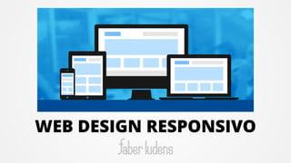


O documento discute o design responsivo de websites, incluindo ferramentas necessárias como editores de texto e navegadores, a importância de se adaptar aos dispositivos móveis, e técnicas como layouts flexíveis, imagens flexíveis e media queries para criar um layout que se adapte a telas de diferentes tamanhos.


![[EXPOTEC 2016] Construção de sites e gestão de conteúdo com WordPress](https://cdn.slidesharecdn.com/ss_thumbnails/minicursowp-160226000405-thumbnail.jpg?width=640&height=640&fit=bounds)


