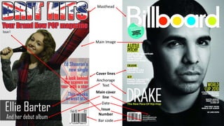
2. On the front cover I have used a range of features in order to follow codes and
conventions. I have used a big bold masthead to stand out. As well as this, I made
sure the mast head was not obstructed. This is needed as I have to brand the
magazine, as it is only the first issue. I also put a large main image on the front, this
attracts the audience into the magazine. As well as this I also used a large cover
line. This is used to make the magazine appeal to the target audience as it someone
that would appeal to them. This is a common theme as the ‘Billboard’ magazine
use the same technique following codes and conventions. As well as this, I also put
a barcode, the date, price and issue number. These are all legal requirements as
well as normal conventions of magazines. As well as this, I also added cover lines,
this are used to sell the magazine as it shows the audience what's contained within
the magazine.
I also used a slogan to try and sell the magazine, I did this because being the first
issue I need to interest the audience to sell my magazine to them. However,
Billboard don’t have to use this feature as they already have an established
audience who regular buy their magazine. Therefore, they have to use less features
intended in attracting new readers. As well as this they create attention by using
famous singers on their magazines, and this therefore attracts an audience.
Whereas I am creating a first magazine and therefore don’t have the money to pay
for a famous person to be on the front cover.
4. I followed the codes and conventions of most music magazines within my
contents page. I did this by using a 3 column format to set out my page. As
well as this I used a range of images, however, I could used more to make the
page more appealing to my target audience which is people between the
ages of 10-20 who are more likely to want to look at images instead of
reading lots of text. I also included my mast head at the top of the page. This
was important as the more the audience see the mast head the more likely
they are to notice it in the future. This is a key method used to brand the
magazine. As well as this, I used a first edition puff, which contained a money
off the next issue voucher. This would make the magazine appeal to the
audience as it means they will save money. This is a good method as most off
them have very little or no income it means they will save more money. One
improvement I could have made would be to include a website address onto
the page, as a code and convention of a standard magazine. This is needed to
brand the magazine as the audience can see more magazine exclusives and it
can be used to help sell the magazine to my target audience.
6. As you can see my double page spread uses many of the features that the established magazine also uses. I have used a
large title at the top of the page introducing what the article is about. As well as this I also used anchorage text to make
sure the audience read this magazine.
The main image I used was effective as it takes up both pages. However, the professional magazine has the image on
one side and the text on the other. However, I feel the way that I put the text on top of the main image breaks codes
and conventions, however, I feel it works as the image is a shadow and therefore the white text stands out. As well as
this, the text being on top of the person who its about makes the audience feel more connected as it is like that person
has actually said it.
I also used a drop cap, as this is a convention of magazine articles now. This makes the magazine look more professional
and well made.
I also used my mast head on my double page spread, this is because I need to keep branding my magazine to make
grow an audience that keep coming back.
Page numbers were used at the bottom corners so the audience can easily locate what page things are on. As well as
this it is also a code and convention of a magazines so it was required to me included.
I also used columns within my article. These are a code and convention of magazines. It was also needed within my
magazine as my target audience is likely to be people between the ages of 10-20 it was necessary to make it look like
there is less text than there is. This is needed as my audience are not going to want to read long boring articles.