Baixar para ler offline


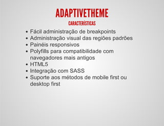
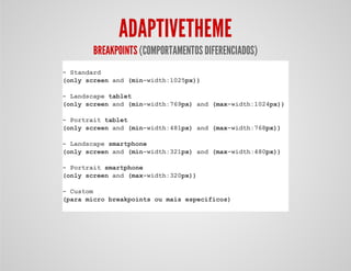
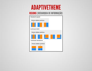
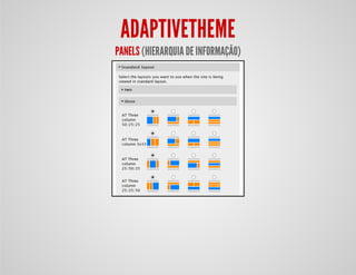
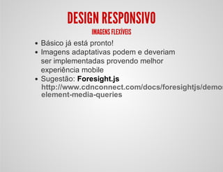
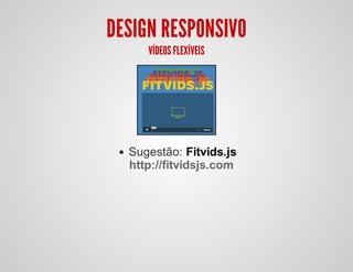
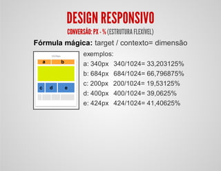


O documento discute como aplicar design responsivo no tema AdaptiveTheme para WordPress. Ele explica como o AdaptiveTheme usa breakpoints e regiões para fornecer experiências diferenciadas em dispositivos móveis e desktops e recomenda ferramentas para imagens, vídeos e formulários flexíveis entre telas.


