
Recomendados
Mais conteúdo relacionado
Mais procurados
Mais procurados (20)
Semelhante a Katy Perry's Reign as Pop Queen
Semelhante a Katy Perry's Reign as Pop Queen (20)
Mais de Zara Iqbal
Último
Último (20)
Katy Perry's Reign as Pop Queen
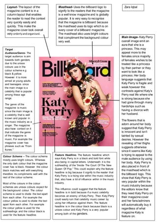
- 1. Main Image- Katy Perry overall image emit an aura that she is a princess. This may appeal more to the females since majority of females wishes to be treated like a princess by their partner or they want to look like a princess. Her body language suggests that Katy Perry is fragile and weak however this contrasts against Katy’s Perry real life where she is strong because she had gone through many hardships such as having a divorce with her husband. The flowers that is adorn around her body suggest that Katy Perry is innocent and isn’t tainted by sexual desires. However the revealing of her thighs suggests otherwise since it seems like Katy is trying to appeal to the male audience by using her body. Katy Perry is also placed in front of the masthead which is the billboard logo. This show that Katy Perry is very popular within the music industry because the editors know that they need Katy Perry on their magazine cover and her fans/admirers will automatically buy it regardless of what magazine Katy is feature on. Feature Headline- The feature headline which says Katy Perry is in a black and bold font while also being in capital letters. Underneath it is the subheading of the “Inside The Court Of The New Queen Of Pop.” This could explain why the feature headline is big because it signify to the reader that Katy Perry is a rising star within the music industry that, also have a lot of influence within in the music industry. This influence could suggest that the feature headline is in bold because if a music celebrity becomes an enemy of Katy Perry. Then Katy Perry could easily ruin that celebrity music career by using her influence against them. The feature headline is in the colour black because black is a unisex colour and Katy Perry is a very popular among both of the genders. Colour Scheme – The colour scheme mostly uses bright colours. Whereas the only dark colour that the magazine cover has is black. However the colour black matches well with everything therefore its compliments well with the rest of the colour scheme. Most of the colours in the colour schemes are unisex colours expect for the background colour. The colour scheme is used to divide the text apart from each other. For example the colour yellow is used to divide the text apart from each other. For example the colour yellow is used for the subheadings and the colour black is used for the feature headline. Target Audience/Genre- The target audience is aim towards both genders due to the unisex colours use in the colour scheme e.g black & yellow. However it is more aimed at young adults and teenagers since the main image is a celebrity that is popular among these age range. The genre of the magazine is music since the main image is a celebrity that is well known and popular in the music industry as a singer. The magazine also have context on it that indicate the genre of the magazine is music. For example the magazine cover has phrases such as “From Itunes.” Layout- The layout of the magazine content is in a column layout that enables the reader to read the context very quickly easily and quickly. This make the magazine cover look overall very orderlyandorganised. Masthead- Uses the billboard logo to signify to the readers that the magazine is a well know magazine and is globally popular. It is very easy to recognise that the magazine is billboard because the masthead uses its logo which is on every cover of a billboard magazine. The masthead also uses bright colours that compliment the background colour very well. Zara Iqbal