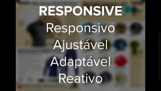
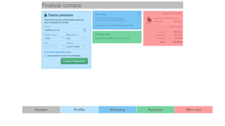
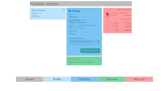
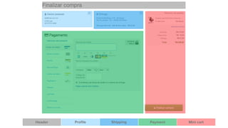
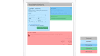
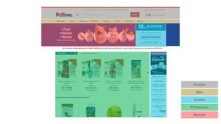
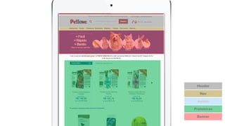
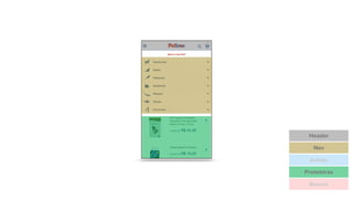
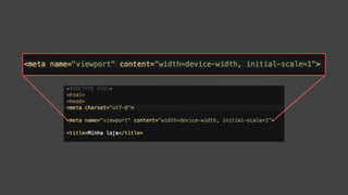
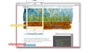
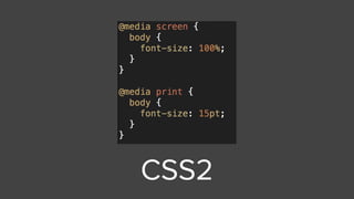
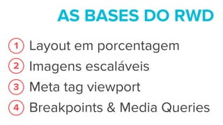
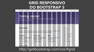
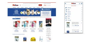
Responsive 

Web Design 

no E-commerce. 

É fácil! VTEX Day - Developers
Rodrigo Muniz
Designer - User Experience Team
fb.com/rodrigomuniz
br.linkedin.com/in/rodrigomuniz/
THE 

PAGE 

IS A LIE
https://www.flickr.com/photos/dmgatlanta/8367355013/
RESPONSIVE
Responsivo
Ajustável
Adaptável
Reativo
https://www.flickr.com/photos/dmgatlanta/8367355013/
http://goo.gl/gdyPYQ
lab.vtex.com
lab.vtex.com
lab.vtex.com
lab.vtex.com
“The measure 

of intelligence is 

the ability to change.”
― ALBERT EINSTEIN
ADAPTE-SE

PARA PODER SOBREVIVER
http://goo.gl/KFqIAo
QUE AMBIENTE 

É ESSE?
Tráfego Web 

E-commerce 

no Mundo

Setembro - Dezembro 201373%
27%
Tablet + Smartphone
Desktop
Smart Insights
E-commerce
mobile no Brasil

Acessos em 

Nov 2013 - Abril 2014
84%
16%
Tablet + Smartphone
Desktop
VTEX
E-commerce mobile
no Brasil

Fechamentos de compra em 

Nov 2013 - Abril 2014
94%
6%
Tablet + Smartphone
Desktop
VTEX
m.minhaloja.com.br

minhaloja.com.br/mobile
m.minhaloja.com.br

minhaloja.com.br/mobile
EVITE CRIAR VERSÃO WEB 

EXCLUSIVA PARA MOBILE
- Dois sites para manter
- Mais código de marcação
- Links "não-compartilháveis"
ENTÃO 

COMO 

FAREMOS?
O SMART CHECKOUT
JÁ É RESPONSIVO. 

:)
THE 

PAGE 

IS A LIE
CALMA
O LAYOUT NÃO
MORREU
O layout ainda
existe, porém o olhar
do designer muda
A página dá
lugar aos
MÓDULOSArtigo: http://daverupert.com/2013/04/responsive-deliverables/
Header Profile Shipping Payment Mini cart
Header
Profile
Shipping
Payment
Mini cart
Header
Nav
Asides
Prateleiras
Banner
Header
Nav
Prateleiras
Banner
Asides
Header
Nav
Asides
Prateleiras
Banner
GIF animado: http://i.imgur.com/kYv0brQ.gif
Comece devagar
lab.vtex.com
lab.vtex.com
Comece devagar
lab.vtex.com
AS BASES 

DO RESPONSIVE

WEB DESIGN
4
LAYOUT EM
PORCENTAGEM
1
GIF animado: http://i.imgur.com/RWPdoNg.gif
IMAGENS
ESCALÁVEIS
2
berry.jpg
A imagem é maior que a div
GIF animado: http://i.imgur.com/YcYkl9K.gif
GIF animado: http://i.imgur.com/7ohV3am.gif
META TAG

VIEWPORT
3
window
viewport
window
viewport
window
viewport
window
viewport
window
viewport
depoisantes
lab.vtex.com lab.vtex.com
BREAKPOINTS
& MEDIA QUERIES
4
CSS2
CSS3
Nasceram os
BREAKPOINTS
Adicione um container para suas divs com
largura em porcentagem.
GIF animado: http://i.imgur.com/ZuKok3D.gif
AS BASES DO RWD
Layout em porcentagem
Imagens escaláveis
Meta tag viewport
Breakpoints & Media Queries
1
2
3
4
BOAS PRÁTICAS
escolha
um grid system
GRID RESPONSIVO 

DO BOOTSTRAP 3
http://getbootstrap.com/css/#grid
GIF animado: http://i.imgur.com/sKC17ud.gif
mobile first
ESPAÇO EM MOBILE É
PRECIOSO
OCULTE AQUILO QUE
NÃO É ESSENCIAL PARA
O FECHAMENTO DA
COMPRA
CUIDADO COM O TAMANHO 

DE CALL TO ACTIONS
MÍNIMO DE 

44PX
TESTANDO 

1, 2, 3…
http://www.dimensionstoolkit.com/a/
http://goo.gl/2PmGih
DÚVIDAS?
OBRIGADO
rodrigo.muniz@vtex.com.br
pela atenção.
lab.vtex.com

@vtexlab
fb.com/vtexlab
REFERÊNCIAS
- MARCOTTE, Ethan. Responsive Web Design, 2011.
- Mobile Marketing Statistics 2014. Acessado em maior de 2014 em <http://
www.smartinsights.com/mobile-marketing/mobile-marketing-analytics/mobile-marketing-
statistics/>
- Reponsive Deliverables. Acessado em maior de 2014 em <http://daverupert.com/2013/04/
responsive-deliverables/>
- Resources - Apple Developers. Acessado em maio de 2014 em <https://developer.apple.com/
resources/>

Responsive Web Design no E-commerce. É fácil!