The document describes the design choices made in creating the cover of a magazine. Key elements include using the font Budmo for the masthead to evoke traditional pop magazines. The name "Molly" was made size 72 in impact font to highlight her as the cover star. A tagline was placed on the left in Arial size 30 to entice readers. Coverlines on the right were aligned right and used impact font size 60 in dark blue to match the model's top and complement the cool tones used throughout. Overlapping text on the model's shirt was made white for readability.
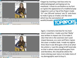
1. I began by inserting a text box onto my
edited photograph and typing out my
masthead. I chose to use Budmo as my font
as it gives the appearance of a traditional pop
magazine ( such as Top of the Pops) I made
‘21st’
size 120 and ‘century’ size 72 and chose
to make it grey as it looks a lot like silver
which has the connotation of
wealth/showbiz.
Again, I inserted a text box for my main
story’s coverline. I made sure that ‘Molly’
was written in impact size 72 to make it
clear that she is the coverstar and I used
impact because, as a sans serif font, it gives
the cover a modern look. I made my tagline
Arial, blue in size 30 to give a hint as to what
the article is. I put this along le left hand side
as that is where natural eyeflow goes from
and therefore, this should be where the
most enticing cover story is to make more of
my demographic want to buy it.
2. For the coverlines on the right hand
side, I chose to align them to the right as
is convention. I made ‘top 10 charts’ size
60 in Impact to make it stand out. I
chose to use a dark blue to match my
model’s blue top and to compliment the
cool tones (whites and greys) which are
continuous throughout my pages.
Where text was overlapping my
model’s blue shirt, I made it white so
it was readable and because it was
further down my page, I made the
Article title size 36
and the description size 24 to show
that its not the most important part
of the issue.