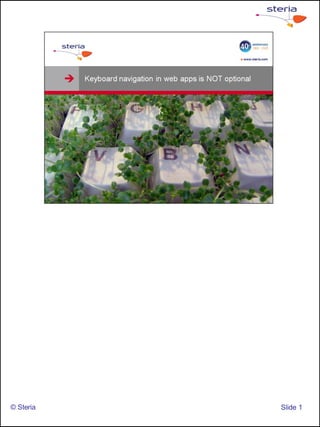
Mais conteúdo relacionado Semelhante a Keyboard navigation (20) 2. Remember thick applications? (Yeah I know we’re still building them
but bear with me)
I’m talking about pre-GUI applications that were navigated solely using
keyboard,
© Steria Slide 2
3. in the case of Word Perfect shown here, we also labelled our
keyboards with cheat-sheets to help us use it more effectively.
More on that later
© Steria Slide 3
5. The rise of the web, which was mouse only, gave way to a trend of
mouse-only interfaces.
Despite some noteable exceptions, a website used with a browser is
still a mouse only interface.
© Steria Slide 5
6. Now what happens! We build thick apps INSIDE another thick app, the
browser.
What happens when apps are moved to the web? Mouse-only
interfaces, that’s what! Just because it’s inside a browser doesn’t mean
it should be designed like a website.
© Steria Slide 6
7. The mouse is easy to learn, while keyboard navigation is more efficient
© Steria Slide 7
8. The reason is a mouse-only interface can be learned without prior
instruction provided that clickable items are visible to the user and their
meaning is apparent. That means it’s fast to learn but slow to use
because of the need to seek out and interpret the information on the
screen.
Keyboard navigation is much faster and commands can be issued
without having to search for it in a menu.
The downside? You have to remember it.
© Steria Slide 8
9. The browser is a just a sack full of EVIL isn’t it.
Your job is to work around it so that the end user doesn’t get the shaft.
What if you had to work with IntelliJ or Eclipse within your browser? It
hurts just thinking about it doesn’t it, doesnt’ it?
© Steria Slide 9
10. An example of browser evil: Any keycombo you want to use for your
webapp is highly likely to conflict with a browser key combo.
It gets worse: not all browsers are the same. You can never control
which browser is going to be used as runtime enviroment for the app
your building.
© Steria Slide 10
11. It doesn’t have to be a browser. When using a framework like Adobe
Flex, AIR can be an alternative to a browser, leaving you with greater
choice of available keyboard shortcuts.
© Steria Slide 11
12. Which keys do we use when every key is taken by the browser?
Here’s Gmail, everyone’s favourite mail app that runs in most of the
browsers we know of.
Gmail is a very good example to follow since it’s very consistent and
has many keyboard shortcuts that does not conflict with browser-
navigation keys.
Regarding consistency…: (next slide)
© Steria Slide 12
13. (cont.)…The time spent learning keyboard shortcuts is drastically
reduced if the keys selected are consistent according to a pattern.
Can you guess the key combo used to go to ”contacts”? Of course you
can.
An arbitrary selection of keys is almost impossible to learn.
© Steria Slide 13
14. When in doubt, follow standards.
This checklist is based on Microsoft recommendations, but remember –
You app can run anywhere, on a Mac, iPad or whatever your client
fancies next.
© Steria Slide 14
15. You can use Alt Gr + most of the letters and numbers on the keyboard
without interfering too much with other browser shortcuts
© Steria Slide 15
16. If it serves your purpose you can open the browser window without
tabs. That way you can use ctrl+1, 2, etc without conflict.
(Those keys are normally used to switch tabs in IE and Firefox)
© Steria Slide 16
17. Make cheat-sheets for the users keyboards, just like in the good old
days – your users will love you for it.
© Steria Slide 17
18. Ways to make shortcuts visible in the application (Remember
”knowledge in the world vs. Knowledge in the head”?)
-Shortcuts visible in menu
-Underlined letters indicate association with a key
© Steria Slide 18
19. Best example I’ve seen is MS Office: Click ALT key to let the
application show you all the keys.
© Steria Slide 19
20. - Tab sequence can be the primary way to navigate and app, e.g. shift
focus from one part of the app to another
- Is the standard way to navigate forms
- Shift+tab = reverse your path
© Steria Slide 20
21. The devil is in the details: Cursor Focus, Error messages, scrollbars,
dropdowns. How do you pull down a pull-down menu with keyboard
only? What about the fancy scripted date-picker?
Can you close an error message using the ESC key?
What about selecting odd lines in a datagrid? Can you de-select them
again?
Be sure to check if all the components in your GUI is possible to use
without a mouse. Unplug the mouse and you’ll soon know if you’re in
trouble or not.
© Steria Slide 21
22. In this example, no keyboard navigation is required. Just type.
- System starts with cursor focus in first text area in the dialog box –no
need to tab to the field, just start typing.
- Error message is displayed inline – cursor is still where it needs to be
and no need to shift focus.
- When the data is correct the cursor automatically jumps to next field,
no need to click or Tab.
-Efficiency and user friendlyness goes hand in hand in this example
© Steria Slide 22
23. Key takeaways from this talk.
-Do you remember what the recommended key for applying a
command to the entire document was?
© Steria Slide 23
24. All the stuff I wanted to include but couldn’t. It’s just 10 minutes after all
© Steria Slide 24
25. I’ve worked as an interaction designer for Steria since 2008 with clients
such as The Norwegian Police, Storm.no and The Norwegian
Government pension fund.
© Steria Slide 25
26. Thanks for checking out this presentation, and good luck building
accessible webapplications.
© Steria Slide 26