

Recomendados
Recomendados
Mais conteúdo relacionado
Mais procurados
Mais procurados (20)
Destaque
Destaque (16)
Semelhante a Analyzing Contents Pages
Semelhante a Analyzing Contents Pages (20)
Mais de BitUser Nguyễn
Último
Último (20)
Analyzing Contents Pages
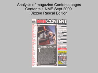
- 1. Analysis of magazine Contents pages Contents 1.NME Sept 2009 Dizzee Rascal Edition
- 2. Contents page NME (SEPT 2009) ANALYSIS BANNER AT TOP ‘ NME CONTENTS’ stands out so that readers know this is a contents page, also it fits in with the colour scheme of this magazine. DATE Featured in all contents pages to allow readers to know what issue they are reading and from which date. SUB HEADING BLOCKED OUT The sub heading background is black to firstly stand out from the background of the page so that readers can see it is a subtitle and also so the text will be a different colour also standing out. BRIEF HEADING +SUMMARY OF CONTENT This adds to the list of articles featured in this issue showing the final things that are featured so the reader will easily be able to find the article they want. NME MASTHEAD SAME COLOUR CODE AS FRONT This shows a format to the magazine as the title becomes more easily recognisable. Also it allows readers to relate the front cover and contents easier. Main image is….. A woman standing next to a tour bus which relates to the article as it is about tours. It is taken on a slight angle to show maybe rule breaking as it defies the norms. Bands are listed in red with page number in black This stands out against the white background making it stand out when readers turn to this page. It is easy to read meaning the reader will be able to browse through the magazine at ease. Image is edited so it looks like a photograph. This fits in with the style of the contents page as everything in the ‘touring special’ article is quite messy and not perfect. This is maybe to do with the fact that normally gigs and festivals aren’t exactly clean and neat. Editors introduction to contents of magazine Gives readers an understanding of what is in this weeks issue and allows the reader a quick glance at the editors opinions and other things that they have featured in this issue. PREVIOUS/FUTURE EDITIONS OF NME ARE SHOWN This allows the reader to subscribe to this magazine instead of having to think about going out and buying it. This is usually one of the highest selling points of a magazine as this allows readers to pay upfront and not having to think about.
- 3. ANALYSIS OF LAYOUT/DESIGN FEATURES OF CONTENTS PAGE Masthead featuring NME colour scheme. Radar and new music that readers can read about Band index showing all the band-s that are featured in this magazine and what page they are featured on. Image of woman standing nest to a tour bus linking in with the article below. Date to allow readers to know what issue it is. News and the following list of articles related. Article about the touring special featured in this issue of the magazine. Small article is featured on the contents page to give a taste of what is in this issue. Reviews from different albums to show readers what are good albums. What band are good to see live or are performing Main feature article and its page number. Subscription for this magazine giving you a number to ring and website to go on.
- 4. Analysis of magazine Contents pages Contents 1.NME Sept 2009 Dizzee Rascal Edition
- 5. ANALYSIS OF CONTENTS PAGE 2 (KERRANG November 2009) x Masthead Same font as front cover title and in yellow to stand out against background provides consistency through magazine. Date and Issue Number Featured on all pages of magazine to allow Readers to know what issue and date of the Magazine they are reading. In white to stand Out against the background. Other Articles Shows a double page spread from inside the Magazine and another article to show readers what Is featured. It also features what pages they are on Readers can easily find them. Note from editor Featured in most magazines to show the reader a Little comment from the editor which will usually be Discussing an article or artist featured in this Issue of the magazine. Magazine subscription Allows readers to subscribe to this magazine for A price that is cheaper than buying each issue Separately It takes a small section on this page While usually being advertised in a larger style On the back page. Main Image Features a member of the band Bring me the horizon At a signing. The image is a medium shot of the band Member but also a group shot of everybody else. It Uses colours that can stand out against the background. He has several tattoos which suggest which genre of Music he is associated with as tattoos usually show Rebellion and this is associated with rock/metal music. Summary of contents This adds to the list of articles featured in this issue showing the final things that are featured so the reader will easily be able to find the article they want. Contents Banner Features the name of the magazine and 'This week' in the same font which suggests that this is the list of articles that will be featured in this weeks issue. The colours are basic and draw the readers attention.
- 6. ANALYSIS OF LAYOUT CONTENTS PAGE 2 x The contents logo is in the Same font as Kerrang Meaning the reader can Recognise it. Small pictures of the articles By the main image so Readers can see them easily List of what is featured In this weeks magazine. The black and yellow Text stands out so it Is easy to read. Note from the Editor at the Bottom corner of The page for easy Viewing. Kerrang! This week in the same font as Masthead so readers can see what Magazine it is. Main image at top of page Taking up around half of the Page so that readers can Easily see it.
- 7. ANALYSIS OF CONTENTS PAGE 3 (Title/date of magazine analysed Masthead Featured in the same font but Smaller than on the front cover. It uses the same colour to Provide a sense of consistency Between the pages in this Magazine. Articles Featured A list of articles that are Featured in this magazine and The corresponding pages. This Makes it easy for readers to find What they are looking for in the Magazine. Date Date and magazine issue lets Readers know what they are Reading and also provides Consistency White colour Font stands out against black Background. Main image Main image shows a band that Are featured as one of the main Articles in this edition. They are Shown against a country Landscape dressed in what Would be typically what readers Of this magazine would wear. Review Guide and reviews to some Of the latest music and Tours to show readers what Is good and what should be Avoided.
- 8. Analysis of layout contents page 3 Masthead in red, Black and white Date which is Featured on all pages Main image of the band That are featured in one Of the articles which Catches the readers Attention immediately. Article list On the side Of the page Using the Same font. Reviews featured on the Bottom of the page under The image which allows The readers attention to Flow around the page.