

Recomendados
Mais conteúdo relacionado
Mais procurados
Mais procurados (18)
Destaque
Destaque (17)
Semelhante a 4 and 5tation1
Semelhante a 4 and 5tation1 (20)
Último
Último (20)
4 and 5tation1
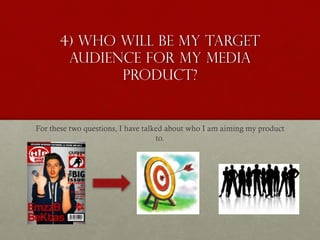
- 1. 4) Who will be my target audience for my media product? For these two questions, I have talked about who I am aiming my product to.
- 2. Who will be my target audience for my media product? Demographics and Psychographics I have looked at both the demographics and psychographics of the Hip-Hop genre, in order to specify who my target audience will be. I have taken into account many different demographics which will potentially be my audience.
- 3. Age I decided to aim my media product to teenagers and young adults (16-30). I believe that the Hip-Hop genre is mainly focussed on by the younger generation so thereby making my product aimed for young audiences will be acceptable as the current conventions show us. Generally, the artists placed on the magazine covers of the Hip-Hop genre tend to be young which gives the young audience something to relate to. Eye contact is also made in order to relate to the audience directly. The artists are really common ones which young audiences will listen to. For example, Chris Brown and Drake will be listened to by teenagers and young adults As I am in this age range, I believe that I will have a good knowledge of what people my age will expect to see in a Hip- Hop magazine, so I decided to aim my age at one I feel comfortable
- 4. Gender As far as gender is concerned, I aimed my media product to both genders as the common magazine conventions show this. In all of the Hip-Hop magazines I have looked at, they all contain information for both genders. Although my product would be aimed more for the male gender because they feature more in my magazine. As we can see, the magazines always have either male or female artists which consist inside. Here the main protagonist is female, whereas in general a male is the main image. We also see male artists along the top, which show there is no sexual inequality within Hip-Hop magazines.
- 5. Race, ethnicity I wanted to aim my product to all races and ethnicities because I believe the demographics of these categories will not impact the Hip-Hop genre. So all religions, nationalities and races are targeted by my product.
- 6. Socio-economic grouping and spending bracket According to the social-economic grouping, my media product mainly targets people in the people in the C2-E category. The reason for this is because young adults will be related to low skill jobs and also students. My product however can appeal to any of the groups. The price tag of the magazine doesn't impact any of the groups to much, meaning anyone can buy my product if they have an interest in the content.
- 7. Interests This mood board are some things in which my target audience may be interested in.
- 8. PSYCHOGRAPHICS In terms of the table on the right which shows the Psychographics, my target audience will be the mainstreamers. This is purely because they tend to follow the trend and keep up to date with new things. Furthermore, mainstreamers also value money family brands which mean they like to be classy. I will however also aim my product to the explorers, and this is because they tend to be younger audiences who seek things a lot.
- 9. Uses and Gratifications My magazine is supposed to socially interact with the audience. I have looked at the different theories and I believe that my audience will be socially interacted with my magazine covers, rather than entertained or educated. My magazine will aim to the esteem section of the pyramid which reveals confidence and also respect to others. I am trying to make young people more condifenent and be achieving the goals they want in life
- 10. 5) How did I address my audience I will show how my media products address my target audience
- 11. FRONT COVER I am the main image and I purposely decided to put myself as my age can relate to my target audience. If I put a 56 year old as the main image, the young audience will not be intrigued. I used appropriate props and clothing which relate to the young generation. As Ralph Lauren is a famous brand worn by the young audiences and the mainstreamers, I decided this will be effective way to address the younger generation. Jewelry is not only used to represent the genre, however many young audiences wear this a lot so I decided to add lots of props which infer wealth. I have included names and features for both genders. Although the main image is a male, I have female actors and also a feature of Cushti Grills who is also a female. I done this in order to make my magazine cover appeal to both genders. However mainly for male gender as the female silhouette can be seen as objectifying women. My magazine colour pallet is not aimed at a specific audience, and I decided to use the colours I received from my survey monkey results. As the people who took part are from different genders, races and nationalities, I believe the colours I have used are aimed for everyone. Educating the audience by giving information on concert times and dates (Uses and gratifications) Eye-contact is shown in order to appeal and socially interact with the audience. The image is also at eye level, so the audience can feel equality and not feel dominated by the magazine, as I am trying to represent how the readers can also achieve in life just like the artists in the magazine.
- 13. DOUBLE PAGE SPREAD Eye-contact made on this in order to attract the audiences attention. I put on a enthusiastic face to reflect on the article of how the main artist on the cover succeed at a young age. This was done in order to motivate the young generation and gives a authentic view, rather than a fantastic. As you can see the dedication in the artists eyes, wearing expensive props infers that he became successful as the article tells us. Many hip-hop products will feature some sort of wealth, whether it be clothing brands, jewellery of tattoos. I wanted to give a realistic view of things rather than a surreal one, so I decided to add these wealth related props to represent the youth as dedicated and successful. This way, I aim my product to the main streamers as they will see the artist is wearing trending fashionable clothing, which is what mainstreamers do. This can also link to the explorers as they are generally young people who seek things, which is shown by the young artist who seeks success. My double page spread socially interacts with the youth by giving a real life story article. This is purposely produced so that the youth can read the article and be influenced by how not giving up will pay off. The article also contains some slang language and quotation marks of the artist which makes the youth represented as entertaining rather than embarrassing. Although the youth may also be portrayed as offensive as some of the words in the article may seem strong. This is why I did not aim my product for young kids below 16. In addition, the idea of slang words being used are aimed for older people. So I decided that the right mix will be good for 16-35 year olds The content in the magazine may make the product appeal more for the male gender. As the main artist is also a young male, this really emphasizes who should be reading my media product. As there are less female hip-hop artists in the industry today, I believe that making a male artist on the cover will attract more viewers as the hip-hop genre is conventionally aimed more the males.
- 14. CONTENTS PAGE I used a similar colour scheme on my contents page than what was on my magazine cover. I decided to use the results I received from my survey monkey questionnaire. And these colours appeal to everyone (age, race, gender and etc.) Eye contact is made again to get the audience to see the image and to sense equality, making the youth represented as dedicated and ambitious. Making a young artist on the contents page will appeal to young audiences. Features are included to give the reader an insight of what it included, as well as the contents. This is educating the reader and entertaining them as well as informing. I have tried to aim the media product to females as the photo shoot of the main artist (3 images) will be viewed by females, rather than males in general. This was done to not make the product aimed to much for the male genre, although it is aimed for males more. I added features which show latest albums and concert dates. This was done in order to aim my product to the mainstreamers. As the mainstreamers are up to date with the latest information. The language in the contents page is formal. I have done this because the contents page is informing the audience, and using informal language and slang terms may appeal to a much younger generation. Thereby I decided to keep the magazine contents page mature and acceptable. Although the youth will like to see informal language, which is why the double page spread contains some informal language.