Chapter 1. Introduction to logotypes for translators.
•
1 gostou•2,270 visualizações

How can your translation business benefit from professional logos? Follow this guide step by step and you will be able to create the logo that your business is missing. Explore and discover the benefits of having your own logo and how to create a define logo focused on your business and your prospective clients. You can read more on: http://www.circalingua.com/blog

Recomendados
Recomendados
Mais conteúdo relacionado
Último
Último (20)
Destaque
Destaque (20)
Chapter 1. Introduction to logotypes for translators.
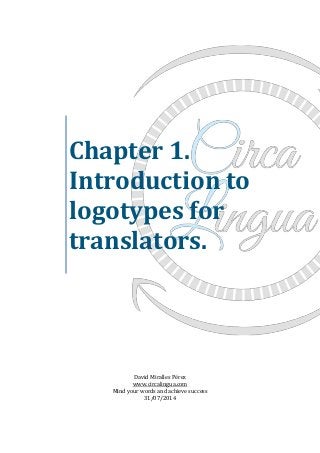
- 1. Chapter 1. Introduction to logotypes for translators. David Miralles Pérez www.circalingua.com Mind your words and achieve success 31/07/2014
- 2. David Miralles Pérez “Mind your words and achieve success” www.circalingua.com Index Chapter 1.1: Why should translators get a professional logo? Chapter 1.2: What makes a good logo? Chapter 1.3: How to define the logo of your translation business? Chapter 1.4: 7 tips to create the logo of your translation business.
- 3. David Miralles Pérez “Mind your words and achieve success” www.circalingua.com Chapter 1.1: Why should translators get a professional logo? Welcome to the age of branding! I am sure that nowadays you all have heard about this concept. For those of you who are starting in this world, brand management is, without going into greater details, the analysis of how a brand is positioned in the market, its targeted public and the public reputation of the brand itself. Today we are going to talk about one of the most visual elements within the branding atmosphere: logos. Maybe some of you haven not even though about getting a logo. And why should you? We are translators, not designer. We do not even know how to draw or come out with a good professional logo. Here you have 7 reasons on why you should stop thinking like this. Why should translators and interpreters brand themselves? 1. To be memorable The human brain can memorise quicker images and colours rather than names of businesses. So, if you want to remain in your client’s mind, be sure of getting a visual and appealing logo! Think about DreamWorks. What? Maybe you can recognise it better like this:
- 4. David Miralles Pérez “Mind your words and achieve success” www.circalingua.com 2. To look professional Logos add value to our businesses. It is the very first thing your clients are going to look at; that is why your logo is going to influence the first impression of your clients. Be sure it looks professional and is adapted to your targeted audience. Who do you think is the targeted audience of this logo? 3. To make a difference Do you want your prospective clients to think that you are just another freelance translator in the middle of a huge translators’ ocean or that you are a business established translator who stands out of the crowd? A logo can make the difference between your business and the rest out there, and it is one of the first features your audience is going to pay attention to. We should not be “freelance translators and interpreters” any more. We are owners of our own translation and interpreting business. (And I love it!) 4. To build trust Investing in a personal identity is a way to make your clients think about the importance of your business. Remember: trust is the first step to engage with your audience. Take a look at these two logos. Both businesses provide a similar product, but which one would you choose? 5. To attract more clients and endear your company name to them
- 5. David Miralles Pérez “Mind your words and achieve success” www.circalingua.com Let’s be honest. Everyone loves logos. It is the most creative part of branding. It is where you mix your personality with the personality of your business. And you can use them everywhere! 6. To explain your company name A visual image always helps to explain why your business is called like that or even the values that your business promotes. When the text of your logo is combined with a visual image, it has a greater impact in our clients’ minds. Maybe not everybody knows the meaning of the Latin preposition “circa” but the arrows explain it pretty well! What do you think? And this leads us to… 7. To promote motivation Once you have created your logo, there is no stop. You have created your own business “mascot” that you always want to feed and take care of. And how are you going to do that? By succeeding in your business! However, not all that glitters is gold unfortunately. You have to make sure that your logo has been created by a professional. We always get angry when we talk to a client about a translation project, and after checking our charges, he/she says: “don’t you worry, my cousin can do it for free”. So, the same applies here! If your logo hasn’t been created by a professional: Your company logo will not look professional. (Please, don’t use Word to create you logo. Just… don’t.) Your logo will not be as original or appealing as it could be. It may not work in every size and format.
- 6. David Miralles Pérez “Mind your words and achieve success” www.circalingua.com Do your homework! 1. Think and list the benefits of using a logo and how they can apply to your business. 2. Think about your business and your target audience. 3. Think about your personality. 4. Think of a way you can mix your personality and your business’ personality taking into account your target audience. 5. Write every single idea and sketch down! Resources WantWords Allbusiness Mplans
- 7. David Miralles Pérez “Mind your words and achieve success” www.circalingua.com Chapter 1.2: What makes a good logo? Once we have analysed why do translators need a professional logo in my previous post, I wanted to talk about what makes a good logo. As you may have found out at this stage, not every logo out there fits its purposes. If you find yourself wondering if yours does, keep reading! I am about to give you some guidelines and tips so you can tweak your logo and make it work. 5 principles of a good logo The first thing I wanted to talk about is the 5 principles of a good logo. Let’s get started: 1. Simplicity. Your client will be more likely to recognise your logo if you keep it simple. There are logos made merely of a simple typography or even a single letter and they have always been stuck on our brains. Here you have some good examples: 2. Memorability. This must be one of the main objectives when designing a logo. Your logo must remain in your target audience’s mind. It is a feature that makes you different; that is why when your client is looking at your logo, he has to remember you and your services. And simplicity influences memorability. 3. Timelessness. This may be a tricky one. Do not base your logo (at least, the whole design of your logo) in a current trend. Why? Because, as you know, trends change very quickly and we don’t want to get an old-fashion logo by the time the design is ready to be used. We want a logo that can last in time by itself. 4. Versatility. Only one design is not enough. I am sure that when your logo will be ready, you are going to publish it everywhere, and that includes your website, your business cards, stamps, pens, stickers, and the list goes on and on. Make sure that your logo can be adjusted to different sizes; you can also print it out just to see if it works on paper as well.
- 8. David Miralles Pérez “Mind your words and achieve success” www.circalingua.com That is why it is so important to elaborate your logo in vector format. As a photography-lover, I am familiarised with Illustrator and it works for me. It’s easy to use and you have plenty of options to tweak your logo. Be creative and explore every possible design. Take into account that if you don’t know how to use any of these tools, you may need to hire a professional designer. It would be a good inversion. 5. Appropriateness. Make sure that your logo match with your business’ brand. For example, a toy store as Toysrus match its brand with the childish typography of its logo:
- 9. David Miralles Pérez “Mind your words and achieve success” www.circalingua.com Chapter 1.3: How to define the logo of your translation business? What does it mean that any logo must be defined? It means that it must fit with the nature of your business and your target audience and this is going to influence the colours and the style we are going to choose for our logos. Take a look at the following steps; we are about to define your logo! Step 1: Define the nature of your business. And by business I mean products (in our case our translation and interpreting productions), blogs, brands, projects, etc. For example, let’s imagine that you are specialised in medical translation; obviously, medical translations take place in a serious and very professional environment, so the childish style of Toysrus’ logo is out of the question. Step 2: Define your target audience. We have to take into account the people who are going to buy from us and think about how the logo can be appealing for any prospective client. A doctor is not going to be attracted by a childish design (unless he is looking for a toy for his son); he will likely identify your business by looking at any element which has something to do with medicine. Step 3: Think carefully the design of your logo. Steps 1 and 2 will influence the choice of the design. Here I wanted to talk about colours and typography. Colours: I am sure that you are all familiarised with this image. Personally, I chose blue and grey because of the nature of my services and my target audience. Now, think about which emotion your prospective client is likely to look for in your services. What do you want to transmit with the colour of your logo? Typography: There’s no rule regarding the choice of a specific typography. Advice: keep it simple. Choose a sophisticated or minimalist typography and run
- 10. David Miralles Pérez “Mind your words and achieve success” www.circalingua.com away from tacky fonts. Do not use more than 2 different styles as it may confuse our clients. Step 4: Think about the style of your logo. Once again, review steps 1 and 2. And here I did some research: I looked for some logos related to my field of expertise and just observed the style of the logo. Is it minimalist, childish, romantic or formal? Get rid of any temptation to copy any design! Just look for the trends within your industry and elaborate something that can be appealing to your prospective clients.
- 11. David Miralles Pérez “Mind your words and achieve success” www.circalingua.com Chapter 1.4: 7 tips to create the logo of your translation business. Once we have followed every necessary step to get our logos defined, it is time to grab some piece of paper and start drawing and sketching. Here you have 7 ideas that I use to create my own logo. Bear them in mind before creating your first sketch and implement then during the process. I am sure that you are about to create the corporate image of your business! 1. Do your research. Answer carefully these questions one by one: a. Who are your prospective clients? b. Where are they? c. What are they looking for? d. How can you help them and meet their needs? e. How your logo can express this idea? Try to answer them carefully. The more you get to know your prospective clients, the better. At the end of your research, your mind will be full up with great ideas. Promise! And most importantly, you will have ideas addressed to your industry and focused on your client needs. 2. Immerse yourself in the brand. You must think and realise that your brand will stay with you during every step of your business. Create something that both, you and your clients would like, something you can be proud of. That is what you need to keep your motivation from the very first moment. Taking this into account, you will realise that you are your brand and your clients will like it, hence they will trust you. 3. Sketch it out and keep all your sketches. Every sketch you draw counts, because the most insignificant idea can take you to develop an important part of your brand. Gather every idea, every photo that inspired you, and every piece of information that may be useful. Sooner or later, those ideas will evolve.
- 12. David Miralles Pérez “Mind your words and achieve success” www.circalingua.com 4. No imitate. I am sure that you have this translator or interpreter or just someone that you take as a reference, a model you want to follow. However, sometimes you have to get rid of his/her influence to create your own ideas and this is one of these moments. Turn off your computer if you need to and be creative. I draw the first sketch of my logo with a pen and a piece of paper. Advice: Look for sources of inspiration (I usually read or go out and take some pictures with my camera, it works for me!) 5. Don’t overdo it. A common mistake when elaborating our logo is thinking too much. When we think about a single idea for hours (even for days or weeks) we tend to miss the main objectives. Advice: Get rid of those extra pictorial elements that may say nothing and keep it simple. 6. Cultural differences. Translators and interpreters usually tend to target more than one culture. That means that we have to take into account that maybe we are missing any cultural nuance with our designs, corporative names or even with our slogans or mission statements. Advice: Show your logo around and check it out with international colleagues. Ask for some feedback. I checked my logo with different English, Spanish and American colleagues and even with a designer before getting it tweaked by professionals, and all them mention some value points. 7. If in doubt, leave it out. Again, do not overthink. If you have doubts about any feature of your logo, leave it out and start again. You will come up with new and better ideas. Advice: Leave it out. Go to sleep or work on your translation assignment, just stop thinking about it. But do not discard any idea because you didn’t like it at the very beginning, because every idea can evolve. Let’s keep in touch! w p l f T G