

Recomendados
Mais conteúdo relacionado
Mais procurados
Mais procurados (20)
Destaque
Semelhante a Evaluation
Semelhante a Evaluation (20)
Mais de Stephaniee Beharry
Mais de Stephaniee Beharry (20)
Último
Último (20)
Evaluation
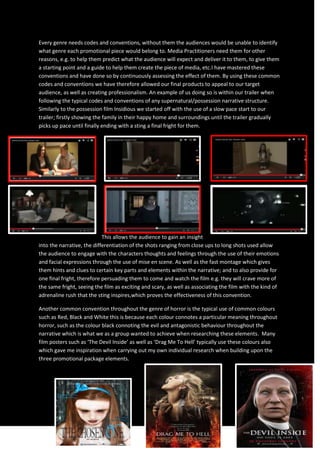
- 1. Every genre needs codes and conventions, without them the audiences would be unable to identify what genre each promotional piece would belong to. Media Practitioners need them for other reasons, e.g. to help them predict what the audience will expect and deliver it to them, to give them a starting point and a guide to help them create the piece of media, etc.I have mastered these conventions and have done so by continuously assessing the effect of them. By using these common codes and conventions we have therefore allowed our final products to appeal to our target audience, as well as creating professionalism. An example of us doing so is within our trailer when following the typical codes and conventions of any supernatural/possession narrative structure. Similarly to the possession film Insidious we started off with the use of a slow pace start to our trailer; firstly showing the family in their happy home and surroundings until the trailer gradually picks up pace until finally ending with a sting a final fright for them. This allows the audience to gain an insight into the narrative, the differentiation of the shots ranging from close ups to long shots used allow the audience to engage with the characters thoughts and feelings through the use of their emotions and facial expressions through the use of mise en scene. As well as the fast montage which gives them hints and clues to certain key parts and elements within the narrative; and to also provide for one final fright, therefore persuading them to come and watch the film e.g. they will crave more of the same fright, seeing the film as exciting and scary, as well as associating the film with the kind of adrenaline rush that the sting inspires,which proves the effectiveness of this convention. Another common convention throughout the genre of horror is the typical use of common colours such as Red, Black and White this is because each colour connotes a particular meaning throughout horror, such as the colour black connoting the evil and antagonistic behaviour throughout the narrative which is what we as a group wanted to achieve when researching these elements. Many film posters such as ‘The Devil Inside’ as well as ‘Drag Me To Hell’ typically use these colours also which gave me inspiration when carrying out my own individual research when building upon the three promotional package elements.
- 2. The red is also another demonic colour as well as connoting blood but we as a group when studying colours felt that we did not want the red to connote blood as this was not a common convention within a possession film, as well as the colour white that connotes innocence and purity which highlights the childlike innocence of Madeleine and Elle although Elle is no innocent child, which allows us as a group to play around with the audiences mind. Another colour that may not be seen as a predominant horror colour was the use of Blue the reasoning for this choice was because we felt that it was a dominant colour over the reds, whites and blacks and Elle herself is a very domineering character within the play; we wanted a colour that would stay within the audiences minds and would remember right the way through. Through the use of these colours throughout all three pieces of our promotional package; our trailer, poster and magazine front cover, we have therefore been able to create a symbiotic link right through our work. We have reinforced the iconography of the supernatural genre as well as the subgenre of possession, this can be seen through the use of our poster as typical conventions such as the dark shadows, and possessed eyes follow the typical conventions of any possession horror film. The use of turning an innocent object evil such as our blue ribbon, we wanted to use this as it toyed with our audience’s minds creating confusion of not knowing whether Elle is good or evil as they assume she is an innocent child from this innocent object. Which can then be linked back to the poster from ‘Insidious’ or ‘Mama’ as both of these posters also use this recurring iconography. Our magazine front cover includes several different codes and conventions, such as the use of strap lines, and the use of the main image dominating the frame. I feel these are very important to include, this way the audience gets an even bigger insight into the film giving them extra snippets of information. The way the image is positioned and the mise en scene within the frame is vital for the audience as their facial expressions explain to the audience the character they are portraying but not entirely explaining the character leading the audience into wanting more.
- 3. The effect of a strap proves that this particular convention is a vital marketing technique, which entices the audience further as it gives clues and hints to the narrative of the film. Straps are much more vital within the trailer itself thoughas a strap provides anchorage, enabling the audience to get a better understanding of the visuals on screen.Such as the use of ‘Based on a True Story’ a strap that is not only in our trailer but in many other trailers also as the film becomes more personal; knowing these things are true allows the audience to believe that they could happen to anyone including themselves. These conventions can be applied to each and every genre of horror such as slasher, supernatural and gothic etc. Although each genre has their own emphasis to their own particular codes and conventions to set the right tone for their specific sub-genre. For example within the genre of gothic horrors, there would typically be big castles and abandoned mansions, as well as mythological beings rather than the eerie and spine chilling evil spirits we would normally see within possession films that show how normality has been disrupted as spirits are not real and are connoted to the dead which shows they should not be seen, heard or felt by humans. We have developed continuously by using and expanding with typical conventions within the supernatural/possession genre and this can be show on first hand to our horror magazine front cover. Our final piece has incorporated the true potential that we were aiming to achieve; this was achieved by the use of common codes and conventions of the supernatural genre. It is clear that we have challenged some conventions as we have chosen to use other colours to dominate both our magazine front cover and our poster such as blue which has a subtle move away from the typical colours used; the blue was a running theme throughout our narrative and we also used this as a way to carry on the symbiotic link through all three pieces of our promotional package. Another typical use of a convention is the use of the stock location that typically features in the trailer of a horror film, in the same way we have also focused heavily on the stock location throughout our trailer as it
- 4. opens with a pan of the family home which is the predominant stock location used throughout our narrative. As media practitioners we have followed these conventions to get the profession quality and feel to our work; the use of the stock location within the trailer of a horror film allows the audience to become familiar with the settings and recognise things throughout the narrative structure of the film. We were inspired by ‘The Conjuring’ as the stock location helps build upon the narrative is also allows the build-up of tension as the invasion of the family home is what scares the public most at the moment, as they should feel safe in their own homes but they have lost their self-sense of security. Other horror films that have inspired us are films such as ‘Mama’ and ‘The Orphan’ as these films both use children as the antagonists; demonic children are a typical convention of Horror possession films. Which after some research within our group we found were another really effective way of scaring the audience, as typically children connote innocence and purity. Esther from ‘The Orphan’ was adopted by the family, similarly Elle from our horror film ‘The Chosen One’ was also adopted which we found was a good way to engage the audiences interests, it brings an outsider into the family home but she is not all that is made out to be The film ‘Mama’ features two young girls who have lost their parents, we liked the idea of using two children as the audience become more enwrapped with the narrative of our film, but in a different way we have chosen to feature one child who is adopted and one child who is the couples own daughter and the audience then find out that one child (Elle) is the antagonist and the other (Madeline) is the protagonist. Elle features throughout our whole promotional package, as the dominant character as well as the main image within our poster and magazine front cover. Madeline features on our magazine front cover also as her importance is only revealed at the ending of our
- 5. film.The inspiration came from the way it had engaged the audience. Using children gets right to the hearts of the audience especially parents, it would persuade them to watch the film as they want to know whether or not the children will be okay; the audience can then picture themselves in the position of the parents of the children.