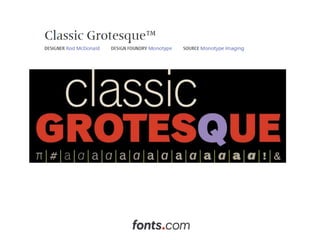
Classic Grotesque Typeface by Rod McDonald

Monotype Imaging has released the newest member of the Monotype collection, the 14-font Classic Grotesque™ suite of typefaces, available from Fonts.com. Created by typeface designer Rod McDonald, Classic Grotesque imbues the aesthetic quality of the original Monotype Grotesque typefaces, the first sans serifs cut for hot-metal machine typesetting. According to McDonald, these were “‘hidden gems that deserved to be updated,” and today the result is Classic Grotesque. Classic Grotesque includes seven weights that range from light to extra bold, each with a cursive italic complement – for a total of 14 styles. The family is available as OpenType® Pro fonts, allowing for the automatic insertion of ligatures, fractions and the alternate two-story ‘g’ and single-story ‘a’ design. Pro fonts also include an extended character set, which enables the setting of most Central European and many Eastern European languages. “Designing Classic Grotesque was more complex than I had anticipated,” McDonald said. “This was largely because I initially based my design solely on the early Monotype Grotesques. As a result, elements of the Arial® design – which also has its roots in the 1926 sans serif typefaces – kept intruding into my design. Then one day I realized that all I had to do was go back to the same typefaces that Monotype had used to develop the Grotesques. After that, Arial ceased to be a problem and I found myself working on a new design inspired by three classic sans serifs: the Ideal Grotesk, Venus™ and Monotype Grotesque designs. As if by magic, I also discovered that this was what I had wanted to do all along.” “Thanks to the beautiful work of Rod McDonald, a new generation of 21st century graphic communicators and type lovers will be able to enjoy this modern version of a typeface based on influences from another era,” said Allan Haley, director of words and letters at Monotype Imaging. “McDonald masterfully orchestrated the interplay of weights within individual characters, making Classic Grotesque a strong, versatile performer even for the small screen.” When asked about the intended uses for Classic Grotesque, McDonald answered, “Graphic and interactive designers will probably use Classic Grotesque in ways that I would never imagine. I’ve used pre-release versions of the family in ads and in books, and they worked remarkably well in both. I can’t think of many places where Classic Grotesque won’t perform well.” About Rod McDonald Since the beginning of his career in the mid-1970s, McDonald’s work – as a graphic designer, lettering artist, educator, historian and writer – has encompassed virtually every aspect of the typographic arts. Notably, he was among the first designers to switch to drawing typefaces on the computer in the mid-1980s, and he was soon providing custom fonts to ad agencies and design studios.

Recomendados
Mais conteúdo relacionado
Destaque
Destaque (13)
Último
Último (20)
Classic Grotesque Typeface by Rod McDonald
- 7. Since his career’s beginnings in the mid–1970s, Rod McDonald’s work as a designer, educator, historian and prolific writer has encompassed virtually every aspect of the typographic arts. McDonald has worked both as a freelance typographic designer and on the staff of such companies as Mono Lino Typesetting and the renowned Cooper & Beatty typesetting house in Toronto. His alphabets, wordmarks and symbols have been used by organizations ranging from General Motors and the National Arts Centre to Canadian Business and Chatelaine magazines. He has taught numerous typography courses at the Ontario College of Art and Design and is currently teaching at the Nova Scotia College of Art and Design. McDonald also writes a column on typography for Applied Arts magazine.