
Recomendados
Mais conteúdo relacionado
Mais procurados
Mais procurados (20)
Semelhante a As reflection
Semelhante a As reflection (20)
Mais de Josh Webb
Último
Último (20)
As reflection
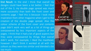
- 1. End Result: In the end I think that overall my designs could have been a lot better. I feel that out of the 3, my double page spread was much more successful than both the front cover and contents page. I feel this is because I took more inspiration from other magazine when I got to the creation of the double page spread. Also the colour scheme of the front cover and contents page didn’t work very well as a lot of things got overpowered by less important aspects of the pages. I think that it had a lot of good aspects but they were overpowered by things that overall didn’t work. For example, I liked the masthead, however I don’t think it worked at all with the colours as they were too similar and blended a bit too much.
- 2. Front Cover: Overall I like the design aspects of the front cover, such as the masthead and headline in the middle. However, I feel that the colour scheme really diminished the overall look of the page as everything was a similar colour and also all of the colours, including those of the image were very dark so things blended too much and nothing ‘popped out’ to the viewer so when passing by they would probably ignore this magazine. I really liked the sub-header with some words larger than other and some darker too, but like the rest of the page, I used dark reds on this and things didn’t pop enough. I also feel that this lacked detail too as it only has names of people and didn’t provide enough information into what those names had to do with the magazine. I also liked the bar at the bottom too, with all of the social media details and barcode in their own section so people could pick out the information they needed. I notice now, that only using a single image, brings down the overall appearance of the page as there’s not much to look at. Looking at this I now know a lot more about overall design, which I can use to greatly improve my magazine this year. I will now realise what colour schemes work and what don’t, and I also now know that I need to make sure aspects of the page don’t blend too much and make them contrast more so the viewer will be able to read it more easy.
- 3. Contents Page: Like the front cover, I think the layout worked well but the entire thing was dragged down by the choice of colours. I feel that this is more bland than the front cover as it uses a lot more grey colours which don’t work too well towards the appearance of the page. I think that text is easier to read on this page, with the choice of white on dark grey, so they contrast enough to read well, although it could still be better. Like the front cover I feel like this is lacking an appearance with only the use of a single image, not including the social media logos at the bottom. I also didn’t pay as much attention to detail as I should have as it shows that there is less than 35 pages in this magazine which shows that it isn’t a very long magazine compared to it’s potential competitors. Looking at this I have a wider range of design knowledge into what works and what doesn’t. I will pay more attention to detail to try and perfect every aspect of my magazine this year, such as the page numbers and the colour schemes I will use and I will now use more images.
- 4. Double Page Spread: Of the 3 pages I feel this one worked a lot better than the rest as I took a lot more inspiration from other magazine. I think the colour scheme worked a lot better as it’s a lot simpler with only 2 main colours, cream and black, which work very well together. I didn’t take as many images as I initially should have, but I think it worked out alright with the DPS as I edited it enough to look better than it may have if I only edited it a bit. I really like the large drop-cap as it add a lot in the way of appearance to the page. Although I really liked the outcome of this page, I really don’t think it works well at all with the front cover and contents page as they are drastically different to this one. So for my magazine this year I will make sure to keep the design consistent throughout everything.
- 5. AS REFLECTION: This year in A2 I now know a lot in the way of design compared to AS and I have this to compare to when designing my work this year. I know where I need to improve and will work on bettering my skills in design with Photoshop. I really enjoyed the creation process in AS so I have decided to work harder on it this year. Strengths: I had the design skills I needed, and knew what I wanted to create and did it. Although it may not have been the best design, that’s what I wanted it to look like at the time. Weaknesses: Overall I feel I had the skill to create the product, however I don’t think I had the ‘eye’ for design and will work harder on trying to improve this. I also need to work on my time management as I was stuck doing a lot of my work in a single week before the deadline so I need to make sure I don’t do the same this year.