
Recomendados
Mais conteúdo relacionado
Mais procurados
Mais procurados (20)
Destaque
Semelhante a Magazine cover inspo
Semelhante a Magazine cover inspo (20)
Último
Último (20)
Magazine cover inspo
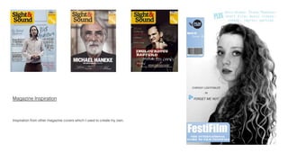
- 1. Magazine Inspiration Inspiration from other magazine covers which I used to create my own.
- 2. Titles & Text For the titles of my magazine cover I continued to use Sight & Sound as my indie inspiration, copying the shape of the tags and information on them: name, issue, barcode etc. I used a mixture of font types for the magazine cover using the Quentin Tarantino’s cover as my scaffolding to create my own: using the connective ‘plus’ like in Sight & Sound (another example is use of ‘also’)
- 3. Image and Film Title I used Sight & Sound as well as Reeling ‘the oscar issue’ as inspiration and to analyse the typical conventions to then use for the layout of my cover. Not only for the labels showing the issue and title, but using the conventions that there is only one person on the cover with the name of the film they are involved in. I chose to also look at Reeling as I liked the simplicity of the cover and the black and white contrasts on the image and titles – I wanted to keep my cover as simple as possible as I thought it was the most effective.