The Principles of Graphing
•Transferir como PPSX, PDF•
1 gostou•1,276 visualizações

The principles of graphing as utilized in economics.

Recomendados
Mais conteúdo relacionado
Mais procurados
Mais procurados (11)
Destaque
Destaque (20)
Semelhante a The Principles of Graphing
Semelhante a The Principles of Graphing (20)
Mais de Lumen Learning
Mais de Lumen Learning (20)
Último
Último (20)
The Principles of Graphing
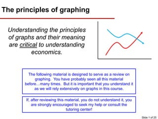
- 1. The principles of graphing Understanding the principles of graphs and their meaning are critical to understanding economics. The following material is designed to serve as a review on graphing. You have probably seen all this material before…many times. But it is important that you understand it as we will rely extensively on graphs in this course. If, after reviewing this material, you do not understand it, you are strongly encouraged to seek my help or consult the tutoring center! Slide 1 of 25
- 2. Where are we headed? We’ll cover this material starting from the very beginning. Please bare with me. Quickly, we’ll add details and complexity and demonstrate concepts in an economic framework. It is critical that you understand this material. You’ll see about 300 graphs this semester and in each case, I’ll assume you understand it. Slide 2 of 25
- 3. Let’s start with the number line Here is a number line. Also note that only whole numbers are shown. The number line is actually made up of an infinite number of points each representing some fraction of the line. Note how the arrows signify that numbers continue into infinity in both directions. Slide 3 of 25 ½-3 ½
- 4. Two Variable Graphs (Cartesian Plane) If we put two number lines together, then we get “space”. In this examples the number lines are referred to as the X axis and the Y axis. Slide 4 of 25
- 5. Two Variable Graphs (Cartesian Plane) (X,Y) (3,2) (4,0) (-1,-2) (-5,5) Using those two axes, we can plot points on the “graph” using coordinates. Those coordinates are presented in an (X,Y) format. Using your finger, predict where each of the coordinates below will be prior to hitting enter. Y X Slide 5 of 25
- 6. Y X The upper right quadrant The upper right quadrant is the most commonly seen (in newspapers, etc) because it contains positive values for both the X and Y axes. Note that the other 3 quadrants are still there…they are just not shown because they are not of interest. Slide 6 of 25
- 7. Relationship Between Studying and GPA Hours Studied Per Week Grade Point Average 16 4.0 12 3.0 8 2.0 4 1.0 0 0.0 Using graphs to determine the relationship between two variables Using two axes allows us to compare two variables. As an example, let’s compare the variable “hours studied per week” with “Grade Point Average” Notice how these look like XY coordinates? We can plot them (on the next slide) and see if a relationship exists between studying and GPA! If you study 16 hours per week, you might get a 4.0 If you study 4 hours per week, you might get a 1.0 7
- 8. Relationship between hours spent studying per week and GPA If hours studying per week were displayed on the X- Axis and GPA were displayed on the Y- Axis, the points would appear as displayed. If those points were connected, then we’d see an upward sloping line. This suggests a POSITIVE RELATIONSHIP between studying and GPA (in other words, the more you study, the better your grades), which seems logical. Here we have interpreted dat this case, we have a direc relationships between variab key learning outco Slide 8 of 25
- 9. Different types of relationships Examine the different types of linear relationships. The next few slides will show examples of these. Slide 9 of 25
- 10. Let’s practice! Try to identify these real- world linear relationship What do you think the relationship between income and life expectancy is? Positive, negative, or no relationship? Generally speaking, it is positive. Note that each dot represents a country. In general, the higher the income, the higher the life expectancy. This can be seen by placing a line (in red) over the dots. This may not seem fair, but it is true. People living in countries with higher incomes usually have better access to doctors and dentists and usually have access to a broader array of foods. Slide 10 of 25
- 11. What is the relationship between the unemployment rate and income? Positive, negative, or no relationship? Real-world application (part 2) Generally speaking, it is negative. Note that each dot represents a county in the U.S. In general, the higher the unemployment rate, the lower the household income. This makes sense as employers in high unemployment areas probably do not have to pay employees as much to attract them. Slide 11 of 25
- 12. Real-world application (part 3) What is the relationship between education and income? Positive, negative, or no relationship? Fortunately, it is positive! Note that each dot represents a county in the U.S. In general, the higher the education level, the greater the income. In other words, stay in school!!! Slide 12 of 25
- 13. Real-world (ridiculous) application (part 4) What is the relationship between my height (6 feet) and population in the world’s countries? Positive, negative, or no relationship? Note that each dot represents a country in the world. As we would expect, there is no relationship between my height and any country’s population. Those two variables are not related. Therefore, the red line that represents this relationship has no slope (it is flat)! Slide 13 of 25
- 14. Different types of relationships Remember that there are 4 types of linear relationships! Slide 14 of 25
- 15. Give it a shot! • Determine two variables that could be measured. – Examples include income, hours worked, wealth, education, population or many others. – Variables can also include non-economic measures such as speed, distance, strength, time spent playing video games or many others. • Then determine what you think the relationship between those two variables would be. – Appropriate answers will be either positive (also called direct), negative (also called inverse) or no relationship. • Continue this exercise until you have uncovered a positive and negative relationship and no relationship. If you want, you can submit these to me via email (slacroix@tcc.edu) and I’ll let you know if you are on the right track! Slide 15 of 25
- 16. Let’s talk about Non-Linear Relationships Here are some examples of non-linear relationships In some cases, relationships can be “non-linear”, meaning they aren’t shown as a straight line. Slide 16 of 25
- 17. Real world example of a nonlinear relationship Imagine we are comparing tax rates to tax revenue. That means we are comparing the rate you charge people per dollar of income to the total amount of money the tax generates. I think you’d agree that in general, higher tax rates result in higher tax revenue. That would be true up to a point. At some point, as rates get higher, we might expect people to stop working or maybe they’d hide their income. This idea is referred to as the “Laffer Curve”. It is used to illustrate the idea that the government can maximize revenues by setting tax rates at some optimal point. Think of it this way – if the government told you that the tax rate was 100% - everything you earned must be given to them… How much income would you report!?! Slide 17 of 25
- 18. Let’s turn our attention to measuring the slope of a line The slope of a line can be measured using this formula: Or Slide 18 of 25
- 19. Here is an example In this case, a 4 unit increase in studying results in a 1 unit increase in GPA. Therefore, the rise = 1 and the run =4. So the slope of this line is ¼ or 0.25. We know this relationship is positive because the slope is above zero! This is the rise This is the run Slide 19 of 25
- 20. Example of calculating slope (part 2) In this case, a 4 unit increase in beer consumption results in a 1 unit decrease in GPA. Therefore, the rise = -1 and the run =4. Therefore the slope of this line is -¼ or -0.25 We know this relationship is negative because the slope is below zero! Slide 20 of 25
- 21. Equation of linear relationship y = a+bx Where y= Dependent variable a=vertical (y-axis) intercept B=slope x= Independent variable Any linear relationship can be summarized using the following formula: You may have learned this as “Y=mX+b”. If you understand that..that is fine. We use this formula because it is used in the textbook Slide 21 of 25
- 22. Let’s take a look at that formula Suppose we have the equation: y=500+.5x Then we can plug in values for x to get y This (500) is “a” which is also called the “Y- intercept” This (+.5) is “b” which is also called the “slope” So if you pick a number at random (say $2000) and plug it into X, you get Y= 500+(.5*2000)… which equals $1500 22
- 23. This equation may typify a person’s spending and can also be seen graphically Note the positive slope indicating the positive relationship between these variables. This should make sense because the more you make, the more your spend (typically). In fact, we can now examine this relationship: Since the Y-Intercept is $500 we know that even if you do not earn any income, you’ll spend $500. And since the slope is +.5, then for every dollar of income we earn, we spend 50 cents! y=500+.5x Slide 23 of 25
- 24. In summary The relationship between any two variables can be illustrated graphically (which is a key learning outcome). That relationship can be positive or negative, and linear or non-linear….or it can have no relationship at all. For linear relationships, we can measure the slope of the line using y=a+bx. “a” is the y-intercept and “b” is the slope ...they describe the relationship! Slide 24 of 25
- 25. It’s negative. For each 1 unit increase in X, Y falls by 0.5! Try this one! Y=4 – 0.5X Using this formula, graph the relationship Start by selecting some (small) numbers for X and then solving for Y. Click to see mine. Then, once you have three “coordinates”, plot them below. Click to see the line. Is this relationship positive or negative? Slide 25 of 25