
Recomendados
Mais conteúdo relacionado
Destaque
Semelhante a Bel260 writing1
Semelhante a Bel260 writing1 (20)
Mais de hasfaa1017
Último
Último (20)
Bel260 writing1
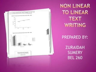
- 1. PREPARED BY: ZURAIDAH SUMERY BEL 260
- 2. Question 1 - No longer the focused summary
- 3. The change? Now…… An interpretation of information presented graphically.
- 4. Question 1: (40 minutes ) Interpret a diagram, table, charts and graphs and present the information in your own words. Organise, present and possibly compare e.g. Money people spend on different forms of entertainment. Describe stages of a procedure or process - e.g. the stages of human evolution. Describe on object or event or series of events e.g. How the water cycle works.
- 5. General Points You must respond appropriately in terms of: Register – formality and politeness; e.g. no short forms Organization – clear and logical Style – academic; e.g. no rhetorical questions, no exclamations, no extreme opinions, use tentative expressions such as ‘ this appears to be…’ ‘ this is probably due to…’ Content – relevant and complete
- 6. Spend 5 minutes reading the graphs/charts etc. Make sure you understand axes. Make sure you follow lines on graph. Focus on the key information. If two graphs – compare. Think about the time period – tenses. Vary your vocabulary. Organize information clearly. Write neatly.
- 7. You spend about 40 minutes on this task. The graph shows the different modes of transport used to travel to and from work in one European city in 1950, 1970 and 1990. Write a report for a university lecturer describing the information shown.
- 8. With a partner : 1. Identify the main trends for each mode. 2. Identify any large increases or decreases. 3. Are there any clear or consistent directions? 4. Does anything seem surprising? 5. Are there any clear relationships between modes and percentages ?
- 9. Instructions: The graph below shows the different modes of transport used to travel to and from work in one European city in 1950, 1970 and 1990. Answer: The graph shows the percentage of travellers in a European city who used bus, car, bike and foot to commute to and from work in the years 1950, 1970 and 1990.
- 10. Answer: The amount of people using cars grew considerably, rising from just over 5% in 1950 to 25% in 1970, and then climbing to almost 40% by 1990.
- 11. Answer: However, the amount of people using bikes decreased. Over 25% of commuters cycled in 1950, but this had fallen to less than 10% by 1990. Similarly, the amount of people who walked to work fell from more than a third in 1950 to about 10% in 1990.
- 12. Answer: The graph indicates the growing use of cars for commuting and the corresponding fall in the popularity of other modes of transport since 1950.
- 13. Answer: The amount of people using buses initially rose in 1970 to about 30%, but had dropped to about 17% by 1990.
- 14. Answer: The graph indicates the growing use of cars for commuting and the corresponding fall in the popularity of other modes of transport since 1950.
- 15. The graph shows the percentage of travellers in a European city who used bus, car, bike and foot to commute to and from work in the years 1950, 1970 and 1990. The amount of people using cars grew considerably, rising from just over 5% in 1950 to 25% in 1970, and then climbing to almost 40% by 1990. However, the amount of people using bikes decreased. Over 25% of commuters cycled in 1950, but this had fallen to less than 10% by 1990. Similarly, the amount of people who walked to work fell from more than a third in 1950 to about 10% in 1990. The amount of people using buses initially rose in 1970 to about 30%, but had dropped to about 17% by 1990. The graph indicates the growing use of cars for commuting and the corresponding fall in the popularity of other modes of transport since 1950.
- 17. You may write in just 1 paragraph but Firstly, extract 2 or 3 paragraphs are also accepted, generally it depends on what kind of the TITLE from stimuli are given. Begin each the question and paragraph with phrases like: i) According to the... underline it. ii) Based on the... iii) With reference to... OV- What does the stimuli present? Answer: a bar graph, diagram, pie FOr the closing, it chart, pictograph, newspaper headline or article, some notes etc. consists of minimum CI- What is the general trend of all the two sentences, stimuli combined? Answer: Increasing, Decreasing, Consistent or Fluctuating Prediction (Pi) and (NOTE: These are the FOUR main Proposal (Pii). trends) P(i)- What future trend can you For the second and/or third predict? Answer: If x happens, then y paragraphs, you need to will continue to increase, decrease, identify the Key Features (KFs) stabilise or fluctuate. which are the MOST P(ii)- What recommendation can you OUTSTANDING ideas from the propose? Answer: The stimuli. government/company/United Nations can... Notes: Do not make any *P(ii) is not compulsory but it will external ASSUMPTIONS differentiate the higher bands from the lower ones.
- 18. TIPS: 1. WRITE THE TITLE AND UNDERLINE 2. WRITE IN 3 PARAGRAPHS (MINIMUM, BODY CAN BE MORE THAN 1 PARAGRAPH) 3. 1ST SENTENCE WRITE THE TYPES OF GRAPHS/DIAGRAMS/HEADLINES ETC. 4. 2ND SENTENCE WRITE THE MOST OUTSTANDING POINT 5. BODY - WRITE ONLY INFORMATION THAT IS OUTSTANDING (KEY FEATURES, NOT FEATURES.. FEATURES JUST MEANS EVERY SINGLE POINT, YOU NEED TO BE SELECTIVE IN CHOOSING THE MOST IMPORTANT ONES ONLY) 6. CONCLUSION IS JUST ONE SINGLE SENTENCE AS SUMMARY. 7. ALL WORDS AFTER 200 IS NOT CHECK/READ/EXAMINED. EXAMINERS WILL NOT READ AFTER THAT SO STICK TO THE WORD LIMIT. 8. TRY TO LINK ALL THE INFO AND EXPLAIN IT IN A SIMPLE BUT EFFECTIVE WAY. 9. TITLES ARE CONSIDERED 1 WORD