
Recomendados
Mais conteúdo relacionado
Destaque
Semelhante a Math Modeling: The Wonderful World of Bar Graphs and Pie Charts
Semelhante a Math Modeling: The Wonderful World of Bar Graphs and Pie Charts (20)
Último
Último (20)
Math Modeling: The Wonderful World of Bar Graphs and Pie Charts
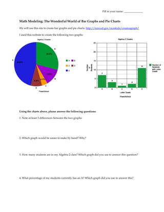
- 1. Fill in your name: ______________ Math Modeling: The Wonderful World of Bar Graphs and Pie Charts We will use this site to create bar graphs and pie charts: http://nces.ed.gov/nceskids/createagraph/ I used this website to create the following two graphs: Using the charts above, please answer the following questions: 1. Note at least 3 differences between the two graphs: 2. Which graph would be easier to make by hand? Why? 3. How many students are in my Algebra 2 class? Which graph did you use to answer this question? 4. What percentage of my students currently has an A? Which graph did you use to answer this?
- 2. 5. If I want to display some data, when should I use a bar graph instead of a pie chart? Vice-versa? Now it is your turn to create a bar graph and pie chart. Use the table below and the website listed above to create your graphs. Make sure to label each axis and display category values. Ann Arbor A2Tech Clemente Community Huron Pioneer Skyline High School Number of 132 86 489 1628 1910 1228 Students Copy and Paste your charts below: 6. How many students attend high school in the Ann Arbor School District? 7. What percentage of these students attends A2Tech? Notes: Bar Graphs = Pros: Cons:
- 3. Pie Charts = Pros: Cons: Practice Questions: 7. The table below shows the number of sneakers sold by brand for this month. Construct a graph which best demonstrates the sales of each brand. Paste your graph below and answer the questions that follow. Why did you select one particular type of graph over another to represent this data? What were the advantages of your selection? Were there any disadvantages? 8. The table shows the composition of the Earth’s atmosphere. Construct a graph that best represents the composition of the Atmosphere. Paste your graph below and answer the questions that follow. Why did you select one particular type of graph over another to represent this data? What were the advantages of your selection? Were there any disadvantages?
- 4. 9. The ages of 7 trumpet players in a band are 13, 12, 11, 12, 11, 10, and 12. What type of graph would be appropriate for comparing the ages of these trumpet players? 10. When asked if “antidisestablishmentarianism” has 28 letters, 50 people said yes, 35 said no, and 15 said I don’t know. What type of graph would best compare these responses to each other and with the total? 11. The growth of 257 different plants was recorded in centimeters. What type of graph would be best for comparing the growth of each plant?