JSF Core Tags Guide
•Transferir como DOC, PDF•
1 gostou•1,746 visualizações

The document contains tables summarizing the core tags, HTML tags, attributes, and other elements of JavaServer Faces (JSF), a Java EE framework for building web applications. It describes tags like f:view, f:facet, h:form, h:inputText, and their attributes. It also provides examples of how to use various tags to generate different HTML form controls and layouts.

Recomendados
Mais conteúdo relacionado
Mais procurados
Mais procurados (19)
Destaque
Destaque (16)
Semelhante a JSF Core Tags Guide
Semelhante a JSF Core Tags Guide (20)
Último
Último (20)
JSF Core Tags Guide
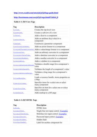
- 1. http://www.exadel.com/tutorial/jsf/jsftags-guide.html http://horstmann.com/corejsf/jsf-tags.html#Table4_8 Table 4–1 JSF Core Tags Tag Description f:view Creates the top-level view f:subview Creates a subview of a view f:facet Adds a facet to a component f:attribute Adds an attribute (key/value) to a component f:param Constructs a parameter component f:actionListener Adds an action listener to a component f:valueChangeListener Adds a valuechange listener to a component f:converter Adds an arbitrary converter to a component f:convertDateTime Adds a datetime converter to a component f:convertNumber Adds a number converter to a component f:validator Adds a validator to a component f:validateDoubleRange Validates a double range for a component’s value f:validateLength Validates the length of a component’s value f:validateLongRange Validates a long range for a component’s value f:loadBundle Loads a resource bundle, stores properties as a Map f:selectitems Specifies items for a select one or select many component f:selectitem Specifies an item for a select one or select many component f:verbatim Adds markup to a JSF page Table 4–2 JSF HTML Tags Tag Description h:form HTML form h:inputText Single-line text input control. Examples h:inputTextArea Multiline text input control. Examples h:inputSecret Password input control. Examples h:inputHidden Hidden field h:outputLabel Label for another component for
- 2. accessibility h:outputLink HTML anchor. Examples h:outputFormat Like outputText, but formats compound messages h:outputText Single-line text output. Examples h:commandButton Button: submit, reset, or pushbutton. Examples h:commandLink Link that acts like a pushbutton. Examples h:message Displays the most recent message for a component h:messages Displays all messages h:grapicImage Displays an image. Examples h:selectOneListbox Single-select listbox. Examples h:selectOneMenu Single-select menu. Examples h:selectOneRadio Set of radio buttons. Examples h:selectBooleanCheckbox Checkbox. Examples h:selectManyCheckbox Set of checkboxes. Examples h:selectManyListbox Multiselect listbox. Examples h:selectManyMenu Multiselect menu. Examples h:panelGrid HTML table h:panelGroup Two or more components that are laid out as one h:dataTable A feature-rich table control h:column Column in a dataTable Table 4–3 Basic HTML Tag Attributes Component Attribute Description Types id A (25) Identifier for a component Reference to the component binding A (25) that can be used in a backing bean A boolean; false suppresses rendered A (25) rendering Cascading stylesheet (CSS) styleClass A (23) class name A component’s value, typically value I, O, C (19) a value binding A method binding to a method valueChangeListener I (11) that responds to value changes
- 3. converter I, O (15) Converter class name Class name of a validator that’s validator I (11) created and attached to a component A boolean; if true, requires a required I (11) value to be entered in the associated field A = all, I = input, O = output, C = commands, (n) = number of tags with attribute Table 4–4 HTML 4.0 Pass-through Attributes Attribute Description accesskey A key, typically combined with a system-defined (14) metakey, that gives focus to an element accept (1) Comma-separated list of content types for a form accept- Comma- or space-separated list of character encodings charset (1) for a form. The accept-charset attribute is specified with the JSF HTML attribute named acceptcharset. Alternative text for nontextual elements such as images alt (4) or applets border (4) Pixel value for an element’s border width charset (3) Character encoding for a linked resource Coordinates for an element whose shape is a rectangle, coords (2) circle, or polygon Direction for text. Valid values are ltr (left to right) and dir (18) rtl (right to left). disabled (11) Disabled state of an input element or button Base language of a resource specified with the href hreflang (2) attribute; hreflang may only be used with href. lang (20) Base language of an element’s attributes and text maxlength (2) Maximum number of characters for text fields readonly Read-only state of an input field; text can be selected in (11) a readonly field but not edited Relationship between the current document and a link rel (2) specified with the href attribute Reverse link from the anchor specified with href to the rev (2) current document. The value of the attribute is a space- separated list of link types. Number of visible rows in a text area. h:dataTable has rows (1) a rows attribute, but it’s not an HTML pass-through attribute.
- 4. Shape of a region. Valid values: default, rect, circle, shape (2) poly. (default signifies the entire region) size (4) Size of an input field style (23) Inline style information tabindex (14) Numerical value specifying a tab index target (3) The name of a frame in which a document is opened A title, used for accessibility, that describes an element. title (22) Visual browsers typically create tooltips for the title’s value type (4) Type of a link; for example, "stylesheet" width (3) Width of an element (n) = number of tags with attribute Table 4–5 DHTML Event Attributes Attribute Description onblur (14) Element loses focus onchange (11) Element’s value changes onclick (17) Mouse button is clicked over the element ondblclick (18) Mouse button is double-clicked over the element onfocus (14) Element receives focus onkeydown (18) Key is pressed onkeypress (18) Key is pressed and subsequently released onkeyup (18) Key is released onmousedown (18) Mouse button is pressed over the element onmousemove (18) Mouse moves over the element onmouseout (18) Mouse leaves the element’s area onmouseover (18) Mouse moves onto an element onmouseup (18) Mouse button is released onreset (1) Form is reset onselect (11) Text is selected in an input field onsubmit (1) Form is submitted (n) = number of tags with attribute Table 4–6 Attributes for h:form
- 5. Attribute Description binding, id, rendered, styleClass Basic attributes accept, acceptcharset, dir, enctype, lang, style, HTML 4.0 target, title attributes onblur, onchange, onclick, ondblclick, onfocus, onkeydown, onkeypress, onkeyup, onmousedown, DHTML onmousemove, onmouseout, onmouseover, onreset, events onsubmit Table 4–7 Attributes for h:inputText, h:inputSecret, h:inputTextarea,and h:inputHidden Attribute Description cols For h:inputTextarea only— number of columns immediate Process validation early in the life cycle For h:inputSecret only— redisplay when true, the input field’s value is redisplayed when the web page is reloaded required Require input in the component when the form is submitted rows For h:inputTextarea only— number of rows valueChangeListener A specified listener that’s notified of value changes binding, converter, id, rendered, required, styleClass, value, Basic attributes validator HTML 4.0 pass-through accesskey, alt, dir, disabled, attributes—alt, maxlength, lang, maxlength, readonly, size, and size do not apply to style, tabindex, title h:inputTextarea. None apply to h:inputHidden. onblur, onchange, onclick, ondblclick, onfocus, onkeydown, DHTML events. None apply to onkeypress, onkeyup, onmousedown, h:inputHidden. onmousemove, onmouseout, onmouseover, onselect Table 4–8 h:inputText and h:inputSecret Examples
- 6. Example Result <h:inputText value="#{form.testString}" readonly="true"/> <h:inputSecret value="#{form.passwd}" redisplay="true"/> <h:inputSecret value="#{form.passwd}" redisplay="false"/> <h:inputText value="inputText" style="color: Yellow; background: Teal;"/> <h:inputText value="1234567" size="5"/> <h:inputText value="1234567890" maxlength="6" size="10"/> Table 4–9 h:inputTextarea Examples Example Result <h:inputTextarea rows="5"/> <h:inputTextarea cols="5"/> <h:inputTextarea value="123456789012345" rows="3" cols="10"/> <h:inputTextarea value="#{form.dataInRows}" rows="2" cols="15"/> Table 4–10 Attributes for h:outputText Attribute Description escape If set to true, escapes <, >, and & characters. Default value is false. binding, converter, id, Basic attributes rendered, styleClass, value style, title HTML 4.0
- 7. Table 4–11 Attributes for h:outputFormat Attribute Description escape If set to true, escapes <, >, and & characters. Default value is false. binding, converter, id, Basic attributes rendered, styleClass, value style, title HTML 4.0 Attributes for h:outputLabel Attribute Description for The ID of the component to be labeled. binding, converter, id, rendered, value Basic attributes Table 4–12 Attributes for h:graphicImage Attribute Description Basic binding, id, rendered, styleClass, value attributes alt, dir, height, ismap, lang, longdesc, style, HTML 4.0 title, url, usemap, width onblur, onchange, onclick, ondblclick, onfocus, DHTML onkeydown, onkeypress, onkeyup, onmousedown, events onmousemove, onmouseout, onmouseover, onmouseup Table 4–13 h:outputText and h:graphicImage Examples Example Result <h:outputText value="#{form.testString}"/> <h:outputText value="Number #{form.number}"/> <h:outputText value="<input type=’text’ value=’hello’/>"/> <h:outputText escape="true" value="<input type=’text’ value=’hello’/>"/> <h:graphicImage value="/tjefferson.jpg"/>
- 8. <h:graphicImage value="/tjefferson.jpg" style="border: thin solid black"/> Table 4–14 h:commandButton and h:commandLink Attribute Description If specified as a string: Directly specifies an outcome used by the navigation handler to determine the JSF action page to load next as a result of activating the button or link If specified as a method binding: The method has this signature: String methodName(); the string represents the outcome A method binding that refers to a actionListener method with this signature: void methodName(ActionEvent) For h:commandLink only—The charset character encoding of the linked reference For h:commandButton only—A context-relative path to an image image displayed in a button. If you specify this attribute, the HTML input’s type will be image. A boolean. If false (the default), actions and action listeners are invoked at the end of the request life cycle; if true, immediate actions and action listeners are invoked at the beginning of the life cycle. See Chapter 6 for more information about the immediate attribute. For h:commandButton: The type of the generated input element: button, submit, or reset. The default, unless you specify type the image attribute, is submit. For h:commandLink: The content type of the linked resource; for example, text/html, image/gif, or audio/basic The label displayed by the button or value link. You can specify a string or a value reference expression. accesskey, alt, binding, id, lang, rendered, styleClass, Basic attributes value
- 9. coords (h:commandLink only), dir, disabled (h:commandButton only), hreflang (h:commandLink only), lang, readonly, rel (h:commandLink only), rev HTML 4.0 (h:commandLink only), shape (h:commandLink only), style, tabindex, target (h:commandLink only), title, type onblur, onchange, onclick, ondblclick, onfocus, onkeydown, onkeypress, onkeyup, onmousedown, DHTML events onmousemove, onmouseout, onmouseover, onmouseup, onselect Table 4–15 h:commandButton Examples Example Result <h:commandButton value="submit" type="submit"/> <h:commandButton value="reset" type="reset"/> <h:commandButton value="click this button..." onclick="alert('button clicked')" type="button"/> <h:commandButton value="disabled" disabled="#{not form.buttonEnabled}"/> <h:commandButton value="#{form.buttonText}" type="reset"/> Table 4–16 h:commandLink Examples Example Result <h:commandLink> <h:outputText value="register"/> </h:commandLink> <h:commandLink style="font-style: italic"> <h:outputText value="#{msgs.linkText}"/> </h:commandLink>
- 10. <h:commandLink> <h:outputText value="#{msgs.linkText}"/> <h:graphicImage value="/registration.jpg"/> </h:commandLink> <h:commandLink value="welcome" actionListener="#{form.useLinkValue}" action="#{form.followLink}"> <h:commandLink> <h:outputText value="welcome"/> <f:param name="outcome" value="welcome"/> </h:commandLink> Table 4–17 Attributes for h:outputLink Attribute Description accesskey, binding, converter, id, lang, rendered, Basic styleClass, value attributes charset, coords, dir, hreflang, lang, rel, rev, HTML 4.0 shape, style, tabindex, target, title, type onblur, onchange, onclick, ondblclick, onfocus, DHTML onkeydown, onkeypress, onkeyup, onmousedown, events onmousemove, onmouseout, onmouseover, onmouseup Table 4–18 h:outputLink Examples Example Result <h:outputLink value="http://java.net"> <h:graphicImage value="java-dot- net.jpg"/> <h:outputText value="java.net"/> </h:outputLink> <h:outputLink value="#{form.welcomeURL}"> <h:outputText value="#{form.welcomeLinkText}"/> </h:outputLink> <h:outputLink value="#introduction"> <h:outputText value="Introduction" style="font- style: italic"/> </h:outputLink>
- 11. <h:outputLink value="#conclusion" title="Go to the conclusion"> <h:outputText value="Conclusion"/ > </h:outputLink> <h:outputLink value="#toc" title="Go to the table of contents"> <f:verbatim> <h2>Table of Contents</h2> </f:verbatim> </ h:outputLink> Table 4–19 Selection Tag Examples Generated Tag Examples HTML <input h:selectBooleanCh type="checkbo eckbox x"> <table> ... <label> h:selectManyCheck <input box type="checkbo x"/> </label> ... </table> <table> ... <label> <input h:selectOneRadio type="radio"/ > </label> ... </table> <select> <option h:selectOneListbo value="Cheese x "> Cheese </option> ... </select> <select multiple> <option h:selectManyListb value="Cheese ox "> Cheese </option> ... </select> <select size="1"> <option h:selectOneMenu value="Cheese "> Cheese </option> ... </select> h:selectManyMenu <select multiple size="1"> <option value="Sunday "> Sunday
- 12. </option> ... </select> Table 4–20 Attributes for h:selectBooleanCheckbox, h:selectManyCheckbox, h:selectOneRadio, h:selectOneListbox, h:selectManyListbox, h:selectOneMenu, h:selectManyMenu Attribute Description CSS class for disabled elements— disabledClass for h:selectOneRadio and h:selectManyCheckbox only CSS class for enabled elements—for enabledClass h:selectOneRadio and h:selectManyCheckbox only Specification for how elements are laid out: lineDirection layout (horizontal) or pageDirection (vertical)—for h:selectOneRadio and h:selectManyCheckbox only binding, converter, id, immediate, styleClass, Basic attributes required, rendered, validator, value, valueChangeListener HTML 4.0—border is applicable to h:selectOneRadio and accesskey, border, dir, h:selectManyCheckbox only. size disabled, lang, readonly, is applicable to style, size, tabindex, title h:selectOneListbox and h:selectManyListbox only. onblur, onchange, onclick, ondblclick, onfocus, onkeydown, onkeypress, onkeyup, onmousedown, DHTML events onmousemove, onmouseout, onmouseover, onmouseup, onselect Table 4–21 Attributes for f:selectItem Attribute Description binding Component binding—see Chapter 2 for more information about component bindings. id Component ID itemDescription Description used by tools only itemDisabled Boolean value that sets the item’s disabled property
- 13. itemLabel Text shown by the item itemValue Item’s value, which is passed to the server as a request parameter value Value binding expression that points to a SelectItem instance Attributes for f:selectItems Attribute Description binding Component binding—see Chapter 2 for more information about component bindings. id Component ID Value binding expression that points to a SelectItem, an value array or Collection of SelectItem objects, or a Map mapping labels to values. Table 4–22 Attributes for h:message and h:messages Attribute Description for The ID of the component whose message is displayed—applicable only to h:message errorClass CSS class applied to error messages errorStyle CSS style applied to error messages fatalClass CSS class applied to fatal messages fatalStyle CSS style applied to fatal messages globalOnly Instruction to display only global messages— applicable only to h:messages. Default: false infoClass CSS class applied to information messages infoStyle CSS style applied to information messages layout Specification for message layout: table or list— applicable only to h:messages A boolean that determines whether message showDetail details are shown. Defaults are false for h:messages, true for h:message. A boolean that determines whether message showSummary summaries are shown. Defaults are true for h:messages, false for h:message. A boolean that determines whether message tooltip details are rendered in a tooltip; the tooltip is only rendered if showDetail and showSummary are true warnClass CSS class for warning messages warnStyle CSS style for warning messages binding, id, Basic attributes
- 14. rendered, styleClass style, title HTML 4.0 Table 4–23 Attributes for h:panelGrid Attribute Description bgcolor Background color for the table border Width of the table’s border cellpadding Padding around table cells cellspacing Spacing between table cells columnClasses Comma-separated list of CSS classes for columns columns Number of columns in the table footerClass CSS class for the table footer frame Specification for sides of the frame surrounding the table that are frame to be drawn; valid values: none, above, below, hsides, vsides, lhs, rhs, box, border headerClass CSS class for the table header rowClasses Comma-separated list of CSS classes for columns Specification for lines drawn rules between cells; valid values: groups, rows, columns, all Summary of the table’s purpose and summary structure used for non-visual feedback such as speech binding, id, rendered, Basic attributes styleClass, value dir, lang, style, title, width HTML 4.0 onclick, ondblclick, onkeydown, onkeypress, onkeyup, onmousedown, DHTML events onmousemove, onmouseout, onmouseover, onmouseup Table 4–24 Attributes for h:panelGroup Attribute Description binding, id, rendered, styleClass Basic attributes
- 15. style HTML 4.0 Table 5–1 Attributes for h:dataTable Attribute Description bgcolor Background color for the table border width of the table's border cellpadding Padding around table cells cellspacing Spacing between table cells columnClasses comma-separated list of CSS classes for columns first index of the first row shown in the table footerClass CSS class for the table footer Specification for sides of the frame surrounding the table should be frame drawn; valid values: none, above, below, hsides, vsides, lhs, rhs, box, border headerClass CSS class for the table header rowClasses comma-separated list of CSS classes for rows Specification for lines drawn rules between cells; valid values: groups, rows, columns, all summary of the table's purpose and summary structure used for non-visual feedback such as speech The name of the variable created by var the data table that represents the current item in the value binding, id, rendered, Basic attributes styleClass, value dir, lang, style, title, width HTML 4.0 onclick, ondblclick, onkeydown, onkeypress, onkeyup, onmousedown, DHTML events onmousemove, onmouseout, onmouseover, onmouseup Attributes for h:column Attribute Description binding, id, rendered Basic attributes
- 16. Table 6–1 Attributes for f:convertNumber Attribute Type Value number (default), currency , type String or percent Formatting pattern, as defined pattern String in java.text.DecimalFormat maxFractionDigits int Maximum number of digits in the fractional part minFractionDigits int Minimum number of digits in the fractional part maxIntegerDigits int Maximum number of digits in the integer part minIntegerDigits int Minimum number of digits in the integer part integerOnly boolean True if only the integer part is parsed (default: false) groupingUsed boolean True if grouping separators are used (default: true) Locale whose preferences are locale java.util.Locale to be used for parsing and formatting ISO 4217 currency code to currencyCode String use when converting currency values currencySymbol String Currency symbol to use when converting currency values Table 6–2 Attributes for f:convertDateTime Attribute Type Value type String date (default), time, or both dateStyle String default, short, medium, long, or full timeStyle String default, short, medium, long, or full pattern String Formatting pattern, as defined in java.text.SimpleDateFormat locale java.util.Locale Locale whose preferences are to be used for parsing and formatting timeZone java.util.TimeZone Time zone to use for parsing and formatting Table 6–3 Standard Validators
- 17. JSP Tag Validator Class Attributes Validates a double value f:validateDoubleRange DoubleRangeValidator minimum, within an maximum optional range a long value minimum, f:validateLongRange LongRangeValidator maximum within an optional range a String with a minimum minimum, f:validateLength LengthValidator maximum and maximum number of characters Attributes for f:view Attribute Description locale The locale for this view. renderKitId (JSF The render kit ID for this view 1.2) beforePhase, Phase listeners that are called in every phase afterPhase except "restore view" Attributes for f:subview Attribute Description binding, id, rendered Basic attributes Attributes for f:facet Attribute Description name The name of this fact. Attributes for f:attribute Attribute Description name The name of the attribute to set. value The value of the attribute. Attributes for f:param
- 18. Attribute Description name An optional name for this parameter component. value The value stored in this component. binding, id Basic attributes Attributes for f:actionListener, f:valueChangeListener Attribute Description type The name of the listener class Attributes for f:converter Attribute Description converterId The ID of the converter Attributes for f:validator Attribute Description validatorId The ID of the validator Attributes for f:loadBundle Attribute Description basename The resource bundle name value The name of the variable that is bound to the bundle map Attributes for f:verbatim Attribute Description escape If set to true, escapes <, >, and & characters. Default value is false. rendered (JSF Basic attributes 1.2)