
Recomendados
Mais conteúdo relacionado
Mais procurados
Mais procurados (20)
Destaque
Semelhante a Evaluation of unit 21
Semelhante a Evaluation of unit 21 (20)
Mais de willeatscake
Mais de willeatscake (20)
Último
Último (20)
Evaluation of unit 21
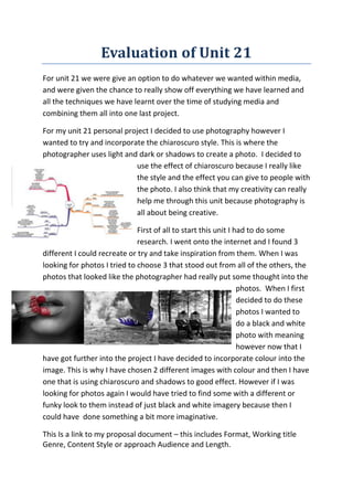
- 1. Evaluation of Unit 21 For unit 21 we were give an option to do whatever we wanted within media, and were given the chance to really show off everything we have learned and all the techniques we have learnt over the time of studying media and combining them all into one last project. For my unit 21 personal project I decided to use photography however I wanted to try and incorporate the chiaroscuro style. This is where the photographer uses light and dark or shadows to create a photo. I decided to use the effect of chiaroscuro because I really like the style and the effect you can give to people with the photo. I also think that my creativity can really help me through this unit because photography is all about being creative. First of all to start this unit I had to do some research. I went onto the internet and I found 3 different I could recreate or try and take inspiration from them. When I was looking for photos I tried to choose 3 that stood out from all of the others, the photos that looked like the photographer had really put some thought into the photos. When I first decided to do these photos I wanted to do a black and white photo with meaning however now that I have got further into the project I have decided to incorporate colour into the image. This is why I have chosen 2 different images with colour and then I have one that is using chiaroscuro and shadows to good effect. However if I was looking for photos again I would have tried to find some with a different or funky look to them instead of just black and white imagery because then I could have done something a bit more imaginative. This Is a link to my proposal document – this includes Format, Working title Genre, Content Style or approach Audience and Length.
- 2. http://prezi.com/k8ubvgjd6aws/proposal-document/ Making of my final piece I was first going to do an exhibition of all of my photos but after thinking it through I decided to use Photoshop and create a page spread and use my photos to fill up the page. I did this because in the end I felt that my photos would look better all together on a double page spread and then I could annotate them so the people could understand more. To do this I went onto Photoshop. First I set up an A4 page and made the blue background with the black and orange banner. Then what I did was move all of my photos into the frame. I decided to put the before and after because you can really tell the difference when they are together to when they are on their own. I think that it was a good idea however I think that I could have changed the background because I is boring and I could have added a gradient to make it look more interesting. Before I took my photos what I wanted to do was practise my editing technique on different photos so what I decided to do was go onto google images and find a photo of a NY Taxi to see if I could edit my final photo well. This is what I came up with. I think that this came out very well and I will try and use this to good effect in my photo. I also tried to use this technique to good effect in a different photo and this is what I came up with. I used the black and white effect that I used in the last photo and I made the reflection on the water look colourful. I think that when I do my photo I will try to use this also in my photo because I now know how to use the technique better and I could do this to good effect. Then once I had finally finished editing these two photos I went out and took 2 of my own. When I took these photos I tried to see what I could have done to try and include the techniques I have used, in the end I felt that it came out well.
- 3. Name Like Dislike Other Comments Tom B-R He likes that the amount of different photos that I have used and the variety I have used in them. He dislikes how some of the writing contrasts on the background. He thinks that I should change the background because he feels this it is too plain, however likes the banner and how it stands out. Nathan B He like the different variety of photos and how there are different techniques used. He thinks that I could try and improve the background by making it more interesting by using a gradient He likes how I have the before and after photos and how they are laid out. Luke H He likes that I have tried to used different editing techniques on each photo and then incorporated them in my final photos. He also dislikes how the writing contrasts with the background and that I could try and make it a bit more interesting He likes all of the different techniques that I have used to edit my photos. One of my main weaknesses was that I didn’t create a production schedule so I didn’t know when to take my photos and they became a lot more rushed and they didn’t come out as well I hoped also I feel I did not show my full potential in this project as well as I wanted to. However on pf my main strengths in this project is my ability to edit, and create my two page magazine cover. I feel that this came out very well with the photos before and after. But I feel that I could have made the background more interesting maybe adding a gradient. If I were to do this project again I would have given myself more time to take my photos and then I would have tried to make my two page spread more interesting and
- 4. maybe tried to take another photo to make the page look more full and complete. Step by step First to create my background I just started by creating a simple banner orange banner and a blue background, I used these colours because I think that they look and blend into each other with the black outer shell. Then I just added a simple text to state what the page was about and what I had done for my personal project. Then after editing my two practice photos I decided to add them into the page to show what work I had done before my final two photos.
- 5. Then what I did was added my two photos and the before and after of what I did using the place tool. I did this because if you didn’t see the photos with the old and new you might not have seen the amount of work put into them. Then to finish off I just added some text using the text tool just to say why I chose these photos to edit and then why I used the effects I did. I quite pleased with my final cover however looking back I think I could have added a gradient to make it look a lot more interesting.