VDIS10002 Residential Interiors 1 Lecture 7 - Colour, Finishes & Artwork in Residential Interiors Projects
•
1 gostou•290 visualizações

VDIS10002 Residential Interiors 1 Lecture 7 - Colour, Finishes & Artwork in Residential Interiors Projects

Recomendados
Recomendados
Mais conteúdo relacionado
Mais procurados
Mais procurados (17)
Destaque
Destaque (7)
Semelhante a VDIS10002 Residential Interiors 1 Lecture 7 - Colour, Finishes & Artwork in Residential Interiors Projects
Semelhante a VDIS10002 Residential Interiors 1 Lecture 7 - Colour, Finishes & Artwork in Residential Interiors Projects (20)
Mais de Virtu Institute
Mais de Virtu Institute (20)
Último
Último (20)
VDIS10002 Residential Interiors 1 Lecture 7 - Colour, Finishes & Artwork in Residential Interiors Projects
- 1. VDIS10002 Residential Interiors 1 Lecture 7: Colour, Finishes & Artwork in Residential Interiors Projects Ramona Solomon
- 2. Colours calm, stimulate, invigorate and energise us. They can have a powerful impact on our moods, both positive and negative. Here’s a few tips to help you break down the project into manageable parts.
- 3. Match colours to the era It always looks great if your colour scheme matches the architecture and era of th building. It’s easy to find inspiration online or around the neighbourhood. But if you want to follow the traditional hues of Victorian or Federation houses, your local council should be able to advise you. Choose a colour palette that references the history of your home. Or, if you prefer a modern twist, introduce an up-to-the-minute palette that has some reference to the history of the house, or go all out with more modern fit out and embrace the style of the era such as art deco, mid-century modern, swinging sixties or some 1970s flair.
- 4. Start with the big picture Begin at the bottom When compiling a colour palette, it’s useful to first first about your flooring. Your floor will influence your colour choices dramatically, and in turn impact how you use textures, tones, accents and even artwork. Once you choose your flooring, you can work in complimentary or contrasting fabric colours for curtains and furniture, tiling, rugs and other styling elements. Then move to the top While the traditional white ceiling is really popular, there are no hard and fast rules on ceiling colour. A non-white ceiling can at once draw the eye up but with darker tones can also make a room feel enclosed. One solid tip is to always use a matt finish when painting ceilings – gloss paint shows up small imperfections so it’s almost impossible to get a seamless look.
- 5. Bring the walls to life A good way to unify the different rooms of your interior is to use one colour on all the walls. If you can’t resist using different colours – particularly for feature walls – then make sure they match tonally. It’s best to avoid any clashing colours even if they are in different ends of the interior. Skirt around the issue Skirting boards invariably take a beating over time so use an enamel paint for durability. White always looks great but if you are using light colours on the walls, the same colour on the skirting boards is a good option.
- 6. Make a space feel larger When decorating a small space, consider using lighter colours on both the wall and ceiling to make the room seem bigger. Make a space feel cosy If you have a small room but absolutely love dark colours, it’s possible to have it all without feeling like you’re living in a cave. Size matters
- 7. When to use white White makes rooms light and airy with a crisp, clean feel. However, whites can be cool or warm, ranging from a yellow tinged cream to a bluish arctic white. If you’re in any doubt, choose pure white. It works as the perfect backdrop to to everything while adding a discreet sense of style. If you change your mind later, it can be easily painted over. Bright, vivid and light
- 8. Bring the outside indoors by using colour cues from your garden. Incorporate nature’s colours into your interior design. The green of a hedge, the blue of a pool or the earthy tones of sandstone can be reflected in your colour choices inside. A smooth transition between indoors and outdoors makes for a harmonious feel. Bring the outdoors, indoors
- 9. Don’t overdo the austerity in an attempt to make a room light and airy. A dramatic artwork, a textured rug or brightly coloured collection of knick-knacks can add personality and warmth to a neutral room. Bring the drama
- 10. Style in monochrome For a stylish look: Choose a monochromatic palette – ranging from warm greys to inky charcoals – but err on the cooler end of the spectrum. Then offset this look with furnishings and trims in either complementary colours or more intense shades of the same colour. Use colour create a mood Cool & refreshing You can paint the room predominantly white, then introduce cool colours, such as blues and greens mixed with lots of white, as a subtle feature. This can range from skirting boards and window frames to a feature wall.
- 11. Light & breezy Choose pastels which provide a fresh but relaxing atmosphere. Many people choose lighter versions of a pastel for the walls and paint the trim with a more intense version. This is a popular option for bedrooms and bathrooms. Warm & cosy Choose deep reds, browns, burnt oranges and muted yellows. These welcoming tones work a treat in living rooms or intimate dining rooms. Darker tones can be introduced when painting structural elements such as staircases – these features simply melt into the background.
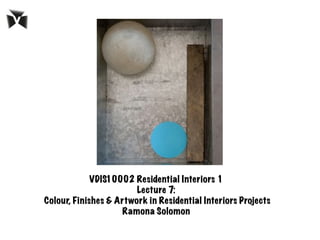
- 12. Texturise Texture is definitely the buzzword in the paint world. But those old sponges are long gone – metallic, silk, suede and stone paints are the new must- haves, providing a tactile effect with minimal fuss. Finishing touches Be bold If you want a fire-engine red feature wall, go for it! Trust your instincts and experiment to your heart’s desire. After all, it only takes a weekend and a few cans of white to return walls to their original state.
- 14. Artwork is so personal with the style, the subject matter and budget. You could be an enthusiast that follows the career path of certain artists that you love where the artwork become investment pieces or you could stumble across pieces at markets and garage sales. At the end of the day it is filling the negative vertical voids of wall space to complement the rest of the furnishings. It’s personal
- 15. Artwork can be a stand out feature that can dictate the space and mood or just melt into its surrounds subtly. It can create that view or faux window into another world for a room that perhaps has no windows or outlook normally. The media style implemented in the artwork can add rhythm, movement and texture to the interior space.
- 16. Art can be either the starting or finishing point of the design process. If my client has a special piece, these colours can be extracted and reflected in the furnishing fabrics or alternatively a masterpiece can be added for that finishing touch. Art in interiors
- 17. When selecting artwork for your home don’t feel every space has to be filled as the walls then become overwhelming and dominating and if too small, it can be insignificant. Check positioning by blu-tacking paper at the size of your art to the wall, prior to making the big purchase. Hanging Art
- 18. Framing can be used to your benefit for incrementally increasing the size with clever use of mounting board and thickness of frame. Research the various styles of framing with a professional framer first. Frames are meant to be an accessory to enhance the artwork and coordinate with the room, not steal the show. Framing
- 19. It can be an exciting and rewarding discovery exploring galleries, markets, hearing the stories behind the artwork and maybe meeting the artists themselves. They can evoke so much feeling too; sentimental holiday memories or perhaps it’s your own creation. At the end of the day it’s an investment financially (particularly if the artist’s career and profile progresses) but also an emotional investment as every artwork carries its own story. Discovering