
Recomendados
Mais conteúdo relacionado
Mais procurados
Mais procurados (20)
Destaque
Destaque (15)
Semelhante a The exploration of a responsive web design – that elevates your website’s potential
Semelhante a The exploration of a responsive web design – that elevates your website’s potential (20)
Último
Último (20)
The exploration of a responsive web design – that elevates your website’s potential
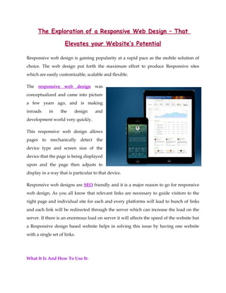
- 1. The Exploration of a Responsive Web Design – That Elevates your Website’s Potential Responsive web design is gaining popularity at a rapid pace as the mobile solution of choice. The web design put forth the maximum effort to produce Responsive sites which are easily customizable, scalable and flexible. The responsive web design was conceptualized and came into picture a few years ago, and is making inroads in the design and development world very quickly. This responsive web design allows pages to mechanically detect the device type and screen size of the device that the page is being displayed upon and the page then adjusts to display in a way that is particular to that device. Responsive web designs are SEO friendly and it is a major reason to go for responsive web design, As you all know that relevant links are necessary to guide visitors to the right page and individual site for each and every platforms will lead to bunch of links and each link will be redirected through the server which can increase the load on the server. If there is an enormous load on server it will affects the speed of the website but a Responsive design based website helps in solving this issue by having one website with a single set of links. What It Is And How To Use It:
- 2. With the advent of many internet-capable devices like Smart phones, laptops, desktops, net books, and tablets along with the wide variety and range of screen resolutions, there comes the need of mustering web pages that fits these multiple devices. A responsive web design is the latest innovation based on specific needs in the website designing and development province. The basic intention is to design applications and websites that are receptive to the environment and behavior of the user based on the platform, screen size and orientation. Responsive web design is a combination of fluid images; flex grids, layouts, CSS media queries and much more. This enhances the user experience in terms of problem-free readability and navigation. A responsive web design is one that elevates commerce to create bang on user experiences by optimizing the web pages for a widespread category of devices. This reduces the need of expensive development methods that are gadget-specific. This progressive approach introduced by Ethan Marcotte puts an end to the limitations of the physical page and persuades web designers to carve extravagant designs that can re-position, reflow and resize pertinently based on the size of the user’s screen.
- 3. SEO is one of the very important reasons to go for responsive web design. For any site, links are must to help visitors get to the right page of the website, but if separate websites were designed for every device out there, there comes an issue with links where each link needs to be redirected through the server which in addition results in unnecessary load on it, affecting the website's speed badly. Responsive web design helps in resolving this issue by having one website with a single set of links. For more information log onto: http://www.blazedream.com/