
Recomendados
Mais conteúdo relacionado
Mais procurados
Mais procurados (17)
Destaque
Destaque (18)
Semelhante a Media digipak analysis rihanna
Semelhante a Media digipak analysis rihanna (20)
Mais de tottenhamboy5
Mais de tottenhamboy5 (20)
Media digipak analysis rihanna
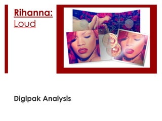
- 2. Front Cover As you can tell by the front cover, the selling point of the album is Rihanna due to her world- wide fame, and she plays on this by using her face as the first thing her audience will see Also, the color red is dominant on the album cover through the singers hair. This vibrant shade of red is a unique hair color, and perhaps matches the personality of hers that Rihanna is trying to display to her audience, therefore highlighting her albums ‘uniqueness’.
- 3. Inside the digipak The image inside the digipak is one of a natural scene. This scene portrays femininity in its outlook, and as Rihanna is shown laying on a bed of roses the image displays a slight vulnerability to the singer, but also the natural environment gives a sense of natural beauty which the female audience will thrive on and hope look up to. Once again the color red is dominant in the image, highlighted in the color of the singers hair, the color of the roses, and even the color of the singers lipstick.
- 4. Color Red is the predominant color of the digipak and gives great effect to the album and creates a selling point to its audience. The continuous use of the color red is effective as red holds as a color for feelings such as love, lust, and compassion, and is a dominant color. These emotions are what Rihanna wants to display to her audience and be associated with as it attracts both male and female audience. The sense of beauty and lust physically attract the male audience, whilst the feminine side of the singer is what the female audience want to see and hope to relate to.