SlideShare uma empresa Scribd logo
1 de 30
Baixar para ler offline
The Shock of the New
Public lecture
HfG Schwäbisch Gmund
10.1.2011
Extended version 16.1.2011 [• T 1]


[• T 2]


‘neue typographie ist die typographie des besseren lesens, der besseren
information, des bestmöglichen angebots für auge und verstand.’


typographie, otl aicher


[• T 3] Goodmorning.

[• T 4] I am very pleased to meet you.

------------------------------------------------------------------------------------------

[• 5] As you may spot, luckely, I am listed in ‘Dutch Graphic Design. A century of

innovation’ [• 6] which was published in 2006.

[• 7] An early example of my work, presented on page 378, is from 1991.

[• 8] The same bookcover for ‘The Shock of the New’ by Robert Hughes is on the next

slide, [• 9] but surrounded by some of my designs out of the same period, [• 10] which

is exactly twenty years ago!


Please excuse me for talking English. [• 11] To show my very best [• 12]

I prepared most textslides in German [• 13] and enjoyed reading [• 14] these

outstanding titles [• 15] to catch some remarkable quotes [• 16].

So this lecture is really up-to-date because it is bi-lingual [• 17], cross cultural [• 18],

and very global [• 19].


By the way is n’t it interesting, in this perspective, that Nandhini Mehra [• 20], a young

Indian designer who graduated in May 2010 at Savannah College of Art & Design in

Atlanta (US), is presenting a bilingual poster on DIN [• 21], a famous, anonymous

German typeface, which was re-drawn as FF DIN [• 22] by Abert Jan Pool [• 23], a
Dutch typedesigner working in Hamburg, because Erik Spiekerman [• 24] – at that time

still at Meta Design in Berlin – told him to, while finalizing the 1994 ATypI conference in

San Fransisco?


As an intermezzo,– to introduce myself, I selected three examples of my recent,

mainly, editorial work.

• First [• T 25]: Dutch opinion magazine Vrij Nederland (main issue: handling the

transformation from newspaper to magazine)

• Second [• T 30]: First View, a visual report of the Willem de Kooning Academy

Fashion Show 2009 (main task: the manual selection of over 1,000 photographs)

• Third [• T 34]: Ben Joosten, a monography (main issue: the balance between much to

much text and the actual work)


Today on special request i am going to talk to you about ‘basics’ & typography.


PREFACE [• T 38]


[• T 39]


‘Die Aufgabe beschreiben, ist ein Teil der Lösung. Impliziert: die kreativen Entscheide
nicht dem gefühl entsprechend treffen, sondern nach intellektuellen Kriterien. Je präziser
und vollständiger diese sind, desto kreativer is die Arbeit.’


Programme entwerfen, Karl Gerstner


Already for ages Typography is a simple craft driven by language and logic [• 40],

and practised by deducting and combining [• 41].


Please do not misunderstand me: some assignments – for instance a newspaper [• 42],

which nowadays in fact is a ‘communication package’ [• 43], and probably will be

publicated in print, online [• 44] and via several mobile applications [• 45] – may be

very complex [• 46],– I am only aiming at the resources.
[• 47] This contemporary solution by CAFA students presented on the Beijing campus

during Icograda 2009 in a beautifull building [• 48] designed by the renowned Japanese

architect Arata Isozaki [• 49] did remind me of another important, distinctive,

characteristic of Typography: it is user orientated.

[• 50] The overal design will be tested, in a very straightforward way, by the user,

probably a reader, in the end. Always . . .

. . . [• 51] In this case the legibility was ok, but the usability was not sufficient.

I got lost.

[• 52] I am not a product designer but I suppose some resemblance with an actual

design philosophy like ‘User Centered Design’ does exist, since UCD [• 53] focuses on

the needs and abilities of the user, in order to create applications, which are easy to

use, and are of added value.


[• 54] My approach to typography has always been systematic and might be called

programmatic.


[• T 55]


‘Programme entwerfen: Warum ist es so schwierig, was gemeint ist, kurz und bündig zu
definieren? Der Untertitel: statt Lösungen für Aufgaben Programnme für Lösungen ist
zwar präzis, aber kaum plastischer als der Titel.’


Programme entwerfen, Karl Gerstner


Like others I distinguish a comprehensive, media independent, set of related variables

like for instance: type, pointsize, linelenght and transport.


[• T 56]


‘Gute Typographie ist wesentlich ein Ergebnis wohlüberlegter Anordung. Einer
ungeschickten Anordnung helfen selbst die allerschönsten Schriften nichts, aber selbst
mit mittelmäßig guten Schriften kann man
eine gefällige Anordnung treffen.’


Erfreuliche Drucksachen durch gute Typographie, Jan Tschichold
Although the same basic set is used over and over, the solution to a problem is unique

when the selection and use of variables differ, and the assignment of values depend on

specific context and content.


[• T 57]


‘Das Technische, Praktische und Ästhetische sind nicht Teilgebiete der Typographie,
sondern Seiten an ihr, es sind Teilaufgaben, die mit jeder Einzelaufgabe immer wieder
gestellt werden.’


Die Kunst der Typographie, Paul Renner


Society is rapidly transforming, and technique is always innovating.

The industry is completely digitilized during the last thirty years of the past century.

Please look at the next two sequences.


[• T 58] Printing [• 59-74] . . .

[• 75] Recently the Espresso Book Machine is available at the American Book Center in

Amsterdam and will deliver anybody a book within minutes if an accurate .pdf is

provided.


[• T 76] Composing . . .

[• 77] By the way it is a persistent misconception to suggest Gutenberg ‘invented’

printing: the Chinese did. [• 78] He introduced typecasting and the use of movable

type.

[• 79] Gutenberg – originally a goldsmith – changed profession to become a punchcutter

and printer. [• 80-98]


[• 99] Of course, we all know ‘the reader’ is rather conventional . . .

[• 100] But how come the fundamentals of Typography did hardly change?

[• 101] Is n’t the issue more related to the biological: to the ‘universal’ human eye and

the brain?

[• 102] More specific is it because we are reading from left to right, from top to bottom,

already for quite some time?
[• 103] Maybe with the introduction of the e-book, the smartphone and the i-pad, our

reading habits will change as some predict.

[• 104] But how and why exactly?

[• 105] Only because of the introduction of a non-linear time-ax and a much more

layered environment?


[• T 106]


‘schrift ist der visuelle niederschlag von sprache.
was heißt das?’


die welt als entwurf, otl aicher


Will we stop reading in one direction?

Or will the replacement of language by image, in visual communication – which is

happening at this very moment – not prove to be much more influential concerning the

scope of typography?


[• 107] The Egyptian hieroglyphic system, which increased from approximatly seven

hundred to around five thousand signs, is not only made up of pictographs, but also of

phonograms and determinatives.

[• 108] Most important, hieroglyphs are written from right to left, or from left to right,

or from top to bottom. The reader must consider the direction in which the asymmetrical

hieroglyphs are turned in order to determine the proper reading order.

[• 109] Jean-François Champillion was the first to understand the originality of the

script, and explained how to decipher the hieroglyphic in Précis du Système

Hiëroglyphique which was publicated in 1824.

[• 110] ‘It is a complex system, writing figurative, symbolic, and phonetic all at once, in

the same text, the same phrase, I would almost say in the same word.’, he writes in a

letter to his editor two years before.
BASICS [• T 111]


[• 112]


‘Elementare Typographische Gestaltung ist die Schaffung der logischen und optischen
Beziehung der durch die aufgabe gegebene Buchstaben, Wörter, Satzteile.’


Elementare Typographie, Iwan Tschichold


Some years ago I had to re-think a Typography programme concerning the first two

years of a four year curriculum.


[• 113]


‘Das einzelne Wort und die Satzseite [...] sind die Elementaraufgaben, an denen wir die
algemeinsten Formgesetze kennenlernen wollen [...]’


Die Kunst der Typographie, Paul Renner


I must have been in pretty good shape and rather concentrated, because I ‘treasured’ an

obvious structure quite soon.


[• T 114] (‘Das Programm’)


First [• T 115] 1. Letter [• T 116]

Second [• T 117] 2. Word [• T 118]

Third [• T 119] 3. Sentence [• T 120]

Fourth [• T 121] 4. Paragraph [• T 122]

Fifth [• T 123] 5. Page [• T 124]

Sixth [• T 125] 6. Book [• T 126]


Now I could easily scedule [• T 127] Typehistory [• 128, 129, 130, 131],– [• T 132]

Classification [• 133, 134, 135, 136] and,– [• T 137] Nomenclature [• 138, 139, 140],

and of course also the most important typographic basics – first introduced by Emiel

Ruder [• 141] – like [• T 142] Contrast [• 143, 144],– [• T 145] Direction [• 146, 147]
and [• T 148] Rhytm [• 149, 150] ([• 151] I am sorry this is not typography . . . but is

it not a beautifull painting?).

Also within this frame we would study [• T 152] Proportions [• 153, 154, 155, 156,

157], the inner [• T 158] Relations [• T159]


‘[...], jede Schrift findet ihre beste Lesbarkeit und ihre günstigste Wirkung bei
bestimmten Zeilenbreiten, Zeilenabständen und Wortzwischenräumen.’


Die Kunst der Typographie, Paul Renner


and all about [• T 160] White (called space in typography) [• 161, 162, 163], et cetera.

[• 164] I even could pay [• 165] some attention to [• 166] visual poetry [• 167], to

tribute Jan Vermeulen [• 168], my own typography teacher [• 169], who might start

one of his lessons by reciting, poets like, Gerrit Achterberg [• 170] or J.C. Bloem [•

171], presumably to indicate the strong relation between language and typography . . .


[• T 172]


Spring


Through desolate spring skies the sun broke clear.
A flight of birds dropped in a sudden sheer.
The thinly sown snow melted on the earth.
Heart, you are free: you had no grounds for fear.


J.C. Bloem


[• 173] In the end the only real problem to tackle seemed to be rather formal: how to

fit the course in four semesters while the division is in six?


[• 174] Sometime later I discovered – by coïncidence – that Paul Renner [• 175] used

more or less the same subdivision in ‘Die Kunst der Typographie’ (Erstes Kapitel: Das

Einzelwort // Zweites Kapitel: Die Satzseite // Drittes Kapitel: Das Buch) before he

wanders from his subject to head for other directions.

[• 176] The ‘link’ with Jan Tschichold – Iwan at that time – is quite obvious, since
Tschichold wrote, in Leipzig, some twenty years before [• 177]: ‘6. Elementare

typografische Gestaltung ist die Schaffung der logischen und optischen Beziehung der

durch die Aufgabe gegebenen Buchstaben, Wörter, Satzteile.’


[• 178] Once more, in this context, demonstrating the elegance of the scheme [• 179]

I would like to emphasize the break between the third and fourth item, [• 180] to

classify the first part as ‘basic’ [• 181], and the second as ‘advanced’ [• 182, 183].

[• 184, 185, 186]


[• 187] So no, I would not change the format [• 188] if someone would ask me to re-

think the programme once again, [• 189] [• 190] although actualizing assignments,

[• 191] and keeping all information up to date, [• 192] is always required in education.


[• 193] In The Tipping Point – an excellent study, and wonderful guide, which should be

read by every design-student – Malcolm Gladwell is introducing three kind of people who

matter in a social epidemic.

[• 194] Connectors: ‘people with a special gift for bringing the world together’, and ‘who

know everyone’. [• 195] Mavens – the word comes from the Yiddish, and it means one

who accumulates knowledge – ‘information brokers, sharing and trading what they

know’. Mavens are data banks. They provide the message.’

[• 196] ‘Connectors are social glue: they spread it. [• 197] But there is also a select

group of people – Salesman – with the skills to persuade us when we are unconvinced of

what we are hearing [. . .].’

[• 198] Although it is not the task of a teacher to start, nor spread an epidemic, I am

quite sure something of a Connector or/and a Maven is in us all. Or to put it in

Gladwells words: ‘To be a Maven is to be a teacher.’


But apart from actualizing . . . [• 199] after visiting the Shanghai International Fashion

Culture Festival in 2010 and listening to a stunning lecture titled: What guides the

designer’ hand? Inside the ultimate design studio: the brain by Art Historian John Onians

[• 200], I am prudently concluding every design programme might need some tuning

re-introducing the manual experiment. [• 201] Recent neuroscientific insights seem to
confirm not only the eye and the hand need training, also the designers brain needs

manual feed to keep in optimum condition. [• 202] The key concept to grasp is that of

neural plasticity.


I quote: [• 203] ‘Another is that the laying down of those memories is associated with

structural changes in the brain. [• 204] We have always known that previous experience

is important for artistic success, but we never knew exactly why. [• 205] Now we know

that it is because each experience we have actually changes our brain’s structure,

leaving us with better resources for dealing with that particular experience if we have it

again.’


And: [• 206] ‘Each trained artist or designer acquires over time a brain whose structure

helps him or her to perform the particular tasks he or she is engaged in.

[• 207] The process by which this happens is one that is only recently has been

understood. [. . .] [• 208] By concentrating on a particular activity we redesign the area

of the brain that we use for it. [. . .] [• 209] Of course those neurally based motor

skills will then influence his own work, [• 210] and they will do so without him being

conscious of it.

[• 211] This is one of the most important insights yielded by neuroscience. [• 212] In a

field like art or design you can have lots of bright ideas, [• 213] but if you don’t have

the required motor skills with pencil or mouse your work will not be a success.’


[• 214, 215, 216] During the past years, I provided a manual exercise, each time at the

start of a fresh course. [• 217, 218, 219] Not only to introduce type quite

straightforward to all students, [• 220, 221, 222] and encourage them to develop some

basic skills. [• 223, 224, 225] But also to enable me to start memorizing all those new

names after finishing the project.

[• 226, 227, 228] The first class in the sequence is of 1981. [• 229, 230] The last

pictures, which are actually selfportraits, are of 2006.
BEYOND [• T 231]


[• T 232]


‘Die Lese-Erfahrungen gelten für die Handsatz-Technik von vor 400 Jahren wie für die
Technik von übermorgen. Selbst wenn Bücher nicht mehr auf Papier gedruckt werden
sollten, bleibt vieles gültig.’


LeseTypo, Hans Peter Willberg


Remains the last part of this talk, which is about The State Of The Art

In The Digital Age . . .

. . . I have already described the change of the profession due to a number of

technologic innovations. Probably design and technology are linked due to mass-

production. [• 233] Is design not driven by technology?

[• 234] . . . And I have tried to research the state of mind of The Contemporary

Reader. Ok, the times they are a-changing [• 235], but are we?


[• 236] Meantime, over time, we all changed pencils, [• 237] and bought quite

expensive digital ones.

Which reminds me: back in the seventees, [• 238] I was one of the first graphic

designers in Holland [• 239] working on a huge mainframe [• 240] studying Fortran and

[• 241] Computer Sound Synthesis.

Then in the eighties, starting as a feelancer, I – of course – could not afford a Mac.

[• 242] Much to expensive, and over budget. [• 243] So, those first years, we mainly

used Atari . . . [• 244]

[• 245] . . . Besides the (German)machine was quite good, [• 246] especially because

the ST was ‘open’ & easy to program.


As an example I’d like to present these early digital sketches, [• 247] made with

Degas, the popular, Atari based, much cheaper rival of Mac Draw [• 248-251].

The assignment is a very special stamp, [• 252, 253] which is distributed in the

beginning of december by Royal Dutch Post.
So I guess my remark that programming, writing code – for instance simple pen-up-

pen-down Turtle Graphics [• 254] – should be part of every up-to-date curriculum to

offer students another perspective and influence design-methodology, is not surprising.

Like Harold Abelson is stating in the Preface of Turtle Geometry:

[• 255] ‘It is our hope that these powerfull but simple tools for creating and exploring

richly interactive environments will dissolve the barriers to the production of knowledge

as the printing press dissolved barriers to its transmission.’

[• 256] ‘This hope is more than our wish for students to experience the joy of discovery

and the give and take between investigator and investigation that typifies scientific

research. Like Piaget, Dewey, and Montessori, we are convinced that personal

involvement and agency are essential to truly effective education.’


[• 257] In this first year exercise, [• 258] students did experience some of the main

difficulties, [• 259] when digitalizing type manually, on a primitive grid.

[• 260] They all had to study the characteristics of a typeface closely, [• 261] while

choosing between zero or one, which in fact may be converted in ink, or no ink . . .

[• 262] Another example: third year. [• 263] What about existing Dot Matrix Alphabets?

[• 264] And how to create your own? [• 265] This exercise is about black and white,

scale, legibillity and consistency most and for all.


[• 266] Nowadays students of course should learn everything about stylesheets, [• 267]

Adobe InDesign and XML.

[• 268] They should study the applications of Woodwing, a Dutch based rather succesfull

firm specialized in Cross Media & Publishing.

[• 269] But I am afraid, by then, they have entered the professional domain of

advanced Typography.

[• 270] We have passed the bounderies of the basic anyhow.

Time to stop.

------------------------------------------------------------------------------------------

[• T 271] Thank you.

[• T 272] Any questions?

Mais conteúdo relacionado

Semelhante a The Shock of the New

Typography
TypographyTypography
Typography
mjones27
 

Semelhante a The Shock of the New (9)

Type classification
Type classificationType classification
Type classification
 
To be continued
To be continuedTo be continued
To be continued
 
Sedgwick e0498336-d0105-31188a-self check c
Sedgwick e0498336-d0105-31188a-self check cSedgwick e0498336-d0105-31188a-self check c
Sedgwick e0498336-d0105-31188a-self check c
 
Graphic design 2
Graphic design 2Graphic design 2
Graphic design 2
 
3-Writing and Rewriting.pdf.pdf
3-Writing and Rewriting.pdf.pdf3-Writing and Rewriting.pdf.pdf
3-Writing and Rewriting.pdf.pdf
 
Typography
TypographyTypography
Typography
 
Michael Renner's lecture at Taipei 2015
Michael Renner's lecture at Taipei 2015Michael Renner's lecture at Taipei 2015
Michael Renner's lecture at Taipei 2015
 
Historical Parallels in Usability
Historical Parallels in UsabilityHistorical Parallels in Usability
Historical Parallels in Usability
 
Graphic Design
Graphic DesignGraphic Design
Graphic Design
 

Mais de Stephan Saaltink (韩默默)

Mais de Stephan Saaltink (韩默默) (20)

Beforehand
BeforehandBeforehand
Beforehand
 
25 plots & prints
25 plots & prints25 plots & prints
25 plots & prints
 
dynamic self organising repeat patterns
dynamic self organising repeat patternsdynamic self organising repeat patterns
dynamic self organising repeat patterns
 
Portfolio
PortfolioPortfolio
Portfolio
 
Teaching & Learning (2011-20)
Teaching & Learning (2011-20)Teaching & Learning (2011-20)
Teaching & Learning (2011-20)
 
GRENEN (2018-20)
GRENEN (2018-20)GRENEN (2018-20)
GRENEN (2018-20)
 
Identifying india
Identifying indiaIdentifying india
Identifying india
 
144 sunflowers in great britain
144 sunflowers in great britain144 sunflowers in great britain
144 sunflowers in great britain
 
crossing borders
crossing borderscrossing borders
crossing borders
 
hello goodbye
hello goodbyehello goodbye
hello goodbye
 
Turtle Graphics 2014-17
Turtle Graphics 2014-17Turtle Graphics 2014-17
Turtle Graphics 2014-17
 
20160818 ©
20160818 ©20160818 ©
20160818 ©
 
Three Turtle Graphics
Three Turtle GraphicsThree Turtle Graphics
Three Turtle Graphics
 
Graphic Arts
Graphic ArtsGraphic Arts
Graphic Arts
 
Visual systems
Visual systemsVisual systems
Visual systems
 
Nine
NineNine
Nine
 
Nine typographic assignments
Nine typographic assignmentsNine typographic assignments
Nine typographic assignments
 
20 1981 2014
20 1981 201420 1981 2014
20 1981 2014
 
Lets meet
Lets meetLets meet
Lets meet
 
eleven examples of professional work
eleven examples of professional workeleven examples of professional work
eleven examples of professional work
 

Último

1029-Danh muc Sach Giao Khoa khoi 6.pdf
1029-Danh muc Sach Giao Khoa khoi  6.pdf1029-Danh muc Sach Giao Khoa khoi  6.pdf
1029-Danh muc Sach Giao Khoa khoi 6.pdf
QucHHunhnh
 
Vishram Singh - Textbook of Anatomy Upper Limb and Thorax.. Volume 1 (1).pdf
Vishram Singh - Textbook of Anatomy  Upper Limb and Thorax.. Volume 1 (1).pdfVishram Singh - Textbook of Anatomy  Upper Limb and Thorax.. Volume 1 (1).pdf
Vishram Singh - Textbook of Anatomy Upper Limb and Thorax.. Volume 1 (1).pdf
ssuserdda66b
 
Spellings Wk 3 English CAPS CARES Please Practise
Spellings Wk 3 English CAPS CARES Please PractiseSpellings Wk 3 English CAPS CARES Please Practise
Spellings Wk 3 English CAPS CARES Please Practise
AnaAcapella
 
Activity 01 - Artificial Culture (1).pdf
Activity 01 - Artificial Culture (1).pdfActivity 01 - Artificial Culture (1).pdf
Activity 01 - Artificial Culture (1).pdf
ciinovamais
 
Jual Obat Aborsi Hongkong ( Asli No.1 ) 085657271886 Obat Penggugur Kandungan...
Jual Obat Aborsi Hongkong ( Asli No.1 ) 085657271886 Obat Penggugur Kandungan...Jual Obat Aborsi Hongkong ( Asli No.1 ) 085657271886 Obat Penggugur Kandungan...
Jual Obat Aborsi Hongkong ( Asli No.1 ) 085657271886 Obat Penggugur Kandungan...
ZurliaSoop
 

Último (20)

This PowerPoint helps students to consider the concept of infinity.
This PowerPoint helps students to consider the concept of infinity.This PowerPoint helps students to consider the concept of infinity.
This PowerPoint helps students to consider the concept of infinity.
 
Understanding Accommodations and Modifications
Understanding  Accommodations and ModificationsUnderstanding  Accommodations and Modifications
Understanding Accommodations and Modifications
 
1029-Danh muc Sach Giao Khoa khoi 6.pdf
1029-Danh muc Sach Giao Khoa khoi  6.pdf1029-Danh muc Sach Giao Khoa khoi  6.pdf
1029-Danh muc Sach Giao Khoa khoi 6.pdf
 
Vishram Singh - Textbook of Anatomy Upper Limb and Thorax.. Volume 1 (1).pdf
Vishram Singh - Textbook of Anatomy  Upper Limb and Thorax.. Volume 1 (1).pdfVishram Singh - Textbook of Anatomy  Upper Limb and Thorax.. Volume 1 (1).pdf
Vishram Singh - Textbook of Anatomy Upper Limb and Thorax.. Volume 1 (1).pdf
 
Explore beautiful and ugly buildings. Mathematics helps us create beautiful d...
Explore beautiful and ugly buildings. Mathematics helps us create beautiful d...Explore beautiful and ugly buildings. Mathematics helps us create beautiful d...
Explore beautiful and ugly buildings. Mathematics helps us create beautiful d...
 
Accessible Digital Futures project (20/03/2024)
Accessible Digital Futures project (20/03/2024)Accessible Digital Futures project (20/03/2024)
Accessible Digital Futures project (20/03/2024)
 
ICT role in 21st century education and it's challenges.
ICT role in 21st century education and it's challenges.ICT role in 21st century education and it's challenges.
ICT role in 21st century education and it's challenges.
 
Spatium Project Simulation student brief
Spatium Project Simulation student briefSpatium Project Simulation student brief
Spatium Project Simulation student brief
 
Food safety_Challenges food safety laboratories_.pdf
Food safety_Challenges food safety laboratories_.pdfFood safety_Challenges food safety laboratories_.pdf
Food safety_Challenges food safety laboratories_.pdf
 
Spellings Wk 3 English CAPS CARES Please Practise
Spellings Wk 3 English CAPS CARES Please PractiseSpellings Wk 3 English CAPS CARES Please Practise
Spellings Wk 3 English CAPS CARES Please Practise
 
Activity 01 - Artificial Culture (1).pdf
Activity 01 - Artificial Culture (1).pdfActivity 01 - Artificial Culture (1).pdf
Activity 01 - Artificial Culture (1).pdf
 
Mixin Classes in Odoo 17 How to Extend Models Using Mixin Classes
Mixin Classes in Odoo 17  How to Extend Models Using Mixin ClassesMixin Classes in Odoo 17  How to Extend Models Using Mixin Classes
Mixin Classes in Odoo 17 How to Extend Models Using Mixin Classes
 
Jual Obat Aborsi Hongkong ( Asli No.1 ) 085657271886 Obat Penggugur Kandungan...
Jual Obat Aborsi Hongkong ( Asli No.1 ) 085657271886 Obat Penggugur Kandungan...Jual Obat Aborsi Hongkong ( Asli No.1 ) 085657271886 Obat Penggugur Kandungan...
Jual Obat Aborsi Hongkong ( Asli No.1 ) 085657271886 Obat Penggugur Kandungan...
 
Application orientated numerical on hev.ppt
Application orientated numerical on hev.pptApplication orientated numerical on hev.ppt
Application orientated numerical on hev.ppt
 
Mehran University Newsletter Vol-X, Issue-I, 2024
Mehran University Newsletter Vol-X, Issue-I, 2024Mehran University Newsletter Vol-X, Issue-I, 2024
Mehran University Newsletter Vol-X, Issue-I, 2024
 
SOC 101 Demonstration of Learning Presentation
SOC 101 Demonstration of Learning PresentationSOC 101 Demonstration of Learning Presentation
SOC 101 Demonstration of Learning Presentation
 
Python Notes for mca i year students osmania university.docx
Python Notes for mca i year students osmania university.docxPython Notes for mca i year students osmania university.docx
Python Notes for mca i year students osmania university.docx
 
TỔNG ÔN TẬP THI VÀO LỚP 10 MÔN TIẾNG ANH NĂM HỌC 2023 - 2024 CÓ ĐÁP ÁN (NGỮ Â...
TỔNG ÔN TẬP THI VÀO LỚP 10 MÔN TIẾNG ANH NĂM HỌC 2023 - 2024 CÓ ĐÁP ÁN (NGỮ Â...TỔNG ÔN TẬP THI VÀO LỚP 10 MÔN TIẾNG ANH NĂM HỌC 2023 - 2024 CÓ ĐÁP ÁN (NGỮ Â...
TỔNG ÔN TẬP THI VÀO LỚP 10 MÔN TIẾNG ANH NĂM HỌC 2023 - 2024 CÓ ĐÁP ÁN (NGỮ Â...
 
UGC NET Paper 1 Mathematical Reasoning & Aptitude.pdf
UGC NET Paper 1 Mathematical Reasoning & Aptitude.pdfUGC NET Paper 1 Mathematical Reasoning & Aptitude.pdf
UGC NET Paper 1 Mathematical Reasoning & Aptitude.pdf
 
Kodo Millet PPT made by Ghanshyam bairwa college of Agriculture kumher bhara...
Kodo Millet  PPT made by Ghanshyam bairwa college of Agriculture kumher bhara...Kodo Millet  PPT made by Ghanshyam bairwa college of Agriculture kumher bhara...
Kodo Millet PPT made by Ghanshyam bairwa college of Agriculture kumher bhara...
 

The Shock of the New

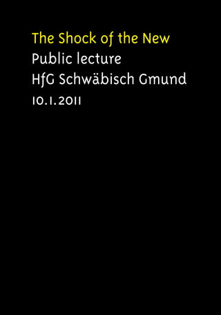
  • 1. The Shock of the New Public lecture HfG Schwäbisch Gmund 10.1.2011
  • 2.
  • 3.
  • 4.
  • 5.
  • 6.
  • 7.
  • 8.
  • 9.
  • 10.
  • 11.
  • 12.
  • 13.
  • 14.
  • 15.
  • 16.
  • 17.
  • 18.
  • 19.
  • 20. Extended version 16.1.2011 [• T 1] [• T 2] ‘neue typographie ist die typographie des besseren lesens, der besseren information, des bestmöglichen angebots für auge und verstand.’ typographie, otl aicher [• T 3] Goodmorning. [• T 4] I am very pleased to meet you. ------------------------------------------------------------------------------------------ [• 5] As you may spot, luckely, I am listed in ‘Dutch Graphic Design. A century of innovation’ [• 6] which was published in 2006. [• 7] An early example of my work, presented on page 378, is from 1991. [• 8] The same bookcover for ‘The Shock of the New’ by Robert Hughes is on the next slide, [• 9] but surrounded by some of my designs out of the same period, [• 10] which is exactly twenty years ago! Please excuse me for talking English. [• 11] To show my very best [• 12] I prepared most textslides in German [• 13] and enjoyed reading [• 14] these outstanding titles [• 15] to catch some remarkable quotes [• 16]. So this lecture is really up-to-date because it is bi-lingual [• 17], cross cultural [• 18], and very global [• 19]. By the way is n’t it interesting, in this perspective, that Nandhini Mehra [• 20], a young Indian designer who graduated in May 2010 at Savannah College of Art & Design in Atlanta (US), is presenting a bilingual poster on DIN [• 21], a famous, anonymous German typeface, which was re-drawn as FF DIN [• 22] by Abert Jan Pool [• 23], a
  • 21. Dutch typedesigner working in Hamburg, because Erik Spiekerman [• 24] – at that time still at Meta Design in Berlin – told him to, while finalizing the 1994 ATypI conference in San Fransisco? As an intermezzo,– to introduce myself, I selected three examples of my recent, mainly, editorial work. • First [• T 25]: Dutch opinion magazine Vrij Nederland (main issue: handling the transformation from newspaper to magazine) • Second [• T 30]: First View, a visual report of the Willem de Kooning Academy Fashion Show 2009 (main task: the manual selection of over 1,000 photographs) • Third [• T 34]: Ben Joosten, a monography (main issue: the balance between much to much text and the actual work) Today on special request i am going to talk to you about ‘basics’ & typography. PREFACE [• T 38] [• T 39] ‘Die Aufgabe beschreiben, ist ein Teil der Lösung. Impliziert: die kreativen Entscheide nicht dem gefühl entsprechend treffen, sondern nach intellektuellen Kriterien. Je präziser und vollständiger diese sind, desto kreativer is die Arbeit.’ Programme entwerfen, Karl Gerstner Already for ages Typography is a simple craft driven by language and logic [• 40], and practised by deducting and combining [• 41]. Please do not misunderstand me: some assignments – for instance a newspaper [• 42], which nowadays in fact is a ‘communication package’ [• 43], and probably will be publicated in print, online [• 44] and via several mobile applications [• 45] – may be very complex [• 46],– I am only aiming at the resources.
  • 22. [• 47] This contemporary solution by CAFA students presented on the Beijing campus during Icograda 2009 in a beautifull building [• 48] designed by the renowned Japanese architect Arata Isozaki [• 49] did remind me of another important, distinctive, characteristic of Typography: it is user orientated. [• 50] The overal design will be tested, in a very straightforward way, by the user, probably a reader, in the end. Always . . . . . . [• 51] In this case the legibility was ok, but the usability was not sufficient. I got lost. [• 52] I am not a product designer but I suppose some resemblance with an actual design philosophy like ‘User Centered Design’ does exist, since UCD [• 53] focuses on the needs and abilities of the user, in order to create applications, which are easy to use, and are of added value. [• 54] My approach to typography has always been systematic and might be called programmatic. [• T 55] ‘Programme entwerfen: Warum ist es so schwierig, was gemeint ist, kurz und bündig zu definieren? Der Untertitel: statt Lösungen für Aufgaben Programnme für Lösungen ist zwar präzis, aber kaum plastischer als der Titel.’ Programme entwerfen, Karl Gerstner Like others I distinguish a comprehensive, media independent, set of related variables like for instance: type, pointsize, linelenght and transport. [• T 56] ‘Gute Typographie ist wesentlich ein Ergebnis wohlüberlegter Anordung. Einer ungeschickten Anordnung helfen selbst die allerschönsten Schriften nichts, aber selbst mit mittelmäßig guten Schriften kann man eine gefällige Anordnung treffen.’ Erfreuliche Drucksachen durch gute Typographie, Jan Tschichold
  • 23. Although the same basic set is used over and over, the solution to a problem is unique when the selection and use of variables differ, and the assignment of values depend on specific context and content. [• T 57] ‘Das Technische, Praktische und Ästhetische sind nicht Teilgebiete der Typographie, sondern Seiten an ihr, es sind Teilaufgaben, die mit jeder Einzelaufgabe immer wieder gestellt werden.’ Die Kunst der Typographie, Paul Renner Society is rapidly transforming, and technique is always innovating. The industry is completely digitilized during the last thirty years of the past century. Please look at the next two sequences. [• T 58] Printing [• 59-74] . . . [• 75] Recently the Espresso Book Machine is available at the American Book Center in Amsterdam and will deliver anybody a book within minutes if an accurate .pdf is provided. [• T 76] Composing . . . [• 77] By the way it is a persistent misconception to suggest Gutenberg ‘invented’ printing: the Chinese did. [• 78] He introduced typecasting and the use of movable type. [• 79] Gutenberg – originally a goldsmith – changed profession to become a punchcutter and printer. [• 80-98] [• 99] Of course, we all know ‘the reader’ is rather conventional . . . [• 100] But how come the fundamentals of Typography did hardly change? [• 101] Is n’t the issue more related to the biological: to the ‘universal’ human eye and the brain? [• 102] More specific is it because we are reading from left to right, from top to bottom, already for quite some time?
  • 24. [• 103] Maybe with the introduction of the e-book, the smartphone and the i-pad, our reading habits will change as some predict. [• 104] But how and why exactly? [• 105] Only because of the introduction of a non-linear time-ax and a much more layered environment? [• T 106] ‘schrift ist der visuelle niederschlag von sprache. was heißt das?’ die welt als entwurf, otl aicher Will we stop reading in one direction? Or will the replacement of language by image, in visual communication – which is happening at this very moment – not prove to be much more influential concerning the scope of typography? [• 107] The Egyptian hieroglyphic system, which increased from approximatly seven hundred to around five thousand signs, is not only made up of pictographs, but also of phonograms and determinatives. [• 108] Most important, hieroglyphs are written from right to left, or from left to right, or from top to bottom. The reader must consider the direction in which the asymmetrical hieroglyphs are turned in order to determine the proper reading order. [• 109] Jean-François Champillion was the first to understand the originality of the script, and explained how to decipher the hieroglyphic in Précis du Système Hiëroglyphique which was publicated in 1824. [• 110] ‘It is a complex system, writing figurative, symbolic, and phonetic all at once, in the same text, the same phrase, I would almost say in the same word.’, he writes in a letter to his editor two years before.
  • 25. BASICS [• T 111] [• 112] ‘Elementare Typographische Gestaltung ist die Schaffung der logischen und optischen Beziehung der durch die aufgabe gegebene Buchstaben, Wörter, Satzteile.’ Elementare Typographie, Iwan Tschichold Some years ago I had to re-think a Typography programme concerning the first two years of a four year curriculum. [• 113] ‘Das einzelne Wort und die Satzseite [...] sind die Elementaraufgaben, an denen wir die algemeinsten Formgesetze kennenlernen wollen [...]’ Die Kunst der Typographie, Paul Renner I must have been in pretty good shape and rather concentrated, because I ‘treasured’ an obvious structure quite soon. [• T 114] (‘Das Programm’) First [• T 115] 1. Letter [• T 116] Second [• T 117] 2. Word [• T 118] Third [• T 119] 3. Sentence [• T 120] Fourth [• T 121] 4. Paragraph [• T 122] Fifth [• T 123] 5. Page [• T 124] Sixth [• T 125] 6. Book [• T 126] Now I could easily scedule [• T 127] Typehistory [• 128, 129, 130, 131],– [• T 132] Classification [• 133, 134, 135, 136] and,– [• T 137] Nomenclature [• 138, 139, 140], and of course also the most important typographic basics – first introduced by Emiel Ruder [• 141] – like [• T 142] Contrast [• 143, 144],– [• T 145] Direction [• 146, 147]
  • 26. and [• T 148] Rhytm [• 149, 150] ([• 151] I am sorry this is not typography . . . but is it not a beautifull painting?). Also within this frame we would study [• T 152] Proportions [• 153, 154, 155, 156, 157], the inner [• T 158] Relations [• T159] ‘[...], jede Schrift findet ihre beste Lesbarkeit und ihre günstigste Wirkung bei bestimmten Zeilenbreiten, Zeilenabständen und Wortzwischenräumen.’ Die Kunst der Typographie, Paul Renner and all about [• T 160] White (called space in typography) [• 161, 162, 163], et cetera. [• 164] I even could pay [• 165] some attention to [• 166] visual poetry [• 167], to tribute Jan Vermeulen [• 168], my own typography teacher [• 169], who might start one of his lessons by reciting, poets like, Gerrit Achterberg [• 170] or J.C. Bloem [• 171], presumably to indicate the strong relation between language and typography . . . [• T 172] Spring Through desolate spring skies the sun broke clear. A flight of birds dropped in a sudden sheer. The thinly sown snow melted on the earth. Heart, you are free: you had no grounds for fear. J.C. Bloem [• 173] In the end the only real problem to tackle seemed to be rather formal: how to fit the course in four semesters while the division is in six? [• 174] Sometime later I discovered – by coïncidence – that Paul Renner [• 175] used more or less the same subdivision in ‘Die Kunst der Typographie’ (Erstes Kapitel: Das Einzelwort // Zweites Kapitel: Die Satzseite // Drittes Kapitel: Das Buch) before he wanders from his subject to head for other directions. [• 176] The ‘link’ with Jan Tschichold – Iwan at that time – is quite obvious, since
  • 27. Tschichold wrote, in Leipzig, some twenty years before [• 177]: ‘6. Elementare typografische Gestaltung ist die Schaffung der logischen und optischen Beziehung der durch die Aufgabe gegebenen Buchstaben, Wörter, Satzteile.’ [• 178] Once more, in this context, demonstrating the elegance of the scheme [• 179] I would like to emphasize the break between the third and fourth item, [• 180] to classify the first part as ‘basic’ [• 181], and the second as ‘advanced’ [• 182, 183]. [• 184, 185, 186] [• 187] So no, I would not change the format [• 188] if someone would ask me to re- think the programme once again, [• 189] [• 190] although actualizing assignments, [• 191] and keeping all information up to date, [• 192] is always required in education. [• 193] In The Tipping Point – an excellent study, and wonderful guide, which should be read by every design-student – Malcolm Gladwell is introducing three kind of people who matter in a social epidemic. [• 194] Connectors: ‘people with a special gift for bringing the world together’, and ‘who know everyone’. [• 195] Mavens – the word comes from the Yiddish, and it means one who accumulates knowledge – ‘information brokers, sharing and trading what they know’. Mavens are data banks. They provide the message.’ [• 196] ‘Connectors are social glue: they spread it. [• 197] But there is also a select group of people – Salesman – with the skills to persuade us when we are unconvinced of what we are hearing [. . .].’ [• 198] Although it is not the task of a teacher to start, nor spread an epidemic, I am quite sure something of a Connector or/and a Maven is in us all. Or to put it in Gladwells words: ‘To be a Maven is to be a teacher.’ But apart from actualizing . . . [• 199] after visiting the Shanghai International Fashion Culture Festival in 2010 and listening to a stunning lecture titled: What guides the designer’ hand? Inside the ultimate design studio: the brain by Art Historian John Onians [• 200], I am prudently concluding every design programme might need some tuning re-introducing the manual experiment. [• 201] Recent neuroscientific insights seem to
  • 28. confirm not only the eye and the hand need training, also the designers brain needs manual feed to keep in optimum condition. [• 202] The key concept to grasp is that of neural plasticity. I quote: [• 203] ‘Another is that the laying down of those memories is associated with structural changes in the brain. [• 204] We have always known that previous experience is important for artistic success, but we never knew exactly why. [• 205] Now we know that it is because each experience we have actually changes our brain’s structure, leaving us with better resources for dealing with that particular experience if we have it again.’ And: [• 206] ‘Each trained artist or designer acquires over time a brain whose structure helps him or her to perform the particular tasks he or she is engaged in. [• 207] The process by which this happens is one that is only recently has been understood. [. . .] [• 208] By concentrating on a particular activity we redesign the area of the brain that we use for it. [. . .] [• 209] Of course those neurally based motor skills will then influence his own work, [• 210] and they will do so without him being conscious of it. [• 211] This is one of the most important insights yielded by neuroscience. [• 212] In a field like art or design you can have lots of bright ideas, [• 213] but if you don’t have the required motor skills with pencil or mouse your work will not be a success.’ [• 214, 215, 216] During the past years, I provided a manual exercise, each time at the start of a fresh course. [• 217, 218, 219] Not only to introduce type quite straightforward to all students, [• 220, 221, 222] and encourage them to develop some basic skills. [• 223, 224, 225] But also to enable me to start memorizing all those new names after finishing the project. [• 226, 227, 228] The first class in the sequence is of 1981. [• 229, 230] The last pictures, which are actually selfportraits, are of 2006.
  • 29. BEYOND [• T 231] [• T 232] ‘Die Lese-Erfahrungen gelten für die Handsatz-Technik von vor 400 Jahren wie für die Technik von übermorgen. Selbst wenn Bücher nicht mehr auf Papier gedruckt werden sollten, bleibt vieles gültig.’ LeseTypo, Hans Peter Willberg Remains the last part of this talk, which is about The State Of The Art In The Digital Age . . . . . . I have already described the change of the profession due to a number of technologic innovations. Probably design and technology are linked due to mass- production. [• 233] Is design not driven by technology? [• 234] . . . And I have tried to research the state of mind of The Contemporary Reader. Ok, the times they are a-changing [• 235], but are we? [• 236] Meantime, over time, we all changed pencils, [• 237] and bought quite expensive digital ones. Which reminds me: back in the seventees, [• 238] I was one of the first graphic designers in Holland [• 239] working on a huge mainframe [• 240] studying Fortran and [• 241] Computer Sound Synthesis. Then in the eighties, starting as a feelancer, I – of course – could not afford a Mac. [• 242] Much to expensive, and over budget. [• 243] So, those first years, we mainly used Atari . . . [• 244] [• 245] . . . Besides the (German)machine was quite good, [• 246] especially because the ST was ‘open’ & easy to program. As an example I’d like to present these early digital sketches, [• 247] made with Degas, the popular, Atari based, much cheaper rival of Mac Draw [• 248-251]. The assignment is a very special stamp, [• 252, 253] which is distributed in the beginning of december by Royal Dutch Post.
  • 30. So I guess my remark that programming, writing code – for instance simple pen-up- pen-down Turtle Graphics [• 254] – should be part of every up-to-date curriculum to offer students another perspective and influence design-methodology, is not surprising. Like Harold Abelson is stating in the Preface of Turtle Geometry: [• 255] ‘It is our hope that these powerfull but simple tools for creating and exploring richly interactive environments will dissolve the barriers to the production of knowledge as the printing press dissolved barriers to its transmission.’ [• 256] ‘This hope is more than our wish for students to experience the joy of discovery and the give and take between investigator and investigation that typifies scientific research. Like Piaget, Dewey, and Montessori, we are convinced that personal involvement and agency are essential to truly effective education.’ [• 257] In this first year exercise, [• 258] students did experience some of the main difficulties, [• 259] when digitalizing type manually, on a primitive grid. [• 260] They all had to study the characteristics of a typeface closely, [• 261] while choosing between zero or one, which in fact may be converted in ink, or no ink . . . [• 262] Another example: third year. [• 263] What about existing Dot Matrix Alphabets? [• 264] And how to create your own? [• 265] This exercise is about black and white, scale, legibillity and consistency most and for all. [• 266] Nowadays students of course should learn everything about stylesheets, [• 267] Adobe InDesign and XML. [• 268] They should study the applications of Woodwing, a Dutch based rather succesfull firm specialized in Cross Media & Publishing. [• 269] But I am afraid, by then, they have entered the professional domain of advanced Typography. [• 270] We have passed the bounderies of the basic anyhow. Time to stop. ------------------------------------------------------------------------------------------ [• T 271] Thank you. [• T 272] Any questions?