
Recomendados
Mais conteúdo relacionado
Mais procurados
Mais procurados (20)
Semelhante a contents page
Semelhante a contents page (20)
Mais de stephanieallmark64
Último
Último (20)
contents page
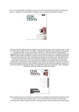
- 1. For my Contents page I wanted to layout all of the information first before including the picture. I wanted to create different designs and see which best fitted my genre. This was my first attempt for the layout of my Contents page. Like my front cover I used the same font, Trajan Pro for Contents. I decided to split the word contents up because i thought this was unique and made it stand out. The blur behind it was done by duplicating the layer, changing the colour and using Gaussian blur. I experimented with different colours like red which I used on the front cover however I decided against this and used the colour blue from the featuring articles on the front cover. My Idea for the "what’s hot this week" came from Kerrang magazine as I wanted to include a main information focal point. One could argue I complied to using standard conventions. Behind this I used a paint splat image to inject colour and vibrancy. I then put a border around the page to frame in and included a box at the top with the magazine name in it. I liked this idea and wanted to keep it consistent through the magazine. I then uploaded the album pictures, featured on the front cover. After looking back at my research and planning I decided to take further inspiration from it and rearrange the contents page. I put a box behind the "whats hot this week" information to make it stand out more, making it seem more important and drawing the
- 2. eye to it first. I created another box to put at the side of the page to make the pages stand out more as it where the readers will want to look for the information therefore it is easier to find. I changed the opacity of both the boxes so they didn't look as boring and wasnt just block colours. I put the information about the pages to the right of the page to make it look more unique as in other magazines it is sometimes for to the right, I this way I was ignoring standard conventions. I used blue and pink in pattern order to make it more clear that they was separate subject and to create colour diversity on the page. I also decided to take off the blur behind contents but it is something I wanted to consider and carry on from the title on the front page. I moved the position of my album pictures to the top of the page to make them more of a focal point and this way I could put "New releases" next to it which worked more effectively that at the bottom. The finally I included a page number at the bottom. Next I incorporated my main image onto my contents page, this worked really well as it fitted in with my layout. I changed some things to make it look better such as elongating the box to the right and making the opacity lower, also I deleted the image behind the "what's hot this week box" and then put another white box behind the content information and made the capacity low. I put the blur behind "Contents" again as I thought it works, but this time I made it pink instead of blue. In the bottom right corner I have included some of the poster pictures that will be included in my magazine and made them different sizes to create diversity and put a slight black line around the images. I also but a darker background blur behind "New releases" to make it stand out more.
- 3. After some feedback and evaluation I came to the conclusion that my contents page still looked to plain. Although I had darkened the blue text, therefore I used the brush tool to create a darker effect on the background in a rounded motion. However I still felt this wasn’t good enough, and there wasn’t enough diversity between colours as the background was the same colour as the boxes. Therefore, I took and image and put it behind my original one. This gives my contents page more colour and density to it. It fits in with the red and blue theme. To put the image behind my original one I had to gradually rub out the background and do some cropping out. Around the outline of the subject I did a black blue behind him to help it blend in more. From speaking to someone else they thought that my contents page looks better with the image behind it that it did before therefore I kept it but wanted to experiment and change it.
- 4. Therefore whilst I was on the background I experiment with the different layers and chose this one, Linear light. It made the image look more vibrant and less dull. it also stopped it from going al the way down to the page giving it more of a rain effect. I am pleased with my final result and by talking to other class mates they think it is well laid out and the information is clear and stands out. They like the positioning of the photos and the angles that are used.