SlideShare uma empresa Scribd logo
1 de 18
Matching Fabric
INIFD CORPORATE
Academics Support
• Two of the biggest decorating hang ups are choosing colours and picking patterns. We
are so afraid to get it wrong. It feels like such a big decision every time. Think about all
the hours you’ve spent staring at paint chips or wandering the fabric store aisles.
• It doesn’t have to be so hard. There are pre-decisions you can make now that will
make choosing colours and patterns easier every time in the future.
• By figuring out these preferences upfront, you eliminate a whole bunch of options
automatically and you can narrow in on what you really want faster.
What’s your colour style?
• Whether we’re talking colour or
pattern, the feeling you want to create
for your room is the most important
thing.
• Although you can mix colour flavours, it
can get a bit tricky. To avoid colour
clashes, it’s easiest to stick with one
flavour.
What patterns draw you in?
• Group patterns into three main categories;
geometric, organic, and neutral. You can
always create a great pattern mix by choosing
one pattern from each category.
• Geometric patterns are structured,
predictable, repeating patterns. They are
based off of repeating geometric shapes.
Some examples include chevron, polka dot,
and stripe. Because of their bold, graphic
nature geometric patterns tend to be more
energetic.
• Organic patterns are natural, free-flowing,
sometimes curvy patterns. They are based off of
natural motifs and although the patterns are
printed in a repeat, where the repeat begins and
ends isn’t as easy to spot. Some examples include
damask, floral, and animal prints.
• Neutral patterns are pattern-less or barely there
patterns. Examples include solid colours, subtle
textures, and tone-on-tone prints. These are the
“go with everything” type of patterns. From a
pattern perspective, neutral patterns are more
calming and a great way to break up more
energetic patterns.
• There is no right answer for how much pattern to include in a room. There are
gorgeous rooms that don’t have any pattern. On the other end of the spectrum,
there are stunning rooms just dripping with pattern. It’s a personal preference, but
I’ve got a few tips to help you pick the right amount of pattern for you.
• A good rule of thumb is to use three patterns in a room. The mix of three different
patterns creates interest without being overbearing. If you choose one pattern from
each of the three main categories, you can create a nice balanced mix whether your
room is energetic or calm.
• Interior design is about so much more than
sense of style. The way that you employ
symmetry in your home has an impact on your
psyche.
• Counter big, bold patterns with areas of solid
color or neutrals. The more patterns you mix in
a room, the more you need to layer in visual
relief. You need areas where you can pull back,
so you can enjoy the prints you have." Can use
solids to maintain harmony and highlight the
patterns
Combining Different Patterns
• Colours- For the stylish and chic feel try to keep on the patterns in the similar colour
shades or in the same texture such as jewels, pastels and earthy tones. Choose the
same colour shades for the biggest pattern, while the second pattern should match
one of these colours. As for the third one, it can come in a completely different shade.
Make sure to use a colour wheel for a striking result.
• However it is not necessarily using patterns in bold hues. Combining different shades
of neutral hues or even opting for a certain classy hue like beige will result a striking
effect. Even if you pick different patterns in the same colour shade, it will be enough
for creating a chic and sophisticated interior design.
• Size-While introducing bold prints into your
room interior, pay attention to their size. It is
probably the hardest part about mixing
different patterns. Don’t place patterns of
the same size next to each other. For
example, hang window treatments with a
large scale print, while your rug should
feature a smaller pattern. This way you will
get a balanced décor.
• Patterns-There are no strict rules of combining
patterns – it is all up to you. Consider the most
widespread options like floral, stripes, geometrical
prints, zigzags, etc. However, make sure to dilute
patterns with a solid colour in order to balance your
room such as white, which is the safest alternative.
• Professional designers think that various patterns ooze
various vibes. So, if you are planning introducing
patterns in a traditionally-styled room like a dining
room, opt for strict prints like damask or stripes. In
case you want to add a cosy feel to your room,
consider using plaid and tribal prints.
• Textures-Take into consideration textures.
The way the fabric feels influences the way
it will look at your room since certain fabrics
allow intensifying an effect from certain
pattern.
Using Texture to Match
Fabric
• When decorating the interior of a home, texture often
takes a backseat to colour and pattern. While those two
elements are important, they can’t quite stimulate the
senses the way texture does. Textures add dimension
and allows different elements to play off one another,
which keeps the space from looking flat.
• You know how sometimes you can just look at a room
and know that something is missing? All the
components of a complete design are there – colour
scheme, furniture, décor items – but the entire room
just feels a little flat. If this scenario feels familiar, you
are not alone and we might just have the answer you
need: texture.
• For some reason, texture seems to always to be an
afterthought when it comes to interiors and we’re
here to change that. Our reasoning: Texture is the
thing that makes a room pop. It’s what brings a
perfectly fine design up to enviable levels.
While texture may play a supporting role to the
function of the space, it is no less vital to a design’s
success. Instead of examples of texture above,
picture trying to get comfortable on a seating set
made of granite. Always consider how texture will
elevate the overall experience of your design.
• Texture Adds Visual Weight-that an object – or
space as a whole – has the ability to draw
attention to itself. A healthy dose of texture will
makes sure that is not a problem.
Texture works in a similar way. Rough textures
are more likely to make a space feel intimate and
grounded while smooth textures bring a sleeker
more aloof tone to the room.
• You should also consider the placement of
textures as you go about designing your
room. Putting a smooth texture directly
next to a rough one while make the rough
object stand out more and seem weightier
than if you space them apart. Use distance
to determine how subtle of a visual weight
you would like to achieve.
• Texture Provides Balance-contrast is essential when it comes to design because it
keeps things balanced and also provides visual interest. Think about it: If
everything is too similar, our eyes have trouble focusing and tend to glaze over.
Use texture to make sure your most important elements pop.
Restraint, of course, is also key, so try not to go too texture crazy. Stick to two or
three distinct textures in any single space. Choose three when you want people
to take in the space as a whole and stick to two when you want to emphasize a
prominent focal point.

Mais conteúdo relacionado

Semelhante a Matching Fabric.pptx

Elements of design
Elements of designElements of design
Elements of design
MsKPetty
 
Elements&Principles Of Interior Design
Elements&Principles Of Interior DesignElements&Principles Of Interior Design
Elements&Principles Of Interior Design
akilian
 

Semelhante a Matching Fabric.pptx (20)

Interior design Module 1: elements of design
Interior design Module 1: elements of designInterior design Module 1: elements of design
Interior design Module 1: elements of design
 
7 Design Principles
7 Design Principles7 Design Principles
7 Design Principles
 
Principles of interior design
Principles of interior designPrinciples of interior design
Principles of interior design
 
element of design for fashion design student
element of design for fashion design studentelement of design for fashion design student
element of design for fashion design student
 
How To Combine Area Rugs In Open Floor | Designer Rugs
How To Combine Area Rugs In Open Floor | Designer RugsHow To Combine Area Rugs In Open Floor | Designer Rugs
How To Combine Area Rugs In Open Floor | Designer Rugs
 
Elements of design
Elements of designElements of design
Elements of design
 
What are The Elements of Interior Design
What are The Elements of Interior Design What are The Elements of Interior Design
What are The Elements of Interior Design
 
Elements-of-Design-1.pptx
Elements-of-Design-1.pptxElements-of-Design-1.pptx
Elements-of-Design-1.pptx
 
5 tips for decorating a room like a pro
5 tips for decorating a room like a pro5 tips for decorating a room like a pro
5 tips for decorating a room like a pro
 
Clothing and personal appearance
Clothing and personal appearanceClothing and personal appearance
Clothing and personal appearance
 
Zentangle
ZentangleZentangle
Zentangle
 
elements word.docx
elements word.docxelements word.docx
elements word.docx
 
Mahima chaudhary , interior design
Mahima chaudhary , interior designMahima chaudhary , interior design
Mahima chaudhary , interior design
 
Home decor tips
Home decor tipsHome decor tips
Home decor tips
 
How to Pick a Colour and Mix Patterns
How to Pick a Colour and Mix PatternsHow to Pick a Colour and Mix Patterns
How to Pick a Colour and Mix Patterns
 
How to pick a colour
How to pick a colourHow to pick a colour
How to pick a colour
 
Elements&Principles Of Interior Design
Elements&Principles Of Interior DesignElements&Principles Of Interior Design
Elements&Principles Of Interior Design
 
How to decorate your bedroom
How to decorate your bedroomHow to decorate your bedroom
How to decorate your bedroom
 
Final
FinalFinal
Final
 
Elements and principles of design in Dressmaking
Elements and principles of design in DressmakingElements and principles of design in Dressmaking
Elements and principles of design in Dressmaking
 

Mais de ssuser0019f9 (6)

ID DHANVI- VISUALPPT 1.pptx
ID DHANVI- VISUALPPT  1.pptxID DHANVI- VISUALPPT  1.pptx
ID DHANVI- VISUALPPT 1.pptx
 
Statistics focus.pptx
Statistics focus.pptxStatistics focus.pptx
Statistics focus.pptx
 
INTERIORs.pptx
INTERIORs.pptxINTERIORs.pptx
INTERIORs.pptx
 
Equipment and Material.pdf
Equipment and Material.pdfEquipment and Material.pdf
Equipment and Material.pdf
 
GenNext Application PPT LFW Oct 2023.pptx
GenNext Application PPT LFW Oct 2023.pptxGenNext Application PPT LFW Oct 2023.pptx
GenNext Application PPT LFW Oct 2023.pptx
 
Line.pptx
Line.pptxLine.pptx
Line.pptx
 

Último

The basics of sentences session 3pptx.pptx
The basics of sentences session 3pptx.pptxThe basics of sentences session 3pptx.pptx
The basics of sentences session 3pptx.pptx
heathfieldcps1
 
Making and Justifying Mathematical Decisions.pdf
Making and Justifying Mathematical Decisions.pdfMaking and Justifying Mathematical Decisions.pdf
Making and Justifying Mathematical Decisions.pdf
Chris Hunter
 
1029 - Danh muc Sach Giao Khoa 10 . pdf
1029 -  Danh muc Sach Giao Khoa 10 . pdf1029 -  Danh muc Sach Giao Khoa 10 . pdf
1029 - Danh muc Sach Giao Khoa 10 . pdf
QucHHunhnh
 

Último (20)

The basics of sentences session 3pptx.pptx
The basics of sentences session 3pptx.pptxThe basics of sentences session 3pptx.pptx
The basics of sentences session 3pptx.pptx
 
Making and Justifying Mathematical Decisions.pdf
Making and Justifying Mathematical Decisions.pdfMaking and Justifying Mathematical Decisions.pdf
Making and Justifying Mathematical Decisions.pdf
 
Explore beautiful and ugly buildings. Mathematics helps us create beautiful d...
Explore beautiful and ugly buildings. Mathematics helps us create beautiful d...Explore beautiful and ugly buildings. Mathematics helps us create beautiful d...
Explore beautiful and ugly buildings. Mathematics helps us create beautiful d...
 
microwave assisted reaction. General introduction
microwave assisted reaction. General introductionmicrowave assisted reaction. General introduction
microwave assisted reaction. General introduction
 
Ecological Succession. ( ECOSYSTEM, B. Pharmacy, 1st Year, Sem-II, Environmen...
Ecological Succession. ( ECOSYSTEM, B. Pharmacy, 1st Year, Sem-II, Environmen...Ecological Succession. ( ECOSYSTEM, B. Pharmacy, 1st Year, Sem-II, Environmen...
Ecological Succession. ( ECOSYSTEM, B. Pharmacy, 1st Year, Sem-II, Environmen...
 
Basic Civil Engineering first year Notes- Chapter 4 Building.pptx
Basic Civil Engineering first year Notes- Chapter 4 Building.pptxBasic Civil Engineering first year Notes- Chapter 4 Building.pptx
Basic Civil Engineering first year Notes- Chapter 4 Building.pptx
 
Food Chain and Food Web (Ecosystem) EVS, B. Pharmacy 1st Year, Sem-II
Food Chain and Food Web (Ecosystem) EVS, B. Pharmacy 1st Year, Sem-IIFood Chain and Food Web (Ecosystem) EVS, B. Pharmacy 1st Year, Sem-II
Food Chain and Food Web (Ecosystem) EVS, B. Pharmacy 1st Year, Sem-II
 
How to Give a Domain for a Field in Odoo 17
How to Give a Domain for a Field in Odoo 17How to Give a Domain for a Field in Odoo 17
How to Give a Domain for a Field in Odoo 17
 
General Principles of Intellectual Property: Concepts of Intellectual Proper...
General Principles of Intellectual Property: Concepts of Intellectual  Proper...General Principles of Intellectual Property: Concepts of Intellectual  Proper...
General Principles of Intellectual Property: Concepts of Intellectual Proper...
 
INDIA QUIZ 2024 RLAC DELHI UNIVERSITY.pptx
INDIA QUIZ 2024 RLAC DELHI UNIVERSITY.pptxINDIA QUIZ 2024 RLAC DELHI UNIVERSITY.pptx
INDIA QUIZ 2024 RLAC DELHI UNIVERSITY.pptx
 
Grant Readiness 101 TechSoup and Remy Consulting
Grant Readiness 101 TechSoup and Remy ConsultingGrant Readiness 101 TechSoup and Remy Consulting
Grant Readiness 101 TechSoup and Remy Consulting
 
1029 - Danh muc Sach Giao Khoa 10 . pdf
1029 -  Danh muc Sach Giao Khoa 10 . pdf1029 -  Danh muc Sach Giao Khoa 10 . pdf
1029 - Danh muc Sach Giao Khoa 10 . pdf
 
ICT Role in 21st Century Education & its Challenges.pptx
ICT Role in 21st Century Education & its Challenges.pptxICT Role in 21st Century Education & its Challenges.pptx
ICT Role in 21st Century Education & its Challenges.pptx
 
Holdier Curriculum Vitae (April 2024).pdf
Holdier Curriculum Vitae (April 2024).pdfHoldier Curriculum Vitae (April 2024).pdf
Holdier Curriculum Vitae (April 2024).pdf
 
Presentation by Andreas Schleicher Tackling the School Absenteeism Crisis 30 ...
Presentation by Andreas Schleicher Tackling the School Absenteeism Crisis 30 ...Presentation by Andreas Schleicher Tackling the School Absenteeism Crisis 30 ...
Presentation by Andreas Schleicher Tackling the School Absenteeism Crisis 30 ...
 
ICT role in 21st century education and it's challenges.
ICT role in 21st century education and it's challenges.ICT role in 21st century education and it's challenges.
ICT role in 21st century education and it's challenges.
 
Class 11th Physics NEET formula sheet pdf
Class 11th Physics NEET formula sheet pdfClass 11th Physics NEET formula sheet pdf
Class 11th Physics NEET formula sheet pdf
 
TỔNG ÔN TẬP THI VÀO LỚP 10 MÔN TIẾNG ANH NĂM HỌC 2023 - 2024 CÓ ĐÁP ÁN (NGỮ Â...
TỔNG ÔN TẬP THI VÀO LỚP 10 MÔN TIẾNG ANH NĂM HỌC 2023 - 2024 CÓ ĐÁP ÁN (NGỮ Â...TỔNG ÔN TẬP THI VÀO LỚP 10 MÔN TIẾNG ANH NĂM HỌC 2023 - 2024 CÓ ĐÁP ÁN (NGỮ Â...
TỔNG ÔN TẬP THI VÀO LỚP 10 MÔN TIẾNG ANH NĂM HỌC 2023 - 2024 CÓ ĐÁP ÁN (NGỮ Â...
 
Unit-IV; Professional Sales Representative (PSR).pptx
Unit-IV; Professional Sales Representative (PSR).pptxUnit-IV; Professional Sales Representative (PSR).pptx
Unit-IV; Professional Sales Representative (PSR).pptx
 
Sociology 101 Demonstration of Learning Exhibit
Sociology 101 Demonstration of Learning ExhibitSociology 101 Demonstration of Learning Exhibit
Sociology 101 Demonstration of Learning Exhibit
 

Matching Fabric.pptx

  • 2. • Two of the biggest decorating hang ups are choosing colours and picking patterns. We are so afraid to get it wrong. It feels like such a big decision every time. Think about all the hours you’ve spent staring at paint chips or wandering the fabric store aisles. • It doesn’t have to be so hard. There are pre-decisions you can make now that will make choosing colours and patterns easier every time in the future. • By figuring out these preferences upfront, you eliminate a whole bunch of options automatically and you can narrow in on what you really want faster.
  • 3. What’s your colour style? • Whether we’re talking colour or pattern, the feeling you want to create for your room is the most important thing. • Although you can mix colour flavours, it can get a bit tricky. To avoid colour clashes, it’s easiest to stick with one flavour.
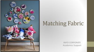
  • 4. What patterns draw you in? • Group patterns into three main categories; geometric, organic, and neutral. You can always create a great pattern mix by choosing one pattern from each category. • Geometric patterns are structured, predictable, repeating patterns. They are based off of repeating geometric shapes. Some examples include chevron, polka dot, and stripe. Because of their bold, graphic nature geometric patterns tend to be more energetic.
  • 5. • Organic patterns are natural, free-flowing, sometimes curvy patterns. They are based off of natural motifs and although the patterns are printed in a repeat, where the repeat begins and ends isn’t as easy to spot. Some examples include damask, floral, and animal prints. • Neutral patterns are pattern-less or barely there patterns. Examples include solid colours, subtle textures, and tone-on-tone prints. These are the “go with everything” type of patterns. From a pattern perspective, neutral patterns are more calming and a great way to break up more energetic patterns.
  • 6. • There is no right answer for how much pattern to include in a room. There are gorgeous rooms that don’t have any pattern. On the other end of the spectrum, there are stunning rooms just dripping with pattern. It’s a personal preference, but I’ve got a few tips to help you pick the right amount of pattern for you. • A good rule of thumb is to use three patterns in a room. The mix of three different patterns creates interest without being overbearing. If you choose one pattern from each of the three main categories, you can create a nice balanced mix whether your room is energetic or calm.
  • 7. • Interior design is about so much more than sense of style. The way that you employ symmetry in your home has an impact on your psyche. • Counter big, bold patterns with areas of solid color or neutrals. The more patterns you mix in a room, the more you need to layer in visual relief. You need areas where you can pull back, so you can enjoy the prints you have." Can use solids to maintain harmony and highlight the patterns
  • 9. • Colours- For the stylish and chic feel try to keep on the patterns in the similar colour shades or in the same texture such as jewels, pastels and earthy tones. Choose the same colour shades for the biggest pattern, while the second pattern should match one of these colours. As for the third one, it can come in a completely different shade. Make sure to use a colour wheel for a striking result. • However it is not necessarily using patterns in bold hues. Combining different shades of neutral hues or even opting for a certain classy hue like beige will result a striking effect. Even if you pick different patterns in the same colour shade, it will be enough for creating a chic and sophisticated interior design.
  • 10. • Size-While introducing bold prints into your room interior, pay attention to their size. It is probably the hardest part about mixing different patterns. Don’t place patterns of the same size next to each other. For example, hang window treatments with a large scale print, while your rug should feature a smaller pattern. This way you will get a balanced décor.
  • 11. • Patterns-There are no strict rules of combining patterns – it is all up to you. Consider the most widespread options like floral, stripes, geometrical prints, zigzags, etc. However, make sure to dilute patterns with a solid colour in order to balance your room such as white, which is the safest alternative. • Professional designers think that various patterns ooze various vibes. So, if you are planning introducing patterns in a traditionally-styled room like a dining room, opt for strict prints like damask or stripes. In case you want to add a cosy feel to your room, consider using plaid and tribal prints.
  • 12. • Textures-Take into consideration textures. The way the fabric feels influences the way it will look at your room since certain fabrics allow intensifying an effect from certain pattern.
  • 13. Using Texture to Match Fabric
  • 14. • When decorating the interior of a home, texture often takes a backseat to colour and pattern. While those two elements are important, they can’t quite stimulate the senses the way texture does. Textures add dimension and allows different elements to play off one another, which keeps the space from looking flat. • You know how sometimes you can just look at a room and know that something is missing? All the components of a complete design are there – colour scheme, furniture, décor items – but the entire room just feels a little flat. If this scenario feels familiar, you are not alone and we might just have the answer you need: texture.
  • 15. • For some reason, texture seems to always to be an afterthought when it comes to interiors and we’re here to change that. Our reasoning: Texture is the thing that makes a room pop. It’s what brings a perfectly fine design up to enviable levels. While texture may play a supporting role to the function of the space, it is no less vital to a design’s success. Instead of examples of texture above, picture trying to get comfortable on a seating set made of granite. Always consider how texture will elevate the overall experience of your design.
  • 16. • Texture Adds Visual Weight-that an object – or space as a whole – has the ability to draw attention to itself. A healthy dose of texture will makes sure that is not a problem. Texture works in a similar way. Rough textures are more likely to make a space feel intimate and grounded while smooth textures bring a sleeker more aloof tone to the room.
  • 17. • You should also consider the placement of textures as you go about designing your room. Putting a smooth texture directly next to a rough one while make the rough object stand out more and seem weightier than if you space them apart. Use distance to determine how subtle of a visual weight you would like to achieve.
  • 18. • Texture Provides Balance-contrast is essential when it comes to design because it keeps things balanced and also provides visual interest. Think about it: If everything is too similar, our eyes have trouble focusing and tend to glaze over. Use texture to make sure your most important elements pop. Restraint, of course, is also key, so try not to go too texture crazy. Stick to two or three distinct textures in any single space. Choose three when you want people to take in the space as a whole and stick to two when you want to emphasize a prominent focal point.