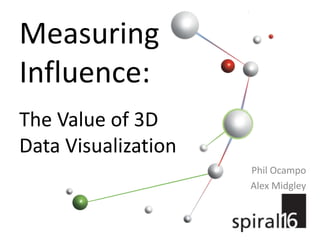
Measuring Influence: The Value of 3D Data Visualization
•
10 gostaram•1,622 visualizações

You’ve seen the graphics—a cluster of colored spheres with seemingly random connections between them, spread out in empty space like a spider’s web. In actuality, it’s not random at all, but a 3D visual map of the links between the key influencers on the Internet talking about your brand. This session will help you understand how to identify the most influential conversations, measure the brand reach of a message, and understand where positive and negative “hot spots” are within your ecosystem. Before you engage with key influencers, you have to first determine how to prioritize your engagement opportunities, and visual mapping is a great place to start.

Recomendados
Mais conteúdo relacionado
Mais procurados
Mais procurados (20)
Destaque
Destaque (11)
Semelhante a Measuring Influence: The Value of 3D Data Visualization
Semelhante a Measuring Influence: The Value of 3D Data Visualization (20)
Mais de Spiral16
Mais de Spiral16 (14)
Último
Último (20)
Measuring Influence: The Value of 3D Data Visualization
- 1. MeasuringInfluence: The Value of 3D Data Visualization Phil Ocampo Alex Midgley
- 2. What is data visualization? Christopher Clark, "A Visual History Of Loudness." “The main goal of data visualization is to communicate information clearly and effectively through graphical means.” Vitaly Friedman, Smashing magazine Nathan Yau, FlowingData.com
- 3. You’re using it every day and you don’t even realize it. "The 30-Second Rule, A Decision Tree" by Audrey Fukman and Andy Wright
- 4. Raw data takes awhile to delve into.
- 5. That’s why we use visualizations to make sense of data quickly.
- 6. This data shows a lot of valuable information, but where do you start?
- 7. Data visualization is all about communication. Understand and measure data sets quickly. Communicate your conclusions effectively.
- 9. Recognizing parallel or non-parallel lines
- 10. Grouping objects
- 12. Best-fit line Linear regression quickly identifies major trends and outliers. Gapminder World (gapminder.org)
- 13. Area chart This area chart places niche retail selling in the long tail—giving you a visual idea of how this sales strategy works. Chris Anderson, The Long Tail: Why the Future of Business Is Selling Less of More
- 14. Heat maps A heat map compares the values of related variables and can overlay information on a familiar image, making it easier to understand. GasBuddy.com U.S. National Gas Price Heat Map
- 15. It is more than just a pretty picture.
- 16. Applying data visualization to social networks Directors with the most movies in common became groups denoted by the same color. This grouping was made clear by using a social network map. Inner circle is black, outliers are white. Andrew Bond, Analytical Visions
- 17. How is data visualization useful to me? After analysis, it’s time to present your conclusions in a dynamic way. What better way to do that than by using data visualization?
- 18. Conan vs. Leno: A Study in Media Wars Questions: Who are the influencers? Where are people talking? Who carries more weight?
- 19. Measuring influence Spheres are URLs, lines represents Internet hyperlinks. The ‘I’m With Coco’ Facebook fan page is a real “hot spot”—the most influential URL in the visualization. Red lines show that the links were all incoming, which are the most valuable. The Facebook page became a lightning rod and gave a voice to all Conan fans who felt slighted by Leno. Conan/Leno case study
- 21. The web pages all link to each other, but very few are linking to them.The highlighted URL only has one inbound and one outbound link, but its influence ranking is 135 because it is the portal through which all other URLs in the grouping are linked to the rest of the Web.
- 22. Domain interconnectivity The big cluster of green lines show Huffington Post is linking all of their Conan-related posts to each other. The users coming to the Huffington Post stories are checking out all the other stories on the site. The red lines show that the Huffington Post stories are the targets of several inbound links as well. The Huffington Post was the 8th most influential domain with 28 URLs.
- 23. Semantic analysis The Conan insight had more than twice the number of URLs in it (55%) than the Team Leno topic. Conan sampling = 4,061 URLsLeno sampling = 1,829 URLs The word “Conan” was the most-used word in both insights.
- 25. Measure the brand reach of a message
- 27. Identify key influencers and authoritative online voices
- 29. Understand where positive and negative “hot spots” are within your ecosystem
- 30. Manage marketing spend more effectively