Ixda Final
•
0 gostou•211 visualizações

The document summarizes the redesign process of a digital camera's user interface through three phases: 1) Evaluation of the original interface identified areas for improvement like confusing icons and menu organization. Participatory design with paper prototypes gathered user feedback. 2) Ideation led to changes in physical buttons and interface design decisions informed by market research. A 3D printed model was created for further testing. 3) Usability testing of revised flows and models identified minor issues that were addressed. The final flows and task solutions demonstrated improved usability.

Recomendados
Recomendados
Mais conteúdo relacionado
Destaque
Último
Último (20)
Ixda Final
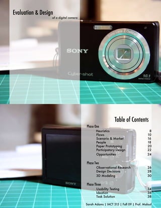
- 1. Evaluation & Design of a digital camera Table of Contents Phase One Heuristics 8 Flows 10 Scenario & Market 16 People 18 Paper Prototyping 20 Participatory Design 22 Opportunities 24 Phase Two Observational Research 26 Design Decisions 28 3D Modeling 30 Phase Three Usability Testing 34 Ideation 36 Task Solution 38 Sarah Adams | IACT 315 | Fall 09 | Prof. Malouf
- 2. Phase One Evaluating the camera and discovering opportunities for improvement. When I first evaluated the camera, I walked it through some simple steps looking for errors or confusion. While exploring its interface, I looked for task flows that I would later use in testing. Heuristic Evaluation Examining the interface of the camera, and comparing it to a set of standards. Imediately I saw the confusion of having the same button work for both the smile feature and deletion. The smile shutter was prominently advertised on the camera packaging as well, so I knew this was going to be one of the flows I tested. Trimming was also a confusing task, as the icons were vague. When trying to crop an item, the Menu button served two purposes. It served as the “next” button, and “return”. When used to try and leave the next step, it would just toggle between the two screens without any clear way of escaping. The Menu button was also inappropriately used when trying to delete multiple photos. To delete the photos, it was required to use Menu, when the trash-can button would have been a more obvious one.
- 3. Flows to Examine Choosing tasks that will explore the camera’s interface and provide valuable feed-back during the usability testing. Flow 1: Taking a Photo Flow 2: Deleting Multiple Images 10M 10M 101 10M 101 112/112 10M 101 390 101 112/112 112/112 Delete OK 3:21 PM EXIT 101-0123 OCT 25 2009 BACK/NEXT VOLUME SELECT MENU TO NEXT MENU RETURN Delete 10M 101 10M 101 112/112 112/112 This image Delete the image 101-0123 OCT 25 2009 3:21 PM 40 F3.1 BACK/NEXT VOLUME SELECT MENU TO NEXT 10M 101 390 Delete 10M 101 112/112 Multiple Images Processing... Delelete multiple selected images SELECT MENU TO NEXT This first flow is the simplest, and was chosen as an easy 10M 101 112/112 10M 101 112/112 intro to the camera. Delete OK EXIT SELECT MENU TO NEXT MENU RETURN The second flow was a bit more complicated, involving more flows. The two actions performed here are reviewing and deleting. These are very common actions, especially if the user keeps most of their photos on the camera. If the camera is used to catalogue inspiration, it may also be used to store the photos.
- 4. Flows to Examine Flow 4: Trimming a Photo 10M 101 112/112 VGA x 1.6 101-0123 OCT 25 2009 3:21 PM BACK/NEXT VOLUME MOVE MENU TO NEXT Flow 3: Using Smile Shutter Slideshow VGA Slideshow x 1.6 10M 101 390 Image Size VGA OK EXIT MENU RETURN DPOF 40 F3.1 VGA x 1.6 Retouch Trimming Image Size VGA OK EXIT MENU RETURN DPOF 40 F3.1 10M 101 112/112 VGA 10M 101 390 x 10 101-0123 OCT 25 2009 3:21 PM Detecting Smile MOVE TO NEXT BACK/NEXT VOLUME Press smile button to exit The final flow was the most complicated. It involved trimming a photo on the camera. To be The third flow was meant to examine one of able to do this, the user must explore the Menu the features advertised by the camera. “Smile system. shutter” technology allows the camera to detect person’s smiles and then automatically take To trim a photo, the user had to select the photo, the photo. It is a very simple process, but is not go to the Menu options, and the begin cropping. imediately recognized for what it does. Besides The term “trimming” seems to be less commonly this, there is a meter that seems to arbiturally used than the word “cropping”, also the use of judge smiles. Its purpose is not made clear. the Menu button is confusing. For one window, Menu means “next”, but when you get to this next window, it means “return”. If you are trying to exit this second window, you end up toggling back-and-forth between the two. Cropping is traditionally done on the computer, allowing it to be done on the camera may save the user’s time. They are instantly able to edit a photo after taking it.
- 5. Scenario & Market It is important to understand the target audience and market use of the the camera’s use. This isn’t a camera proffessional’s camera, and it shouldn’t be treated as such. It is a small camera easily carried on the go. Because of its portability, this camera is perfect for capturing Creative persons, who actively inspiration or observations on record their daily observations, the various tiny things that occur are the ideal audience for this through out a day. From this, we camera. This small camera can understand that the interface could aide them in recording must also be just as quick & simple and storing the things of as the camera’s exterior. interest in their life. For consistencies sake, all four were read the same script and led through the tasks in the same order. They were video recorded, so that analysis could be made later. Camera Testers People were asked to run-through a quick evaluation of the four tasks on a paper prototype of the camera. In total there were four participants,all of them kept a sketchbook to record inspiration. The first was an Industrial design major, and the scond was a double major in industrial and jewlery design. The last two were roommates, one was a fibers major and the other a sequential major.
- 6. Paper Prototyping A paper, modular model of the camera interface and flows. A view of the top and back was printed out and fastened to foam core, giving it durability. Push pins worked as buttons, being more physical than just paper. The screens were printed out individually and slid underneath the back view. The lens was also capable of pulling out, showing that the camera was “on”. By being made out of paper, the model had the affor- dance to draw and alter it by both the tester and Participatory Design* researcher. This process allows for testers to give feedback and participate in the design process. Users were asked to use their pen as much as possible to explain their ideas or confu- sion. Some drew icons that they though would be more recognieable, or showed where a bterr placement of a button should be. * See video for significant clips & findings of the testing
- 7. Opportunities Conclusions drawn after evaluating the camera through heuristics and participatory design. For the most part, this digital camera is easy to use, with few menus to confuse. The problems encountered were terminology, icons, and the grouping of information on the menu. Instead of completely changing the interface, a better and more cost-effective change would be to improve on the existing one.
- 8. Phase Two Ideation of form, and the time for final decisions When I talked to a casual user, one who had just gotten his camera, he shared some interesting insights. He mostly used his camera on vacations, where he liked to photograph the scenery or other things of interest. He preferred a camera that allowed him to change modes quickly, without having to go through an interface. He also preferred something with some small affordance of a grip. Observational Research Going to Best Buy & interviewing casual users, gave more insight to the re-design By viewing many cameras out in the market, I was able to see how they organized their features and where they placed their buttons.
- 9. Design Descisons The main physical design changes I made were ON/OFF to the front cover of the camera, the shooting button, the deletion button and camera mode SteadyShot DSC-W180 icons. The modes button I added eliminates the need W T for changing modes within the digital menu completely. This was a decision made directly from talking to camera users. MENU The icons were changed to better reflect what they were. The film strip was ambiguous, so it DISP was changed to a filming camera. The triangle in a box was seen as meaning “start”, and so I changed it to an icon that appeared more like a gallery view. Within the interface, there was reorganizing of menu options, icon changes, terminology, and excessive windows. OLD NEW
- 10. 3D Model The 3D model was made from chip board, because of its light-weight. It was cut and engraved by a laser- cutting machine. The sides taper out in imitation of the original camera. The inset of the screen allowed for small paper screens to be set in place.
- 11. Phase Three discovering final solutions The user was given the 3D model to hold, and interact with, while the camera screens were on the computer. The only confusion on the physical model was the repetition of the flower icon. Within the interface, there was only confusion on the newly added task. This task was to change a transition setting and view a slideshow on the camera. From this, I eliminated an unnessary pop-up screen and the extra flower icon. Usability Testing Using the research gathered previously, the re- designed flows and physical models were tested.
- 12. Final Flows* The final task flows designed Flow One Flow Two Switching a mode & taking a photo Deleting multiple photos at once Delete OK EXIT 111/11 2 112/112 OC T 30 200 9 08:45 112/ 11 2 OC T 30 200 9 08:45 MENU RETURN NEXT BACK SELECT DELETE Deletion Options DELETED Individual 112/ 11 2 OC T 30 200 9 08:45 112/ 11 2 OC T 30 200 9 08:45 SELECT DELETE NEXT BACK 10M Deletion Options Multiple 112/ 11 2 OC T 30 200 9 08:45 112/ 11 2 OC T 30 200 9 08:45 NEXT BACK SELECT DELETE Delete OK EXIT 111/11 2 112/ 11 2 OC T 30 200 9 08:45 MENU RETURN SELECT DELETE This first task was a very simple The second task is the same as One trashcan was eliminated from one, meant to show the whole the original one. The flow goesthe menu as it was redundent. Instead point of a camera - taking a through the deletion of the last of using the Menu button to continue photo. two photos at once. deleting a selected picture, the trash- can icon is used. The Menu button is Differing from my first flow, this Placement of information such only used for returning. To confirm that one has the mode change as as date, & photo number have deletion has happened, a brief screen well. been grouped together. Instead tells you afterwards. of using a black bar, the same The biggest difference from gray bar used elsewhere is the original, is that to switch to used here. The option for these modes (from landscape volume has been eliminated, to night) a dial is turned. No and the placement of “next/ longer does the user have to go back” differs in that they are through the Menu interface. seperated to either end. *See video for a walkthrough of final solution.
- 13. Flow Three Deleting multiple photos at once 112/ 11 2 OC T 30 2009 08:45 NEXT BACK Slideshow Star t Size This third flow is about editing the size of a photo. The first change are the icons, they are more universal now and show better what the action is. Instead of calling the action “trimming”, which is less commonly used. The new name is “cropping”, which all the users were more Editing familiar with. The rotation tool was seperated into its Cropping own category. In this new design it has been grouped Size with the other editing options. Another change to the screen, is when the option comes to zoom in & crop the picture. Here, I have put arrows indicating to move as well as “+” and “-” to indicate zooming in. The trashcan symbol is used to exit the screen instead of the Menu button. Finally, a confirmation screen is shown while the cropping is being placed. 112/ 11 2 OC T 30 2009 08:45 MOVE -+ ZOOM EXIT Flow Four Changing options & watching a slideshow Slideshow Images All Effect s Auto Interval 10 sec Repeat On The fourth flow is different. It explores 11 2/11 2 OC T 30 2009 08:4 5 11 2/11 2 OC T 30 2009 08:4 5 NEXT BACK NEXT BACK MENU START EXIT the menu of the slide-show option. Simple icons have changed for clarity. The bars Slidesho w Slideshow highlighting the options have also changed Star t so that they look more seperate from the Size bottom bar & its options. The Menu button is now used to start the slideshow & the EXIT PAUSE/CONTINUE trasch-can icon to exit out of the window. To indicate that the options on the bars Slideshow Slideshow can change, arrows have been added. Images Effect s All Standar d Instead of a seperate window apearing to Interval 10 sec On display options, it is now kept just to the Repeat bar. Once the slideshow has started, the MENU START EXIT EXIT PAUSE/CONTINUE most significant feature is the ability to now pause what is being seen. Again, instead of Slideshow Slideshow using the Menu button, the trash-can icon Images All Effect s Standar d has been chosen to exit the screen. Interval 10 sec Repeat On MENU START EXIT EXIT PAUSE/CONTINUE
- 14. Flow Four Using the smile shutter The final flow uses the smile shutter technology. The most significant change here is the removal of the smile-meter. No one understood its purposes in the testing, and it seemed to have no use. Besides its elimination, another, brief screen has been added to notify users that the smile shutter process is beginning. Ideation Through sketching, I was able to vixualize my ideas of the exterior of the camera.
- 15. Final Model I added the minor detail of two different materials to the front to give the affordance in grip. The line breaks between two different materials, with a slight raise in material. The aesthetic of a flat, square camera is still maintained even with the material partition. Conclusion A final digital camera was realized only through repeated, various research and ideation. Al- though the changes made to the camera and the camera’s interface were not drastic, they improved the design. The brand language of the camera was not lost through out the process, and good design was expanded on. This camera has the potential for quite a few things. I think its use as an inspiration catalogue is one of its more interesting functions. It is small enough to carry around, has a user interface that allows for quick photo viewing and editing, and finally it has a stylish appearance.