
Recomendados
Mais conteúdo relacionado
Mais procurados
Destaque
Destaque (7)
Semelhante a Evaluation (2)
Semelhante a Evaluation (2) (20)
Último
Último (20)
Evaluation (2)
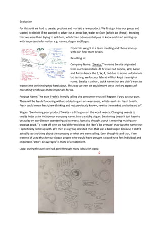
- 1. Evaluation For this unit we had to create, produce and market a new product. We first got into our group and started to decide if we wanted to advertise a cereal bar, water or Gum (which we chose). Knowing that we were then trying to sell Gum, which then obviously help us to know and start coming up with important information e.g. names, slogan and logos. From this we got in a team meeting and then came up with our final team details. Resulting in: Company Name: ‘Swaits ‘The name Swaits originated from our team initials. At first we had Sophie, Will, Aaron and Aaron hence the S, W, A, but due to some unfortunate lab testing, we lost our lab rat will but kept the original name. Swaits is a short, quick name that we didn’t want to waste time on thinking too hard about. This was so then we could move on to the key aspects of marketing which was more important for us. Product Name: The title ‘Fresh’is literally telling the consumer what will happen if you eat our gum. There will be Fresh flavouring with no added sugars or sweeteners, which results in Fresh breath. Fresh could mean fresh/new thinking and not previously known, new to the market and unheard off. Slogan: ‘Swaitening your product’ Swaits is a little pun on the word sweets. Changing sweets to swaits helps us to include our company name, into a catchy slogan. Swaitening doesn’t just have to be a play on word mean sweetening as in sweets. We also thought about it meaning making any product good. To start off with we had different ideas like ‘don’t’ be average’ that was the name that I specifically came up with. We then as a group decided that, that was a bad slogan because it didn’t actually say anything about the company or what we were selling. Even though it said that, if we were to of used that for our slogan people who would have brought it could have felt individual and important. ‘Don’t be averages’ is more of a statement. Logo: during this unit we had gone through many ideas for logos:
- 2. We finally got to a good logo which was creative and unique. The S inside the W is also meant to look like the number 8 and the later S. This was inside a W and when said out loud sounded like ‘sweight’ which was also meant to be an abbreviation or a easy way to say our company name ‘swaites’. For our product and company we wanted to come across as a relatable production company. We thought about practical packaging and responsible pricing. This was a good thing that would help us get well known quickly, because people would be so happy and relieved about how handy our product is.To help is with our packaging we used some market research on existing gum products as to which styles, colours and fonts are most commonly used. We wanted to know how the packing influences the consumers to buy the products every single day. We found out that the 2 most common forms of packing are the boxes of gum containing 25 pieces of gum, or the rectangular packets containing 8 smaller pieces of gum. We have chosen the smaller packaging as we need our gum to be easily accessible whilst on the go again appealing to our 20-30 year olds who are always needing something to chew whilst sat in the car, or indeed waiting at the busses or trains. Our wrapper wanted to obviously be eye catching and presentable. With this we thought the colours we chose were appropriate and suited our target audienceor anyone out of our specific target range. We thought this because teenagers are a colourful, active age and full of youth. But to the older target audiences will like the colours of our wrappers because it’s something new and bright, something that will spark a hard day at work. The wrapper contains colour, bold writing and in the corner there is a triangle showing an indication of what flavour is inside. All these aspects are used on gums such as Five, Trident and Wrigley’s extra. This was thought of by Aaron Cork. We clearly need the logo in the corner so people knew who the gum was coming from. Unfortunately on the watermelon wrapper the writing is in green, this was not meant to happen and was an accident because on the other wrappers the writing is meant to be in white to stand out and be pure. However I think leaving it green worked out well because green relates to the skin of a watermelon.
- 3. We Initially had another wrapper design idea made my Aaron Cogdell but we quickly changes it because we felt like the colours had nothing to do with our flavour and also the colour were very dull. On the other hand our new the wrapper is very unique and behind the entire colour the initial background is ice cubes. We were all messing around on Photoshop and thenAaron Cork came up with the idea of the ice cubes because he thought it stood for our name fresh. We all think that it represents ice and the normal mint flavoured gum. This is quitetongue-in-cheek in the sense that our gum is not to do with mint, but does leave your mouth feeling fresh and smelling nice. Ice is associated with cooling down and being fresh so we though then that the ice could be something to do with the name fresh. For this unit we had to use Photoshop and Premier Pro. On Photoshop made 3 print adverts, where we made website banner, Magazine posters, Underground train stations and a bus stop poster/sign. When choosing what website we wanted our banners to be on, we didn’t just pick any random site. We chose the TV channels; Dave: we chose this website because it was suitable to everyone in our target audience range. We did research on this website to see what type of ages and people watched programmes from Dave. Dave mainly appeals to the older ages from our target audience however it still is watched but younger ages like teens. MTV: I think choosing MTV was good, because it really related to our company and what we are like. MTV’s target audience are more teenagers and in 20’s, however their themes and colours are
- 4. the same as ‘swaits’. MTV is a colourful and Fun TV channel and this is appropriate for the younger years in our target range. As a team we made certain people look up things about the websites we were going to avertise on. With research we new that we should us MTV because they target more teenagers. Having Dave and MTV gives our company a diverse advertising range. We thought having these to websites would help broaden our advertising and get our gum more talked about and well known. Before we made anything on Photoshop we sat around and talked about our target audience or if we wanted it to be clever or funny. Firstly we had an idea of a lion with big teeth and smelly breath. We started sketching the ideas and seeing if it would look appropriate. We then came to the conclusion that it would look to childish and we thought his because we know we couldn’t get a real lion, so for that reason the poster would look fake and not professional. I then came up with the idea of the differences of teeth. I thought if we got a lot of pictures of teeth and then made a collage but had one set of teeth that represented out gum product to stand out. I didn’t just want the poster to look colourful I wanted it to be interactive so then when people are walking past they literal have to stop, look and answer. So we included a question on the poster ‘which do you Chews’ we purposely used the word chews instead of choose because it clearly fit in with the product we are selling. To get this end result I used Photoshop and the editing tools on there. Specifically I used ‘Quick selection tool’ I highlighted the
- 5. important bits of the picture then inserted it to another page and chose the size and where to put it. We thought it was important to have all of the pictures the same size; this would leave it looking professional and looking neat. Also having the pictures the same size doesn’t give any clues to the wright answer at the bottom of the poster. I also used the gradient tool for the bottom of the poster. This helped me add colour to the poster and we chose thecolour purple to relate back to our first wrapper colour. I had to use this tool last because then the colour wouldn’t hide the pictures. We thought about using Purple because it is known and seen as a wealthy, successful colour. We also put into account that popular companies use the colour purple and that means it’s a memorable colour. Such as: It’s not too bright or to boring, and it’s a unisex colour, which mean anyone and everyone could like it. I then inserted the wrapper image and the logo to put on the bottom of the poster. We think that it was appropriate to but this on all of the 3 print adverts so then people would know who we are. To edit the website banner we had to make it look as real as possible. So I saved a print screen of ‘Dave’’s website and then pasted it onto Photoshop. With that ready to edit I measured the sizes of the boxes I need to fill in. I then made our company design fit to scale, into the website boxes. To do this I used the lasso Tool, Which helped me individually or specifically select things I need. A weakness about this advert was that, the top banner didn’t fit as well as the side banner did. The top banner then had unclear writing made read and made it look unprofessional. So next time we have to make sure that all of our banners fit. Or I would have made a specific and individual banner to make sure it fitted and look appropriate for the website.
- 6. ADVERT For our advert it took a while to come up with an idea that we wanted to do. Aaron cork and Aaron Cogdell both came up with the idea we have now. Original we had an idea to relate it to our magazine cover. We were going to have loads of people doing day to day things and what they do with their teeth/what they eat. However there was already a ‘wriggles extra’ advert like that. The boys got this advert idea from the ‘linx’ adverts. I think our advert works well, because there isn’t a gum advert that is about to relationships. I was the person who edited our adverts. I put them into a sequence and order, which was efficient for the others if they didn’t quite get the idea of the adverts. It also helped because if one of them wanted to add to the editing they could. Primarily we sorted out roles: Aaron Cogdell: actor Sophie Carey: Director/editor Aaron Cork: camera man Having these roles saved us time and gave us structure throughout the proses, this was good because we rarely argued. We got together and thought about the right people for the right roles and when started to look for locations. From there we started to film. Once the filming of more than one shot over everything, we uploaded to the computer and stared to edit. Firstly I imported the clips, and then put them all in order. I then sored through the effects for, transitions and volume alters, and chose the ones that suited our clips. Adding effects would improve the smoothness and flow of the video. In this specific shot its meant to be, the boss has called one of their workers to come in for a talk. As Aron walks in, Emily puts in some gum. We made sure that the Gum scene shod out. To make a split screen we had to minimise a clip/video. Then put it on a layer were another video is. The clip that you haven’t minimised, you then have to minimised and fit to the screen. Making sure that the clips is playing at the same time, to make it look tidy and professional. We wanted the views to know the difference from having fresh breath and bad. Having one character trying to do day to day jobs, but getting shot down because he has bad breath, was shown through, the spilt screen was to show the ease of just having some of our gum.
- 7. I personally liked the split screen idea. However I didn’t quite like how it didn’t fill the screen, so when you watch the video, clips look disorientated. To improve this we tried stretching the clips and as a result of this they looked even worse than before. It was helpful and useful that we did try to make it fit the screen, just in case it did look better. To start with we had to make a story board. Although we had a story board, we didn’t always film in order. The story board helped us all understand the advert, and could help us make any changes or remember to film a certain clip. I Love how as it zooms in it gets clearer People possibly could think that it isn’t meant to be blurry. The end clip I got it to stay in a still image for a long time because I copied and pasted the clip. I had to find the end of We added the The video and cut it as small as I could. From there i information because it tells the viewer what it Then I right clicked on it to copy. I think I was a good was we were advertising. The fact that that image Idea To have a still image of the product. is last, hopefully would stay in the viewer’s mind because they saw it last. We left it clear and We used white for the Aaron Cogdell came plan so it let the writing to keep it simple up with this idea. views wait and think and look modern. You can tell that it’s about the product getting clearer This clip is blurry, however it’s ok that it is because then you wouldn’t be able to notice the wrapper. After doing this shot we soon realised that the gum packaging was not perfect. This was because we did this clip too late and meant we have ruined the packaging Although as a group we agreed that the white font was most appropriate. Looking back on it now I would have changed it to make it stand out more.
- 8. I believe that I worked really hard on this unit. I think I was committed and dedicated to making this a really good unit. We met deadlines and made everything as detailed and as perfect as possible. I am very pleased with the name, I think it suites the product and our general groups personalities. If I had to do it again I would have made a shorter advert and I would have gone back on the entire task and tried to perfect then and I would have tried to make my work look as professional as possible. I know that I have learnt a lot of things during this unit and it will help me with future units that we will do. Our group worked really well together, we all listened to one another, and however even Though we met deadline there was a couple of times were we rushed things. It was also very frustrating how we all were selected to help film other group’s project, which clearly delayed us from improving/moving on with our project. At the end of the unit we then did a presentation to our class and the other year 11 class. It was clear that we did extremely well in our pitch, because we got teacher and student feedback and an end of unit grade. I think our pitch went well because we used a script and practices and our slides didn’t have hardly and information on them we we had to imprivise and say as much information as we could to keep the viewes egaged and entertained. We made it interactive with rhetorical questions, and we thought as a team if we changed the tone of our voices, to make us sound excited, then this would phyalogicaly make our product seem more interesting. Making the slide bare helped enthasise our pitch techneiques, which also helped show of how good we could be with so little backup. I think we worked really hard and well on our script. We decided to make it as detailed as we could. Aaron cogdell was the main person to write the script, but we all did have big imputs on the script. If we had to do it again I would have made it a bit more interactive. At first I had a idea to have different coloured sweets ( I would have chosen sweets that I knew magority liked purple. E.G. ‘starburst or ‘skittles’ )to see what colour everyone went to and hoping that people would have chosen purple. From there I would have said we did research and it is clearly provern that people like flavours that come in a purple packaging. But in a Nutshell, as a team we worked well together to make the pitch as clear and perfect as possible. Thankfully we remember to put our logo on every slide to make , the presentation that much more professional.