Transfira gratuitamente durante 30 dias
Fazer login
Carregar
Idioma (PT)
Suporte
Negócios
Celular
Mídias sociais
Marketing
Tecnologia
Arte e fotografia
Carreiras
Design
Educação
Apresentações e oratória
Governo e ONGs
Saúde
Internet
Direito
Liderança e gerenciamento
Indústria automotiva
Engenharia
Software
Recrutamento e RH
Varejo
Vendas
Serviços
Ciências
Pequenos negócios e empreendedorismo
Alimentos
Meio ambiente
Economia e finanças
Dados e análise
Relação com investidores
Esportes
Espiritual
Notícias e política
Turismo
Aperfeiçoamento pessoal
Imóveis
Diversão e humor
Saúde e medicina
Dispositivos e hardware
Estilo de vida
Mudar o idioma
Idioma
English
Español
Português
Français
Deutsche
Cancelar
Salvar
PT
Carregado por
azizamrobinsonmedia
PPTX, PDF
146 visualizações
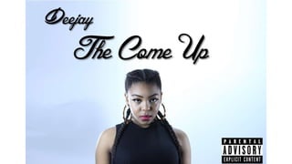
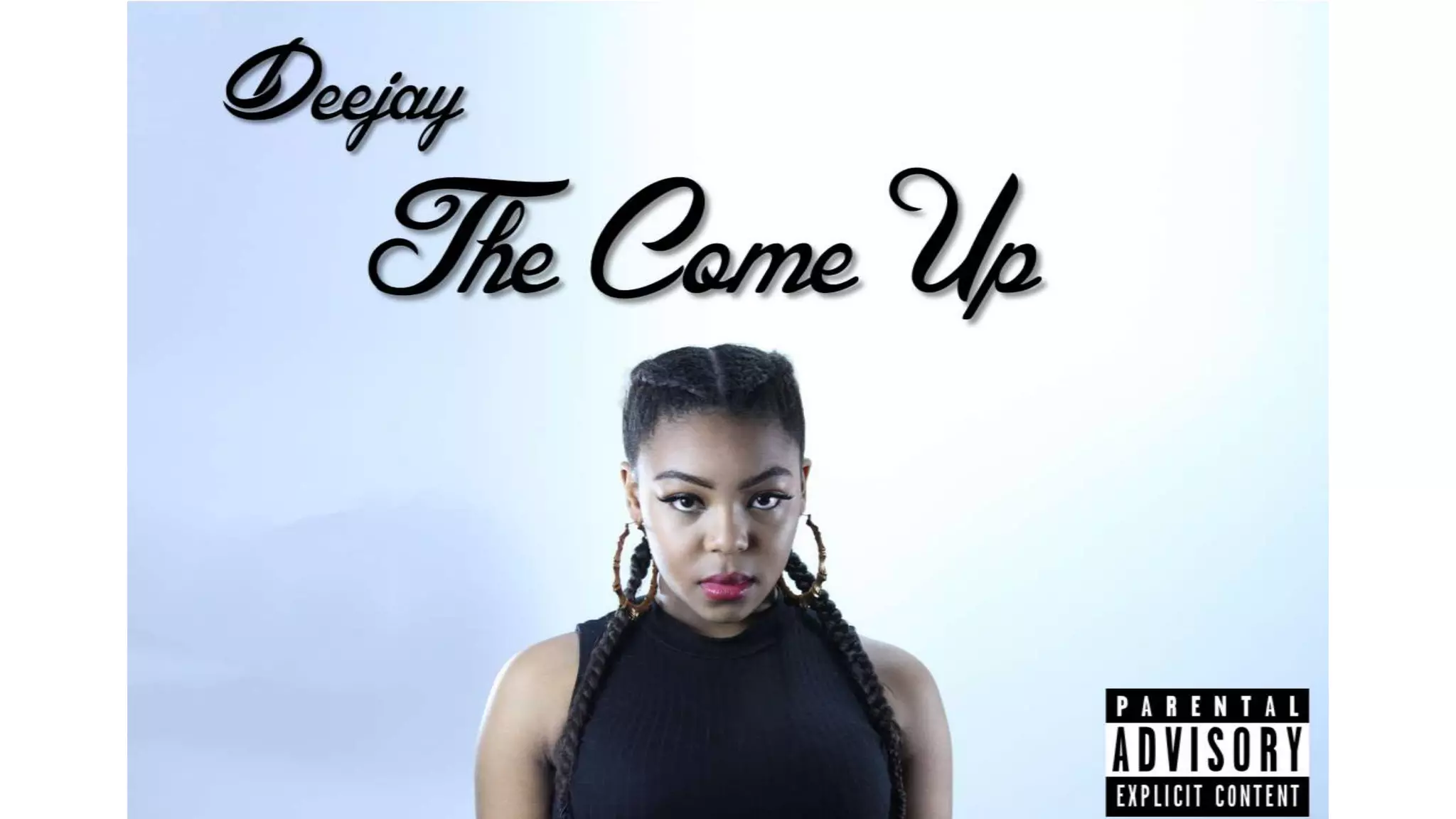
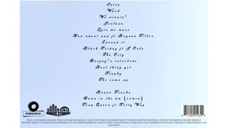
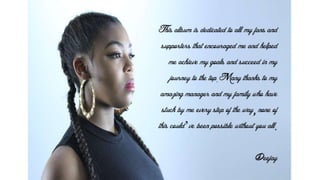
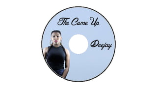
Digipack mock up2
.................
Design
◦
Leia mais
0
Salvar
Compartilhar
Incorporar
Incorporar apresentação
Baixar
Baixar para ler offline
1
/ 4
2
/ 4
3
/ 4
4
/ 4
Mais conteúdo relacionado
PPTX
Keungulan Letak Geostrategis
por
Debora GP
PPTX
FRONT//CONTENTS
por
azizamrobinsonmedia
PPTX
PICTURES TAKEN
por
azizamrobinsonmedia
PPTX
Drake
por
azizamrobinsonmedia
PPT
Environment BY Ishansh lal
por
Ishansh Lal
PPTX
πανελλήνια ημέρα σχολικού αθλητισμού
por
gymnasio_tilou
PPTX
House style & mode of address
por
beckytaplin
PPTX
Target audience
por
azizamrobinsonmedia
Keungulan Letak Geostrategis
por
Debora GP
FRONT//CONTENTS
por
azizamrobinsonmedia
PICTURES TAKEN
por
azizamrobinsonmedia
Drake
por
azizamrobinsonmedia
Environment BY Ishansh lal
por
Ishansh Lal
πανελλήνια ημέρα σχολικού αθλητισμού
por
gymnasio_tilou
House style & mode of address
por
beckytaplin
Target audience
por
azizamrobinsonmedia
Destaque
PPTX
FRONT//CONTENTS PAGE
por
azizamrobinsonmedia
PDF
Potential for rapid development: Yelahanka
por
Vestian
PPT
Παγκόσμια Ημέρα Αθλητισμού
por
gymnasio_tilou
PPTX
House style & mode of address
por
beckytaplin
PPTX
Survey results
por
azizamrobinsonmedia
PPTX
Drake
por
azizamrobinsonmedia
PPTX
House style & mode of address
por
beckytaplin
PPTX
House style & mode of address
por
beckytaplin
PDF
Commercial development pushing growth: Bellary Road
por
Vestian
PPTX
House style & mode of address
por
beckytaplin
PPT
Wybory samorządowe na Prezydenta Miasta Nowego Sącza 2014 r.
por
DTS24
PPT
Yorkglobal english for all
por
mail2yorkglobal
DOC
Bowel cancer - colorectal surgeon, Australia
por
Jenelledave
DOCX
Evaluation part 7
por
azizamrobinsonmedia
PPTX
tugas ke 3
por
dwintaherahmasiwi
FRONT//CONTENTS PAGE
por
azizamrobinsonmedia
Potential for rapid development: Yelahanka
por
Vestian
Παγκόσμια Ημέρα Αθλητισμού
por
gymnasio_tilou
House style & mode of address
por
beckytaplin
Survey results
por
azizamrobinsonmedia
Drake
por
azizamrobinsonmedia
House style & mode of address
por
beckytaplin
House style & mode of address
por
beckytaplin
Commercial development pushing growth: Bellary Road
por
Vestian
House style & mode of address
por
beckytaplin
Wybory samorządowe na Prezydenta Miasta Nowego Sącza 2014 r.
por
DTS24
Yorkglobal english for all
por
mail2yorkglobal
Bowel cancer - colorectal surgeon, Australia
por
Jenelledave
Evaluation part 7
por
azizamrobinsonmedia
tugas ke 3
por
dwintaherahmasiwi
Mais de azizamrobinsonmedia
DOCX
Extended project qualification evaluation
por
azizamrobinsonmedia
DOCX
Bibiliography
por
azizamrobinsonmedia
DOCX
Extended project qualification plan
por
azizamrobinsonmedia
PPTX
What have you learnt from your audience feedback
por
azizamrobinsonmedia
PPTX
Evaluation 1
por
azizamrobinsonmedia
PPTX
Photoshoot scheduling
por
azizamrobinsonmedia
PPTX
Logo designs
por
azizamrobinsonmedia
PPTX
Equipment used
por
azizamrobinsonmedia
PPTX
Digipack mock uppppp
por
azizamrobinsonmedia
PPTX
Advert mockup2
por
azizamrobinsonmedia
PPTX
Digipack mock up
por
azizamrobinsonmedia
PPTX
Fonts
por
azizamrobinsonmedia
PPTX
Music video moodboard
por
azizamrobinsonmedia
PPTX
Music advert moodboard
por
azizamrobinsonmedia
PPTX
Digipack moodboard
por
azizamrobinsonmedia
PPTX
Survey Results
por
azizamrobinsonmedia
PPTX
target audience profile
por
azizamrobinsonmedia
PPTX
MOCK UP CONTENTS
por
azizamrobinsonmedia
PPTX
FONTS
por
azizamrobinsonmedia
PPTX
FONTS
por
azizamrobinsonmedia
Extended project qualification evaluation
por
azizamrobinsonmedia
Bibiliography
por
azizamrobinsonmedia
Extended project qualification plan
por
azizamrobinsonmedia
What have you learnt from your audience feedback
por
azizamrobinsonmedia
Evaluation 1
por
azizamrobinsonmedia
Photoshoot scheduling
por
azizamrobinsonmedia
Logo designs
por
azizamrobinsonmedia
Equipment used
por
azizamrobinsonmedia
Digipack mock uppppp
por
azizamrobinsonmedia
Advert mockup2
por
azizamrobinsonmedia
Digipack mock up
por
azizamrobinsonmedia
Fonts
por
azizamrobinsonmedia
Music video moodboard
por
azizamrobinsonmedia
Music advert moodboard
por
azizamrobinsonmedia
Digipack moodboard
por
azizamrobinsonmedia
Survey Results
por
azizamrobinsonmedia
target audience profile
por
azizamrobinsonmedia
MOCK UP CONTENTS
por
azizamrobinsonmedia
FONTS
por
azizamrobinsonmedia
FONTS
por
azizamrobinsonmedia
Baixar