
Recomendados
Mais conteúdo relacionado
Destaque
Destaque (14)
Último
Último (20)
Conventions of Magazines
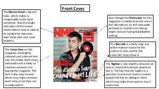
- 1. The Master Head is big and basic, which makes is recognisable to the loyal customers. Also the bright red colour of the master head makes it easy to read so its suitable for everyone, even those who cant read properly. The Cover lines on this magazine are brightly coloured and a decent font size, this makes them more noticeable and is likely to interest someone in to buying this magazine. The font is also easy to read which may make someone want to buy it as they can actually read it. Even though the Promotion for this magazine is smaller then the rest of the information, its still noticeable and easy to read due to it being bright red and having black&white writing. The Barcode is a fairly large size which makes it easier for the cashier to scan and for the customer to purchase it. The Togline is also brightly coloured ad easy to read which attracts people to buy it. The fact that the togline is a question to who ever reads it, makes people feel like its talking to them which may make them want to buy it even more. Front Cover
- 2. The title of the contents page is big, white colour stands out to the black background and it lets people know that it is the contents page, without having to literally write Contents Page. These sub headings are bold and stand out, this makes it easier for people to read and to understand what's on the other pages. This promotion is big and colourful which draws the readers attention. The promotion is also good because people like to win things and some believe they have a chance in winning it. Contents Page These side headings let the person who's reading know what bands are going to be including within this certain genre, of the magazine. The main heading on the contents page is big and bold. The black writing stands out to the white background, which makes it easier for people to read. The heading is noticeable so the people who are reading know what the main story is going to be and where to find it.
- 3. Double Page Spread The picture on this double page spread is big and clear. This helps the reader know straight away what band they're reading about before they even start reading the article. The caption for this photo gives the reader a little more detail about the band and the photo. Its noticeable because of the black writing. Even though the side storylines are small they are still readable and give the reader an insight of what's in the rest of the magazine. The article itself is very detailed and fits perfectly on the double paged spread. The font is a good size and the font is readable, especially because it is black. These aspects make the magazine enjoyable for the reader to read. The main heading is bold, good font and easy to read, which gives the reader an idea of what they could be reading about. The white writing on the dark background also makes it more noticeable.