
Recomendados
Mais conteúdo relacionado
Último
Último (20)
Destaque
Destaque (20)
Msp 10; identify colour palettes in genre magazines
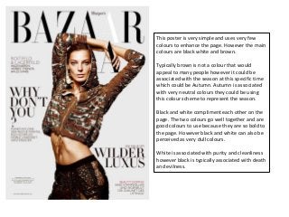
- 1. This poster is very simple and uses very few colours to enhance the page. However the main colours are black white and brown. Typically brown is not a colour that would appeal to many people however it could be associated with the season at this specific time which could be Autumn. Autumn is associated with very neutral colours they could be using this colour scheme to represent the season. Black and white compliment each other on the page. The two colours go well together and are good colours to use because they are so bold to the page. However black and white can also be perceived as very dull colours. White is associated with purity and cleanliness however black is typically associated with death and evilness.
- 2. This magazine cover is very different from most of Vogue’s magazines as it has a different colour scheme which stands out on the page more. However the title of the page is still the same font with just a different fill colour/pattern to relate to the theme of ‘fashion gone wild’. The cover does not typically have the sell lines, and lots of information crowded on the page. Unlike other magazines it’s very simple and plain which gives the boost picture more of a purpose. The sell line of ‘fashion gone wild’ is clearly stated in white so that it makes a statement on the front of the cover. The colour white is very eye catching a bold so it will attract people to look at the cover and also buy the magazine as its very eye catching. The title of vogue stands out to the page very clearly because it has many different prints and the colours are bright which allows it to stand out to the page. The colour blue is a very bold colour it stands out on the page and makes a statement to the page. Blue is associated with the sea and the beach. Other colours such as red and orange represent a sense of wildness, which links because ‘fashion’s gone wild’
- 3. The main colours of this magazine are red, white and brown. These colours typically would not be associated with each other because they do not exactly compliment each other. However this magazine is very unique and different to magazines as we can clearly see from the way the model is dressed and positioned on the page. Red is associated with danger, by the model wearing red lipstick is represents that she is wanting to be noticed and it also it makes the page very dramatic. As the rest of the poster is highlighted with black and white it is clear that by using red it is going to attract a specific target audience and its also very eye catching. The colour white and black are very sophisticated colours and go well together. The way the model is dressed is representing this use of the sophisticated colours.