
Recomendados
Mais conteúdo relacionado
Destaque
Último
Último (20)
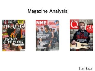
Magazine analysis
- 2. Large and bold masthead to make it stand out to customers. It is in white writing to contrast with the red background this again makes it stand out. As well as this the writing is serif which makes it seem soft and less harsh. Plug. White writing to stand out. Overlaps title. Sans Serif writing which is more harsh so stands out. ‘Stories of the year,’ this emphasises the popularity of the magazine and it shows that they are up to date with their stories. This plugs what's inside the magazine. Splash Image of well known artist. Usually Pop artist. Attracts audience interested in pop music. The artist is holding a guitar which relates to the headline. The image is a medium shot. Large main cover line, in a different colour to show its importance. Relates to the picture. Serif writing but a different font. Headline mentions ‘guitar’ which relates to main image. Cover lines. Sans serif font. Artists names in bold to attract readers. White writing so it stands out more on the background. Bottom strip, smaller font. Aimed at people who pick up the magazine. Colour scheme The main background colour is dark so white writing is used to contrast this. However the background colour gets lighter around the image to make the artist stand out more. Red is used in the title as it is the main colour of the brand, this shows the importance which is why red is used for the main story and the extra information to attract its target audience. Price, small font. The price is £3.99 which shows that the audience targeted are willing to pay a high amount for the popular magazine. Puff. Large and bold to attract the audience. Shows it’s a feature of the magazine. One off. Buzz words are used to make the audience drawn into the magazine.
- 3. Title says what the page is. Its bold and in sans serif so it is clear to the reader. The colour of the background is black which is makes the white and red writing stand out. The Q is the generic red colour of the brand as well as being serif. Sub Images, Gives a preview of what's in the magazine. Also links with the subheadings. Issue, shows the date of the issue. Shows how up to date the magazine is. Page numbers, shows the reader which pages show what artist. This is so it is more convenient for the reader to go to there preferred page Headline, Large and bold to show the reader what is in the magazine. Bright colours used to make it stand out. ‘46- Page celebration’ shows that it is a one off. Subheadings, Sans serif writing, bold and in black font to make it stand out more. Page style, the left page seems to be bolder and has more colour to make it more appealing. The other page titles ‘also in this issue’ making it seem less important. It also seems more monochrome as it has less colour. Extra Information, shows what else is in the magazine if the reader is not interested in the main spread. Large Description, Tells the reader a bit about what is on the page. This is unusual for most magazines as they usually just do a subheading and page number and/or a sentence for their ‘description’.
- 4. Main Image, shows the reader what the page is about. Large to bring attention to the page. Picture links with the text on the page. The image is of a band this is shown by the number of people and by them holding instruments that the audience assumes them to play. The image goes over two pages. Extra Information, This is kind of like a plug to the reader to get them to read more of the magazine. It gives sub headings and sub pictures to give the reader another sneak peak into the magazine. Quote, The quote is large and bold to indicate that what the person has said is important. The writing is sans serif and black as it makes stand out more. The name is in red and sans serif to make it stand out more. Puff, Red background with white and black writing. Generic colour of Q. Shows facts that the reader might be interested in. In the middle of the article so makes it different to other magazines. however it is in small font which can be easily dismissed so might not be that important to the double page spread. Title, Large and bold. Stands out to the reader. Shows the reader who or what the article is about. Subheading, Smaller font but still bigger than the article font. In red to make it stand out with one word being highlighted to show the importance. Gives a bit more detail about the article and what it is about. Logo, shows the title of the magazine and what the issue is about. As this issue features a special this seems to be a one off. Article text, small font, large amount of text. This is specifically aimed at the reader. It’ll be related to the title and picture. It is set out in columns which is quite generic for magazine articles. Colour scheme, the colours used are quite appealing to an audience as they are bright. The white space makes the writing contrast as it is black.
- 5. Plug, The number 6 is large and bold, its also in a red colour to stand out. This will attract the audience into buying it because they have free posters. The audience will think they are getting their moneys worth. Masthead, Bold and in sans serif to stand out to the audience. The exclamation mark is part of the brand but also makes it stand out. It is in a white colour which contrasts well against the background. As well as this it is being covered by the main splash image to show that the title of the magazine is well known by their audience Puff, Makes the magazine stand out from others. Exclusive special specifically for the audience of the magazine. Cover lines, preview of what else is in the magazine. Smaller font but still bold to attract its audience. Uses more well known artists to stand out but features less known as well. They are on the left of the magazine to be more likely seen. Plug, the word ‘Win!’ is large and bold as well as being a yellow colour to stand out. This will encourage people to buy the magazine for what they could potentially win. Colour Scheme, The colour scheme of the magazine is quite dark and fiery which is why blacks and oranges are used. This gives a preview of what genre in music they aim at their audience. The white writing stands out well on the dark background. This will make people appeal to the magazine Splash Image, This is the main image on the cover. It is large and overlaps the title to show the importance of the image. As it overlaps the title it makes the artists look like they are coming out of the page which makes them stand out more. Sub Image, This gives a preview of what else is in the magazine. Links with the sub cover line underneath The main cover line is large and bold, it is also in sans serif writing to make it stand out more as well as being in white writing. It tells the audience what the main story is as well as linking to the splash image. Price, the price of the magazine is £2.20 which is still quite expensive but as its quite a popular magazine for this genre of music most people will be willing to pay. Also with the plugs the audience will thing they are getting there moneys worth from it. Top strip, All on one line at the top. It looks ripped to give a preview to the audience of what's in the magazine.
- 6. Colour scheme, The colour scheme of the magazine is quite dark, this is why reds and blacks are used. It goes with the theme and music genre as rock is deemed as quite dark and heavy music. For the subheadings the colours are yellow and black which represents caution. This goes well with the genre of the magazine. Main Image, This stands out and fills most of the space on the contents page. It acts as a background for the contents. It is also a preview for an article which is why at the bottom it is overlapped by the page number and title. Subheadings, In some magazines the subheadings are the title of the page for the contents, however in Kerrang! the magazine is split into 6 separate topics. They are in yellow and black writing which stands out well against the plain white background. Page Numbers, They are bold and in brackets. Correspond the title. The main reason for the contents. It helps the reader get to there preferred page Title, The title is sans serif writing which is quite bold. It is also white which stands out against the dark red background. The title shows the audience what page it is. The black around the title makes it look 3D so it stands out better than normal writing on the page. Editorial Message, This is the message which the editor leaves in the magazine for the reader. In some magazines it is the same each issue but in others it changes. At the bottom it is signed by the editor to give it a more personal touch. The writing is in white which is better seen against the black background. A picture of the editor is also shown next to it. Issue Number/Date, This shows the reader which issue of the magazine it is and the date released. The reader can see how up to date the magazine is by this. A cover preview is placed in the contents so readers don’t have to keep flicking back to the front cover. The orange writing stands out to show something different. In this case it is the contents for what is on the front cover. The cover preview shows which pages belong to which cover line on the cover. This makes the magazine easy to navigate through for the reader. Sub Image, This is used to give a preview of what's in the magazine, it corresponds to the page number and sub heading underneath Small Description, underneath the page number and its title the description is short and to the point. It describes a bit about the page that its relating to.
- 7. Main Image, This shows two of the band members which relates to the band the article is talking about. It is the largest picture on the page and takes up the majority of the space. Title, This is the title of the double page spread. As it is called ‘the big story’ it shows the audience it is one of the main articles in the magazine. It uses the black and yellow colour which stands out. Subheading, The subheading ‘News’ relates to the contents page and the sub topics on the page. The font matches the title on the contents but is slightly smaller this is so the audience knows which topic it is relating to but it doesn’t over power the page. Quote, This is in a bigger and bolder font to stand out from the rest of the article . It is placed near the middle to attract the readers attention. It relates to the rest of the article however it may have some importance which is why it has been placed in a well seen location. Colour scheme, The colour scheme of the magazine is quite bold. The white writing stands out against the black background. This is unusual as most magazines have a white background with black writing as it is brighter and may be more appealing. However, As the background is black it reflects the magazine genre, as rock is deemed as quite a dark and bold music type. The boarder of this double page spread is yellow and black which again reflects the genre of the music as yellow and black means caution. Article, This article is an interview with Tonight Alive’s lead singer. The article is set out in columns which is considered normal for magazine articles, the question is bold and the lead (Jenna Mcdougall’s) answer is in smaller font and less bold. The article is specific to the reader of the magazine who is specifically interested in the band. Sub Images, The images relate to the article/ who the article is about. It also relates to the caption. It gives the magazine a more visual look. Captions, The captions link with the pictures. It tells the reader a little about the picture, for example, what they are doing in the picture or who they are.
- 8. Masthead, it is the title of the magazine so it has to stand out to the audience. The writing is sans serif and is bold which makes it easily seen. Issue Date, This just shows the date of release for the specific issue. The audience can see whether it is up to date or not. Splash Image, This takes up the majority of the space, which makes it stand out to the audience. As the audience can see who is on the front cover they get an idea of what genre the magazine is . Main Cover line, this is the largest line on the front cover which stands out to the audience. This cover line also links with the splash image. It gives a preview of the genre and what else is in the magazine. Sub cover lines, These also give a preview of what's in the magazine. They are not as large and less bold compared to others so they stand out less but are still seen by the audience. These cover lines are larger than the ones on the right as they are more well known artists for the specific genre of magazine. They are on the left to promote the magazine. Colour Scheme, the colour scheme of the magazine has a lot of pastel colours. This makes it more appealing to some as the colours are not as harsh. The colours look quite red based which is the generic colour of NME and its logo. The majority of the magazine has colour but some white space is used to attract the audience to that specific cover line. Sub Image, This image links with the cover line next to it. This also gives a preview of what else is in the magazine. Sub cover lines, These are on the right as they are less important compared to the ones on the left but they still promote the magazine and give the audience a preview of what else is in the magazine. The sub cover line at the top is slightly different as it is in red. This is so it stands out more as it links to the sub image next to it. This again gives a preview of what else is in the magazine. Price, the price of NME is £2.50 which is fairly expensive. The magazine however is popular so must have high demand to be put at a high price. The audience of this magazine must be willing to pay £2.50
- 9. Title, This is unusual for magazines as they usually just call this page the contents however NME have called it ‘Inside NME’ which makes the magazine seem different from others. This is bold and to the left of the page which grabs the readers attention. Subheadings, They are less bold then the title but still stand out. In NME they seem to put regulars on the left of the page for readers who buy the magazine regularly. The reader can easily navigate through the magazine this way. Page Numbers, They are bold and correspond with the subheadings next to them, this makes the magazine easy to navigate through. Text, These are still headings of what is in the magazine however they are not as bold or as large as the others which makes them seem less important. However they are on the left side of the page so will still be seen and give a preview of what's in the magazine. Descriptions, These are only done for the features of the magazine this is so the reader can have a small preview of the article so they know whether they are interested in the article or not. Subheadings, This is larger then the regulars section of the page this is because the magazine features exclusives for this issue. Band List, This is like an index for the magazine which is unusual for mainstream magazines. It allows the reader to easily navigate to whichever band they want to read about as the page numbers are next to the names and it is in alphabetical order. This makes the magazine different which will appeal to some readers. Sub image, This gives a preview of the magazine and links to the subheading. Page number, This tells the reader where they are in the magazine. It is placed in the middle on the right hand side of the page, this is different as most magazines place it at the bottom right of the magazine. Colour Scheme, the colour scheme of the magazine is similar to the front cover as it is still light pastel colours. NME tend to colour what they want people to read in red as it is the generic colour of the magazine and it is the brightest on the page to make it stand out more. The page seems t be an off white colour so its not as harsh on the eyes.
- 10. Sub Images, These images relate to the article and who it is about. They are around the page to attract the readers attention. The magazine is more of a visual representation this way. Letter form S, this is to stand out as the start of the article. It is bold and easily seen by the reader. Colour scheme, as with the rest of the magazines colour scheme it is faded pastel colours. The background of the magazine is white which makes the writing stand out against it. However on this page there is no red which suggests only readers that are interested in this artist will read these pages Captions, The captions relate to the sub images of the article. They describe a bit about the picture which will also relate to the article. Article text, the article goes straight into text and doesn’t have a bold title, however on the right page at the top it has the artists name of who the article is about. It is set in long columns and the actual text is small which shows it is specified for the reader of the magazine. Quote, this is in a larger font to attract the readers attention. It relates to the article and shows some importance which is why it is larger font. Bottom Strip/Puff, this is unusual as most magazines don’t have a bottom strip in there double page spread. However in this specific article NME have placed a bottom strip which relates to who the article is about. This specific bottom strip is a time line across both pages, it shows the artists ‘highs and lows’. It is also a puff as it makes the magazine stand out from others.