How to convert your website to responsive mode
•
0 gostou•31 visualizações

Nowadays, it's not only important to develop your clients' websites to look good on all browsers, and on PC and MAC, it's also a must that websites are viewable on tablets and mobile devices. A lot of people opt for making one version of their site for desktop and another for mobile. Others choose Responsive Design, a mix of fluid grids and layouts, flexible images and intelligent use of CSS media queries. There are quite a few sites dedicated to lending a hand with responsive grids, Gridpak, CSSGrid, Skeleton, and SimpleGrid, just to name a few.

Recomendados
Mais conteúdo relacionado
Mais procurados
Mais procurados (16)
Semelhante a How to convert your website to responsive mode
Semelhante a How to convert your website to responsive mode (20)
Mais de siavosh kaviani
Mais de siavosh kaviani (20)
Último
Último (20)
How to convert your website to responsive mode
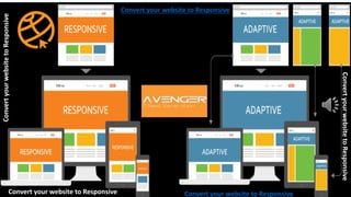
- 1. Convert your website to Responsive Convert your website to Responsive Convert your website to Responsive ConvertyourwebsitetoResponsive ConvertyourwebsitetoResponsive
- 2. Three Main Components of Responsive Design Responsive website design consists of the following three main components: • Flexible layouts - Using a flexible grid to create the website layout that will dynamically resize to any width. • Media queries - An extension to media types when targeting and including styles. Media queries allow designers to specify different styles for specific browser and device circumstances. • Flexible media - Makes media (images, video and other formats) scalable, by changing the size of the media as the size of the viewport changes.
- 3. Transitioning into Responsive Design For site owners like you, this means you no longer have to create a separate site for mobile users. Now, to transition to a responsive design, you must do the following steps:
- 4. 1-Choose a Framework. • Choose a Framework. As you can imagine, switching to responsiveness takes a lot of work. Fortunately, frameworks such as Twitter Bootstrap and Foundation can do the heavy lifting for you. Instead of starting from scratch, these frameworks allow you to modify and upgrade your existing site's code (Tweet These Tools).
- 5. 2- Convert the code Be sure to review everything you need to know about converting fixed width. You'll want to add meta tags such as width=device-width, initial- scale=1, and maximum-scale=1. Furthermore, when moving from fixed layout to responsive design, establish "break points" that will trigger CSS style rules. The more you identify components suitable for replacement, the easier it will be to convert your site's code. Take it in bite-sized chunks by moving one page at a time.
- 6. 3-Review your site • Test your converted site on multiple devices to ensure that everything is responding accordingly. Try visiting your site on an iPhone, tablet, and other devices with varying screen size. The more you test your responsive site, the better the user experience will be in the end. Also remember to invest in responsive video, as embedded videos from sites like YouTube have fixed sizes. Another consideration to check is whether or not you have printer-friendly styles.
- 7. Conclusion: how to convert an existing website to responsive •Define Breakpoints and Plan Layouts •Add Responsive Meta Tags •Apply Media Queries •Perfect the Navigation and Typography •Make All Media Flexible •Prepare for Different Types of Interactions
- 8. If you have any questions, you can share with us. We will help you in this area by providing appropriate advice. Do not forget to make responsive your website . And responsive mode is one of the most important ways to increase traffic and traffic on web pages. We are waiting for you! contact us below to get started! +33-1-43-13-38-08 info@avengering.com sales@avengering.com