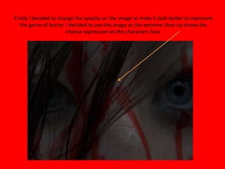
1. Firstly I decided to change the opacity on the image to make it look darker to represent
the genre of horror. I decided to use this image as the extreme close up shows the
intense expression on the characters face.
2. I then added a black bar at the bottom of the poster with text showing the directors
name, producers and the characters. I added this to highlight the ideology of the poster as I
want it to look extremely realistic.
3. After this I decided to add the horror films slogan ‘JUSTICE IS REVENGE…’ and the
release date of the film ‘October 2012’. I also made up a website for the film to make
the horror poster more realistic.
4. I then decided to add the age certification which is a ‘15’ as the target audience for my
horror trailer is 15-30. I also added the logo’s of the production and distribution companies
which are ‘Dimension Films’ and ‘Newline Cinemas’.
5. I then added the title of the horror film which is the main aspect of the horror
poster, this stands out as it is in the colour red which connotes blood therefore
represents horror.
6. After this I changed the titles at the bottom of the screen to a dull grey colour because I felt
they stood out to the audience to much. Finally I added some short reviews from popular
newspapers and my actual magazine front cover, I added this to make the magazine look
more realistic.