iOS Human Interface Design Guideline Part 1
•
0 gostou•419 visualizações

iOS Human Interface Design Guideline Part 1 Topics - Overviews - User Interactions - System Capabilities - Visual Design - Icons - Design Glyphs

Recomendados
Mais conteúdo relacionado
Mais procurados
Mais procurados (20)
Semelhante a iOS Human Interface Design Guideline Part 1
Semelhante a iOS Human Interface Design Guideline Part 1 (20)
Último
Último (20)
iOS Human Interface Design Guideline Part 1
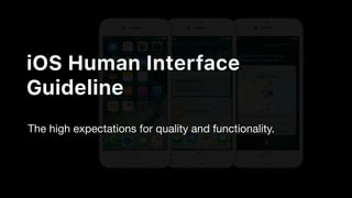
- 1. iOS Human Interface Guideline The high expectations for quality and functionality.
- 2. Topics Overviews User Interactions System Capabilities Visual Design Icons Design Glyphs Workshop
- 4. Overview Deference iOS Design Theme The content is paramount The UI doesn’t compete with the content
- 5. Overview Clarity iOS Design Theme Function drives design Text is easy to read at any size Icons are effective and precise Adornments are subtle Negative space, Color, Fonts, Graphics, UI highlight important content
- 6. Overview Depth iOS Design Theme Motion & Layer work together create a livelier Transition provide a sense of depth
- 7. Aesthetic Integrity Consistency Direct Manipulation Feedback Metaphors User Control Overview Design Principle
- 8. Help people perform a serious task can keep them focused by using subtle Design Principle Aesthetic Integrity
- 9. Unobtrusive graphics Design Principle Aesthetic Integrity
- 10. Standard controls Design Principle Aesthetic Integrity
- 11. Predictable behaviors Design Principle Aesthetic Integrity
- 12. Use system-provided interface elements Design Principle Consistency
- 14. Standard text styles Design Principle Consistency
- 16. Engage people and facilitates understanding Design Principle Direct Manipulation
- 17. Rotate the device Design Principle Direct Manipulation
- 18. Use gestures to affect onscreen content Design Principle Direct Manipulation
- 19. Uniform terminology Design Principle Direct Manipulation
- 20. Feedback acknowledges actions and shows results to keep people informed Design Principle Feedback
- 23. Animation and sound Design Principle Feedback
- 24. People learn more quickly when an app’s virtual objects and actions are metaphors for familiar experiences Design Principle Metaphors
- 25. Drag and swipe content Design Principle Metaphors
- 28. Flick through pages Design Principle Metaphors
- 29. The best apps find the correct balance between enabling users and avoiding unwanted outcomes. Design Principle User Control
- 30. Keeping interactive elements familiar and predictable Design Principle User Control
- 32. Make it easy to cancel operations, even when they’re already underway. Design Principle User Control
- 33. User Interaction 3D Touch Accessibility Data Entry Drag and Drop First Launch Experience Gesture Navigation
- 34. User Interaction 3D Touch Peek and Pop
- 35. User Interaction 3D Touch Peek and Pop
- 36. User Interaction Accessibility Reduce Transparency Voice Over Button Shapes
- 38. User Interaction Drag and Drop With a single finger, a user can move or duplicate selected photos, text, or other content by dragging the content from one location to another, then raising the finger to drop it.
- 39. User Interaction Gesture Tap Double Tab Drag Flick Swipe Pinch Touch and Hold Shake
- 40. User Interaction Navigation Hierarchical navigation Flat navigation Content-driven or experience-driven navigation
- 48. System Capabilities Notifications Apps can use notifications to provide timely and important information anytime, whether the device is locked or in use.
- 50. System Capabilities Printing Your app can take advantage of the system’s built-in AirPrint technology to enable wireless printing of images, PDFs, and other content to compatible printers.
- 51. System Capabilities Quick Look Quick Look lets people preview Keynote, Numbers, Pages, and PDF documents, as well as images and other types of files.
- 52. System Capabilities Screenshots A user can capture what's displayed on their screen by taking a screenshot. Starting in iOS 11.
- 53. System Capabilities Siri Your app can integrate with Siri so that the user can perform certain tasks in response to spoken commands and questions.
- 56. Visual Design Animation Beautiful, subtle animation throughout iOS builds a visual sense of connection between people and content onscreen.
- 57. Visual Design Animation Strive for realism and credibility. Use consistent animation. Make animations optional. Always test the results to make sure they work well.
- 58. Visual Design Branding Successful branding involves more than just adding brand assets to your app. but not so much that it becomes a distraction.
- 59. Visual Design Branding Incorporate refined, unobtrusive branding. Don’t let branding get in the way of great app design. Defer to content over branding. Resist the temptation to display your logo throughout your app. This is especially important in navigation bars, where a title is more helpful.
- 60. Visual Design Color R 255 G 59 B 48 R 255 G 149 B 0 R 255 G 204 B 0 R 76 G 217 B 100 R 90 G 200 B 250 R 0 G 122 B 255 R 88 G 86 B 214 R 255 G 45 B 85 PinkPurpleBlueTeal BlueGreenYellowOrangeRed
- 61. Visual Design Color R 255 G 59 B 48 R 255 G 149 B 0 R 255 G 204 B 0 R 76 G 217 B 100 R 90 G 200 B 250 R 0 G 122 B 255 R 88 G 86 B 214 R 255 G 45 B 85 R 255 G 255 B 255 R 239 G 239 B 244 R 229 G 229 B 234 R 209 G 209 B 214 R 199 G 199 B 204 R 142 G 142 B 147 R 0 B 0 G 0 BlackGrayMid GrayLight Gray 2Light GrayCustom GrayWhite PinkPurpleBlueTeal BlueGreenYellowOrangeRed
- 62. Visual Design Color Enabled and disabled elements Avoid using the same color for interactive and non-interactive elements.
- 63. Visual Design Color Dark color scheme Consider how artwork and translucency affect nearby colors.
- 64. Visual Design Color Dark color scheme Consider how artwork and translucency affect nearby colors.
- 66. Visual Design Color Be aware of colorblindness. As seen with red-green color blindness. As seen without color blindness.
- 67. Visual Design Color Consider how your use of color might be perceived in other countries and cultures.
- 68. Visual Design Color Use sufficient color contrast ratios. Standard minimum contrast ratio of 4.5:1, although 7:1
- 69. Visual Design Color Color Management Apply color profiles to your images. Standard RGB (sRGB) or P3 Provide color space-specific image and color variations when the experience calls for it.
- 76. Visual Design Layout Design an app that provides a great experience in any context.
- 82. Visual Design Typography San Francisco (SF) Use SF Pro Text for sizes below 20pt. Use SF Pro Display for sizes 20pt or greater.
- 83. Icons App Icon Custom Icons System Icons Design Glyphs
- 84. Icons
- 85. Icons App Icon Beautiful, subtle animation throughout iOS builds a visual sense of connection between people and content onscreen.
- 86. Icons App Icon
- 87. Icons App Icon
- 93. Icons App Icon Embrace simplicity Provide a single focus point. Use words only when they’re essential or part of a logo. Keep icon corners square. Test your icon against different wallpapers.
- 95. Icons Custom Icons Provide two versions of custom tab bar icons.
- 96. Icons Custom Icons “To create a filled-in version of an icon that has interior details (such as the Radio icon) invert the details so they retain their prominence in the selected version. The Keypad icon also has interior details, but the selected version would be confusing and hard to recognize if its background was filled in and the circles became white outlines.” Excerpt From: Apple Inc. “iOS Human Interface Guidelines.” iBooks.
- 97. Icons Custom Icons “Sometimes, a design needs a slight alteration to look good when it’s selected. For example, because the Timer and Podcasts icons include open areas, the selected versions condense the strokes a bit to fit into a circular enclosure.” Excerpt From: Apple Inc. “iOS Human Interface Guidelines.” iBooks.
- 98. Icons Custom Icons “If an icon becomes less recognizable when it’s filled in, a good alternative is to use a heavier stroke to draw the selected version. For example, the selected versions of the Voicemail and Reading List icons are drawn with a 2-point stroke, instead of the 1-point stroke that was used to draw the unselected versions.” Excerpt From: Apple Inc. “iOS Human Interface Guidelines.” iBooks.
- 100. Icons Custom Icons Create simple, recognizable designs. Design a solid color icon with transparency, anti-aliasing, and no drop shadow. Keep your icons consistent.
- 101. Icons System Icons Navigation Bar Toolbar Tab Bar Quick Action
- 102. Icons System Icons Navigation Bar & Toolbar TitleParent Title
- 103. Icons System Icons Navigation Bar & Toolbar
- 108. Icons Design Glyphs
- 109. Design Glyphs
- 110. Design Glyphs
- 111. Design Glyphs
- 112. Design Glyphs
- 113. Design Glyphs
- 114. Design Glyphs
- 115. Icons
- 116. Glyphs Icons
- 121. Simplified form Universal symbology Quickly readable in context Effective Glyphs
- 124. Delicious
- 125. Delicious
- 126. Delicious
- 127. Delicious
- 128. Delicious
- 129. Where are glyphs used?
- 148. Lines
- 153. Positioning
- 165. Crafting Glyphs
- 166. Crafting Glyphs Build as a set Test in context Preview on device
- 167. How do I get started?
- 168. In-app
- 169. Light Heavy
- 171. System spaces
- 175. Recap
- 176. Recap Simplify and think globally Build as sets and test in context Harmonize with type Adapt for system spaces
- 177. Workshop Design Icon