

Recomendados
Mais conteúdo relacionado
Destaque
Destaque (19)
Semelhante a My learningessentails
Semelhante a My learningessentails (20)
Último
Último (20)
My learningessentails
- 2. Colour lighter fresher friendlier feel to increase its visual appeal Appeal to the target audience Help to shape the users attitudes More effective communication Engagement
- 3. Text Elderly users and visual impairments Black or dark colours for text, and white or soft tones for background. Use no more than three colours as it can make the course look busy. Could be viewing on smaller screens
- 4. Layout The placement of the elements on each page could flow more naturally from one to the next Graphics should be oriented in a way that directs the reader's attention inward and onward, never away from the content. Create a more consistent feel and would create more flexibility to use the content area
- 5. Content Needs to stand out more and given much more emphasis. The Use of Space and Colour Make the content separate from the navigation Make Instructions Separate from the text Break up the text using more bullet points Using Visuals
- 6. Visual Content Visual content drives more engagement than just text. Can enhance a course’s quality because it helps to humanize the concepts being covered. Learners view the content as a relatable, personal experience.
- 7. Visual Imagery Representational - to reflect and reinforce the text Organisational – using diagrams to create overview of the content Decorative – used sparingly to add aesthetic appeal Professional and Stylish
- 8. Interactions The same interaction is being presented in different ways. Keeping the format of this interaction the same throughout would enable you to use more variety in interactions. Consistency helps learners move from one task to the next, knowing there are certain aspects of the design that won't change.
- 10. Learning Activities More intuitive Make easier to use Clearer Feedback Conclude or recap Knowledge Check Task based activities / simulations
- 11. Navigation Visual Hierarchy Rollovers Interactive Icons Pop Ups Keep elements consistent throughout using a clear and consistent design will help keep students focused
- 12. Example Screen
Notas do Editor
- For this presentation I have looked at how I would improve on the suite of existing modules for my learning essentials This covers :
- Purple and yellow is a good effective contrast for learning if used carefully Can feel dark, heavy which is distracting from the content. Student expectations are for a more professional look and feel This will shape the users attitudes towards the content and create a more credible feel More effective coms wil get the message you r trying to convey a lot faster Create more engagement and get them coming back for more
- Dark purple on grey is not a good colour contrast. Yellow on purple Both failed on colour contraster on Webaim For large amounts of text it is safer to stick with dark coulours on lighter backgrounds
- The slug on the left is not consistent throughout sometimes its there or not there and sometimes its grey and sometimes its purple Example: Keep the title and use a specific heading to denote an activity Lose the dark slab of colour from the left
- The use of space and colour as I v mentioned will help to do this Example: Currently the boxes are blending in to much Break up the text using formatting and visuals
- Needs to reinforce the message and help users relate to the content. Most people recognise visuals images before text. creates and emotional /mood. “if a picture is worth a thousand words use it”
- Example: these two interactivities are the same but look completely different
- Example 1: could use an interactive table to display this better Example 2: could use video and audio to enhance the user experience. Interactive map of the library
- Example 1: Could simulate typing into a database which would make it more intuitive Example 2: Citing it right Section 3 of 4 , what do I need to reference – activity Needs a recap and also a knowledge check
- Needs to be more consistent throughout to focus on the content
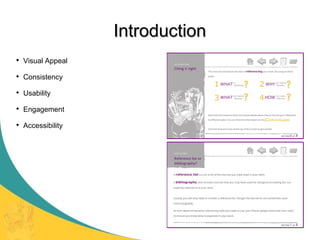
- I have included a main title sub heading Lost the large slab from the left and included a watermark Freeing up the content area Seperate out the instructions from the text Added in a visual that reflects the subject Drawn out the lines to give more emphasis to the content That concludes my presentation I welcome any questions