
Recomendados
Mais conteúdo relacionado
Semelhante a الملصق العلميNorah al zoman
Semelhante a الملصق العلميNorah al zoman (20)
Mais de researchcenterm
Mais de researchcenterm (20)
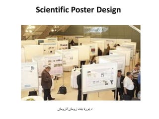
الملصق العلميNorah al zoman
- 2. العام الهدف واالتجاهات والمهارات المعارف المشاركة إكساب المؤتمرات ًف الملصقات وعرض إعداد نحو اإلٌجابٌة فعال بشكل
- 3. االهدافالتفصٌلٌه من االنتهاء بعد المتوقع منالمحاضرهتصبح أنالحاضرهأن على قادرة: •المؤتمرات ًف العلمٌة الملصقات وعرض تقدٌم أهمٌة تدرك •العلمٌة الملصقات لتصمٌم العامة اإلرشادات تطبق •العلمٌة الملصقات بناء آلٌات تطبق •العلمٌة الملصقات تصمٌم ًف المناسبة البرامج تستخدم •الجٌدة وغٌر الجٌدة الملصقات مابٌن تفرق •المؤتمرات ًف العلمٌة الملصقات تقدٌم آلٌات تطبق
- 4. المؤتمرات ًف نشارك لماذاالعلمٌه •األصدقاء لقاء •اآلخرٌن مع أفكارنا مناقشة •أبحاثنا نتائج نشر •وخبرات معلومات اكتساب •وظٌفٌة فرص إٌجاد •بالمجال المهتمٌن على التعرف •الذاتٌة السٌرة إثراء
- 5. الملصقات أنواع •أهدافها حسب الملصقات تختلف •تثقٌفٌة •علمٌة •إرشادٌة •ترفٌهٌة •إعالنٌة
- 7. ًالعلم الملصق •كبٌرة عرض لوحة •والرسم الصورة طرٌق عن علمٌة موضوعات تلخص وفعالٌة بسرعة تقدٌمها بغرض الموجزة والعبارات •ٌمر من نظر تجذب بحٌثبهاللموضوع انتباهه وتشد •ندوة أو اجتماع خالل عادة وتقدمأومؤتمرتجمع أي أو آخر ًعلم.
- 8. ملصقامورقة •الخبرة قلة •الموضوع صعوبة •اللغة ضعف •الجرأة عدم •الموضوع تخصص
- 9. ملصقامورقة •اكثرمن فعالٌةالمحاضرهاحٌانا •تواجدك عدم حالة ًف موجودة •المحاضرة من اقل وقت •وقت القارئ تمنحاطوللالطالعوالمناقشة •طوٌلة لفترات استخدامه ٌمكن •علٌه االطالع المختصٌن لغٌر ٌمكن
- 12. المطلوبة التفاصٌل •تفاصٌل فٌه نداء للمؤتمر المنظمة الجهات ترسل ما عادة حٌث من المطلوب: •الموضوعات •البحث طبٌعة •اإلخراج وتفاصٌل الملصق حجم •الفكرة نضج مستوى
- 14. مرحلة لكل الزمنٌة النسبة الملصق إعداد مراحلالمستغرق الزمن نسبة ًزمن جدول وإعداد المطلوب فهم%5 الملخص كتابة)اًبمطلو كان إذا%30 األساسٌة العناصر تجهٌز%30(الملخص تجهٌز بعد) الملصق تصمٌم%25 الملصق تقدٌم%10
- 15. الثالثة المرحلة الملصق عناصر تجهٌز
- 17. الملصق عناصر
- 18. الملصق عناصر
- 19. الملصق عنوان •واضح:ومفهومة صحٌحة صٌاغة •محدد:البحث نطاق ٌعٌن •جذاب:االنتباه لتجلب منتقاة ألفاظ
- 20. األذون •المختصة الجهات إذن أخذ تستوجب ًالعلم البحث أخالقٌات ب تتعلق أبحاث بأي القٌام قبل: •تجارب إجراءمختبرٌةاألشخاص أو الحٌوانات على •إذن إعطاء ٌملكون ال من أو األطفال مع التعامل •علمهم دون أفراد عن شخصٌة معلومات جمع
- 21. المؤلفٌن •صحٌحة بطرٌقة األسماء كتابة •األول االسمواألخٌرواألب اسم من األول الحرف ٌمكن االنجلٌزٌة باللغة لألبحاث •جدا مهم الترتٌب •ًاإللكترون وبرٌده المؤلف لها ٌتبع ًالت الجهة(برٌد ًأكادٌم)ًالرئٌس للكاتب األقل على
- 22. المحتوى •الحضور طبٌعة ًافهم •للملخص ًداع ال •قدر الموضوع ًبسطاالمكان •النص ًحولالىومركزة محددة مختصره نقاط •الرسوم على وركزي النص من ممكنه كمٌه أقل ًاستخدم
- 23. المقدمة •وأهمٌته الموضوع خلفٌة ًلخص •من األدنى الحد باستخدام الخلفٌة ًصٌغالتعارٌف •من مركزة مجموعة أو سؤال شكل على األهمٌة ًصٌغ األهداف(3)األكثر على
- 24. البحث طرٌقة •ًالت الرئٌسٌة األدوات جمٌع اذكرياستخدمتٌها •مختصر بشكل الخطوات اذكري •ًاستخدمالفلوتشارتعن عوضا التوضٌحٌة الرسوم و أمكن إن الخطوات ذكر
- 25. النتائجوالمناقشه •بٌانٌة رسوم شكل على النتائج أهم ًاعرض •للمناقشة المخصص الكالم ًقلل •عوضا الرسوم نفس على مبسط شرح أو النقاط ًاستخدم النتائج سرد عن
- 26. الخاتمه •التالٌة لألمور نقاط أربعة من أقل ًف تلخٌص: •البحث أهمٌة •طرٌقته(ممٌزة كانت إذا) •ومعناها النتائج خالصة •للبحث المستقبلٌة االتجاهات
- 27. المراجع •البحث عناصر أهم أحد •بنوعٌتها العناٌةووالباحث البحث ًرق على ٌدل صٌاغتها •للفهرسة معتمدة طرٌقة بناء تنسٌقها ٌجب •المشاركة نداء أو الملصق قالب ًف ذكرها ٌتم ما غالبا •اإلنترنت على مواقع هناكوالتنسٌق تدعم جاهزة برامج للمراجع ًالتلقائ
- 28. الشكر •ًالت األكادٌمٌة األخالقٌات منالٌحسنإغفالها •لها الشكر توجٌه ًٌنبغ ًالت الجهات •البحث تموٌل ًف شاركت جهة أي •علمٌا البحث دعمت جهة أي •عادة العلمٌة الرسائل بداٌة ًف الموجه الشكر عن ٌختلف ومجاملة تفصٌال أكثر ٌكون والذي
- 30. الجٌد الملصق خصائص •التعبٌر وواضع قوي •وجذابة ممٌزة ألوان ذو •مختصر بشكل المحتوى ٌعرض •االنتباه جذب على ٌعمل •بوضوح بعد عن رؤٌته ٌمكن
- 31. اهمالملصقات تصمٌم برامج •منها عدٌدة برامج هناك: • PowerPoint • PosterGenius • Illustrator, etc. • Graphic design tips • Get help: hire a designer
- 34. العام المخطط •عادة للملصق العام المخططماٌكونالمقدم اختٌار من •المخطط ٌكون أن ٌمكن •ًعرض أو ًطول •األطراف مطوي أو مستوي •العرض متساوٌة األعمدة تكون أن األفضل •للٌسار الٌمٌن من ًالمنطق الترتٌب ًاتبع(ًعرب)ومناألعلى أسفل إلى •األعمدة بٌن كافٌة فارغة مسافات ترك ٌجبوكذلكبٌن الرئٌسٌة األجزاء
- 37. األلوانوالخلفٌات •ًف كبٌر أهمٌة والخلفٌات لأللوان: •للملصق االنتباه جذب •له العام المظهر إعطاء •المحتوى وضوح
- 38. للخلفٌات عامه إرشادات •الصور أو النقوش ذات الخلفٌات ًتجنب •الفاتحة الخلفٌات تفضل عادة المطبوعات ًف (البٌضاءتحدٌدا)مقابل ًف الداكنة والنصوص العكس
- 39. لأللوان عامة إرشادات •ألوان ثالث من أكثر استخدام ًتجن •متناسقة متجاورة ألوان ثالث فأي األلوان عجلة استخدمنا إذا المتقابلة األلوان نختار فقط لونٌن استخدام حالة ًوف •الذي األلوان نظام حدديستطبقٌهعلى بناء: •الموضوع وطبٌعة الموجودة والصور المخصص القالب •والفسفورٌة الصارخة األلوان ًتجنب •المهمة التفاصٌل ًف األخضر مع األحمر ًتجنب
- 41. الخط حجم
- 42. النص تنسٌق ًف عامة إرشادات •ثالثة عن الملصق ًف الخطوط أنواع عدد ٌزٌد أن ًٌنبغ ال •اإلمكان قدر نقاط هٌئة على واجعلٌه النص ًقلل •أسطر ثالثة عن نقطة أو فقرة أي طول ٌزٌد ال أن ًٌنبغ •مختلفة مستوٌات استخدام خالل من واضحة هٌكلٌة ًضع •للخطوط •أجود الملصق كان كلما حجمه وكبر النص قل كلما •منفصلة جزئٌة ًف نصه مع عنوان كل ًضع •أخرى تفاصٌل إضافة أردت إذا نشرات إرفاق ٌمكن
- 43. والرسوم للصور عامة إرشادات •أمكن ما النصوص عن عوضا الرسوم ًاستخدم •ضروري غٌر رسم أي ًتقحم ال •الرسم أو الصورة ًف التفاصٌل ًقلل •الصور امتداد استخدمpng ,tiffالطباعة ًف أوضح ألنها •األلوان تغٌٌر أو التفاصٌل إللغاء الصور تحرٌر على ًتمرس •مكبرا جودته ٌفقد رسم أي عن االستغناء ًف تترددي ال •للنظر مرٌح بشكل الملصق على والرسوم الصور ًوزع •والرسومات للصور عناوٌن ًضع
- 44. البٌانٌة الرسوم لتصمٌم إرشادات •الرسوم نصوص جمٌع تكون أن ًاحرصمقرؤةمسافة من كافٌة •العنوان ًتغفل الووالوحدات المحاور تسمٌة •الشبكة وخطوط الخلفٌات مثل التفاصٌل ًتجنب •المعلومات لطبٌعة المناسب ًالبٌان الرسم اختاري •واحدة فكرة لٌعرض الرسم ًبسط •األبعاد ثالثٌة الرسوم ًتجنب
- 46. ارشاداتالطباعه •ًاحفظبصٌغة الملف: •png /tiff /pdf •الحبر لٌجف كافٌة فترة الملصق ًاترك •بعناٌة الورق اختاري: •ورقلماعأوًمطف
- 48. الملصق حفظ •األسطوانٌة العلب ًف الملصق حفظ األفضل أطول زمنا لٌعٌش لذلك المخصصة •المكشوفة الحقائب أو المطاطات استخدام أطرافه وتمزق الملصق تجعد إلى ٌؤدي
- 50. للتقدٌم االستعداد •الصباح منذ وتشربٌن تأكلٌن لما ًانتبه •البطاقة واستالم التسجٌل إلتمام مبكرة المكان إلى ًاذهب •العرض مكان إلى مباشرة ًتوجهومناسب موقع اختاري •الدبابٌس من كمٌة معك ًاصطحبواألقالمواللصقوالبلوتك •تسلم وعادة اسمك علٌها بطاقة ارتداء األفضل منلكعند التسجٌل •األعمال بطاقات من كافٌا عدد جهزي •أناقتك ًف ًتبالغ وال مرٌح ًرسم وحذاء رسمٌة مالبس ارتدي
- 51. عامة إرشاداتاثناءالتقدٌم •ملصقك من دائما قرٌبة ًكون •ًالتبدئالحظت أو بالسؤال الشخص بدأ إذا إال الملصق بشرح فضوله •ثم مهم هدف أو متوقعة غٌر نتٌجة مثال المثٌرة بالنقاط ًابدئ الشخص اهتمام الحظت إذا ًأكمل •ًفه المختص لغٌر المتخصصة والمصطلحات التفاصٌل ًتجنب منفرة •ٌحدثك من ًعٌن ًف انظري •إجابة لدٌك تكن لم إذا بلباقة أعرف ال قول ًف تترددي ال •الزوار إلى األسئلة توجٌه ًتجنب
- 52. عامة إرشاداتاثناءالتقدٌم •صدرك تحت تعقدٌها أو خصرك على أو جٌبك ًف ٌدٌك ًتضع ال •الشرح بدأت ًتكون أن بعد لملصقك مجموعة انضمت إذا •أوال بدأته ما ًفأكمل لشخص •أنه ًفاعرف الحقا وسأعود جمٌل ملصق وقال شخص مر إذا غٌرمهتمبابتسامة فاشكرٌه بالملصق •أو الشمسٌة للنظارة ًداع الالكابالعطر وال العرض أثناء الرائحة قوي •والمشروبات األطعمة توزٌع ًتجنب
- 55. الملصق تقيم
- 59. • Background image is distracting, wastes ink. • Text box backgrounds are dark, which makes text hard to read (and wastes ink). • Text box backgrounds are all different colors, for no reason (thus annoying). • Text boxes are different widths (and annoying). • Text boxes not separated from each other by pleasing “white” space.
- 62. The background below can make the text hard to read and the poster hard to follow
- 63. This is a good example for a scientific poster background choice
- 64. Nice poster
- 66. I am feeling sleepy
- 67. OK, but which way do I go?
- 71. •Author information should be larger. •Large image of manatee is low-resolution and heavily pixelated on full-size poster . •Graph fnts are too small.
- 72. •Poster seems a bit text heavy and unbalanced (all figures in upper right). •Hard to read text over the lion graphic •Title is not very informative
- 73. DOs and DON’Ts • http://www.ncsu.edu/project/posters/Videos. html • http://colinpurrington.com/tips/academic/pos terdesign
- 74. إرشاداتالملصقات(Posters)البحوث في العلمية •ضَعرُت، للمؤتمر المصاحب المعرض ًف الملصقاتمع المحددة األوقات خالل ملصقه بجانب المشارك حضور ضرورة المؤتمر برنامج بحسب للتحكٌمما الملصق إعداد ًف وٌراعى ، ًٌأت: •المشاركٌن أسماء أو المشارك واسم ، البحث عنوان على احتواؤه أعلى ًف الوزارة شعار ووضع ، إلٌها ٌنتسب ًالت والجامعة ، الجهة من المؤتمر وشعار ، الٌمنى الجهة من الملصق الٌسرى(مالحظة:عبر الشعارات تحمٌل ٌمكنطالراب هذا). •المهمة العناصر على احتواؤهمثل:الدراسة ومشكلة ، المقدمة ، البحث ًف المتبعة والمنهجٌة ، الرئٌسة والمجاالت ، وأهدافها ، والمصادر ، والتوصٌات ، والنتائج ، والمناقشة.
- 75. •جمٌع ًتغط مركزة فةّمكث تكون بحٌث المعلومات إٌجاز البحث جوانب. •والجداول لألشكال موجزة عناوٌن اختٌار. •مسافة من قراءتها ٌمكن بحٌث الملصق على الكتابة وضوح مترٌن عن تقل ال. •المهتمٌن لتواصل للباحث ًااللكترون البرٌد وضع ٌحبذ البحث بموضوع.
- 76. •طول بمقاس ، ًاٌطول الملصق طباعة100وعرض ، سم 70سمتختلف ًالت أو ، العرضٌة الملصقات تقبل وال ، الموضحة المقاسات عن مقاساتها. •وٌسلمه ، وٌطبعه ، الملصق ٌصمم أن الطالب على ٌجب ًفاالسطوانٌة حافظتهأقصاها مدة ًف الجامعة منسق إلى األربعاء ٌوم7/6/1434هـ. •من الحجم صغٌرة إضافٌة نسخ اصطحاب للطالب ٌمكن الزوار من ٌطلبها لمن لتقدٌمها الملصق. •
- 78. Useful Resources: • A Guide for Preparation, Carol Waite Connor, U.S. Geological Survey • How to Make a Great Poster, Dina F. Mandoli, University of Washington • Creating Effective Poster Presentations, North Carolina State University
- 79. Resources • http://colinpurrington.com/tips/academic/pos terdesign •اعدادالعلمٌة الملصقات وتقدٌم د.هبهعبداللطٌفكردي