3. Question 2. How effective
is the combination of your
main product and ancillary
texts?
4. Forms and conventions of existing soap opera magazines
Large
Date Masthead
within the
top left
hand 1/3 of
Price the page
Large and easy to
read font
No colour scheme
Tabs allow the
reader to
Other soaps are navigate through
referred to in the magazine
box, using the easier
names of the
characters
Website
5. We decided that for our soap a cheap looking magazine would not suit our
brand identity yet a magazine similar to that of the sun’s fabulous would go
much better as it will appeal to my younger more glamorous demographic.
Date and issue
Website number
Large
Masthead
within the Colour scheme
top 1/3 of created by the
the page. photography
Large font
Strap with Anchored onto
extra features the characters
face
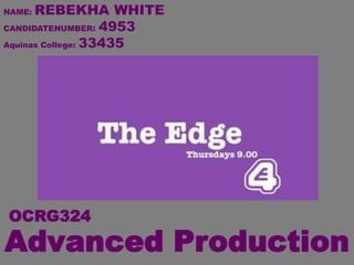
6. ANCILLARY TEXT ONE
MY MAGAZINE FRONT COVER
Date
Twitter
Colour
Large scheme
Masthead created by
within the the
top 1/3 of photography
the page.
Large font
Anchored onto
the characters
face
7. Forms and conventions of existing soap opera billboard
Channel 4 colours- black and white
Stars of the soap
Logo not
in the
corner like
E4
billboards
Channel 4 branding- Font Channel 4 branding- logo
8. ANCILLARY TEXT TWO
BILLBOARD
E4 colours- purple and white
Stars of the soap
E4 logo
positioned
in the corner
of the
E4 branding- Font billboard
E4 branding- logo
9. BILLBOARD IDEA
As a group we collectively decided that we did not want to create the conventional soap
opera poster of the cast shown either in action or stood in a conformed triangular line, we
wanted to challenge the conventions like Hollyoaks did on the previous slide.
We took an element of our storyline and decided to interpret it in an abstract
form, Nat’s character Sierra is controlling in a way the other characters within
the trailer as she is the only one who knows everything. We thought it would be
a good idea to show this by creating a puppet and master type image. This
would be an image that would not only grab our demographic but a larger
audience also.
10. I used the E4 off-air identity style
guide to make sure the colours,
logos and font were correct when
making my ancillary products,
especially the billboard.
These two print- print screens
allowed me to know the
position and size to have my
logo in order to match E4 brand
identity and allow my product to
look as real as possible.
11. This is the font E4 uses on everything
from billboards to title cards.
12. This showed me exactly where and how the banner should look on my
billboard in order for ancillary product to look professional and fit E4’s
brand identity.
13. Audience representation in both ancillary
products and trailer
Actors/actresses
of the same or Up too date fashions
similar age to the
target audience
(16-24)
Clear fonts
Make Up
Lively bright colours
14. Audience representation in both ancillary products and trailer
USE OF TECHNOLOGY
STORIES THAT APPEAL TO THE TARGET AUDIENCE
ISSUES THAT MY TARGET AUDIENCE MAY BE EXPERIENCING
SETTINGS
SOCIALISING ROMANCE AND RELATIONSHIPS
GOSSIP CHEATING
15. Audience representation in both ancillary products and trailer
Within social groups there
always seems to be the Many people within of
one that knows everything primary audience
and gossip. will be of the age
where they feel
something is
controlling them in
some way. e.g.
education
Realistic issues
seen through all
three
products- how Issues are dramatised by the
one person actors yet still real life issues
knows
everything and is
controlling the
situation.
16. Audience representation in both ancillary products
and trailer
Characters- People can relate to the characters or know somebody
who reminds them of one of a few of them
Realistic issues seen through all three products- how one person
knows everything and is controlling the situation.