
Recomendados
Mais conteúdo relacionado
Mais procurados
Mais procurados (20)
Destaque
Destaque (17)
Semelhante a Film poster overview
Semelhante a Film poster overview (20)
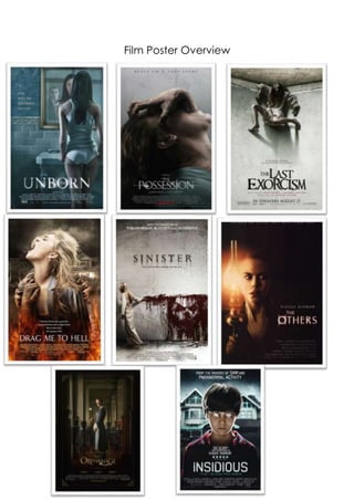
Film poster overview
- 2. All of these eight film posters have been designed and created to effectively promote films that fall within the supernatural sub-genre. Through carrying out thorough research of these film posters and by comparing them all to each other, I have been able to identify any shared features within them and establish fully any repeated patterns. Each of the eight posters all feature typical and expected film poster conventions such as the title, it is always the largest and most significant text within the frame through the use of typography they use in order to make it effective, an image that dominates the frame allowing the audience to become engaged with the film poster signalling to them that the image is something or someone important within the film’s narrative, a slogan or tag line to support the image, as well as the expected use of horrific imager from a horror film poster. Furthermore to this, it is evident that there are other repeated patterns. In almost all of the film posters, aside from one all of the posters feature a main female character, which appears to be suffering from some sort of torment or looks as if she is under threat in some way. In the Drag Me To Hell poster as an example, the mise-enscene displays an image of a female screaming in despair as demonic hands tug at her necklace and shoulders almost pulling her down creating a symbiotic link to the title of the film as it could be suggested that the hands are quite literally dragging her to hell. Within the
- 3. poster for the film The Unborn as an audience we can see the reflection through the mirror of an evil, demonic child standing alongside the female protagonist as she stares at her reflection in the mirror. The idea from these film posters is to display that the narratives of these films, just like other supernatural horrors, focus primarily around a female protagonist whose role is to play a fighting woman against whichever curse, spirit or demon presents itself as a threat to her. In addition, many of the females that play the dominant protagonist are young and quite attractive she does not appear as a typical ‘bimbo’ however making sense as the ‘bimbo’ stereotype does not have the bravery, intelligence and confidence to fight off any dangerous threats. In four of the eight film posters, we can see possessed, demonic, scary children reinforcing the idea that these characters are common in supernatural horrors and that children often appear as sources of evil. This could be highly dependent on the fact that children are, by nature associated as innocent, adorable and sweet whereas evil children are freaks of nature and timelessly terrifying. Noticeably from each of the four posters, the children look as if they are standing there lifeless, with cold blank stares with their arms by their sides. The little boy within the insidious poster even has his eyes scratched out, adding emphasis to the overall idea that evil prowls within and that any human innocence and warmth is completely lost.
- 4. All the images presented in the eight film posters are all horrific and designed to not only scare but to clearly signal to the audience that these films all belong to the genre of horror. Within the Sinister poster, we see a young female protagonist wearing white pyjamas automatically allowing the audience to think of the terrifying events which happen at night. The girl appears to be smearing blood along the dark, grey wall where the blood has resulted to dripping down the wall to form a dark, dangerous face which the audience can assume that this evil, demonic face will appear within the narrative. The image also featured in the poster for The Possession is equally troubling; with a decayed hand emerging from the mouth of the female to grab hold of her face creating fear for the audience as they question what will happen to her in the narrative. In each of the eight film posters, there are no masked antagonists carrying chainsaws or knives and no bloodied victims. Instead, there is imagery of decaying hands with demon-like claws, ghostly figures, images from the fires of hell and tormented souls creating the suggestion that the threat within all of these films is from supernatural elements. In each of the posters, there is consitency of colour as many of them use cold, dark colours, particularly grey, and pale blue to add emphasis to the pale faces within the images. These are common colours used in film posters as they help create an unwelcoming, sinister tone. With regards to the film posters for The Possession, Sinister, The Last Exorcism and The Unborn the protagonist almost disapears into the cold colours of the background to
- 5. represent the way in which the protagonists are being drawn into a world of evil, where there is no hope or escapism. Therefore showing that the battle they must now fight against there lives completely defines them as characters. The title of each poster tends to always be placed in a noticeable and exposed position and as a common expectation is always the largest text dominating the page. In six of the eight film posters, the titles are positioned at the bottom of the film poster just beneath the main image; the idea that the audience will then be presented with the title. The repitition of this placement of the text in each poster clearly conveys a layout convention for supernatural films. All of the titles are presented in an uppercase, bold yet simplistic and highly visible font. The use of text effects, such as a drop shadow on the Sinister film poster are used in most cases to make the title of the film look more horrifying. The Orphanage title is the most decorated title in comparison to the others as it uses a more traditional looking font which could link to the traditional old building that is featured within the narrative of the film. More than half of the eight posters include institutional information within the film poster which is positioned either at the base or the very top of the poster and seven out of the eight posters feature a tagline or strap that help to support and reinforce the meaning behind the image in order to reveal more about the narrative to the audience, allowing them to gain an insight into the film. The tagline featured on The Possession film poster claims that
- 6. ‘Darkness Lives Inside’ complimenting the image of the rotten, decaying hand which emerges from the female characters mouth. Other additional text such as ‘Based on a True Story’ which appears on the film poster of The Possession and ‘From the makers of Paranormal Activity and Insidious’ which is displayed on the film poster of Sinister are both used to draw in the eyes of the audience. Giving the audience the knowledge that the film they are about to see has been inspired by a real occurrence and event makes the film so much more scarier to watch for the audiences, as they then go on to feel that the events that happen in the narrative could possibly happen to them. In addition, giving audiences again the knowledge of knowing that the film has been produced from the same produces as existing successful films allows the audience to gain a trusting bond with the film as they know and trust the produces to satisfy their needs and wants when watching a Horror film. All of the text that is presented to the audience is always kept readible and simple and often the typography is in a sans serif font. All of the supernatural film posters which are presented above are highly effective and share simplicity in common, with the use of minimal and simple text and the image kept bold and dominant doing all of the speaking for the film poster allows of these eight posters to become highly effective and successful in which they aim to achieve.