Brain rules 1, 2, 3: Put neuroscience in your presentations
•
0 gostou•206 visualizações

Neuroscience should be applied to PowerPoint presentations to make them more effective. Create and design your slides with your audience in mind: not just in terms of content, but also how you display information on the slide, and the presentation as a whole. Plenty of multimedia learning presentation tips in these 3 brain rules.

Recomendados
Mais conteúdo relacionado
Semelhante a Brain rules 1, 2, 3: Put neuroscience in your presentations
Semelhante a Brain rules 1, 2, 3: Put neuroscience in your presentations (20)
Mais de Presented.
Mais de Presented. (9)
Último
Último (20)
Brain rules 1, 2, 3: Put neuroscience in your presentations
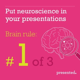
- 1. Put neuroscience in your presentations Brain rule: # of 3
- 2. Brain rule #1 = Respect the limits of working memory
- 3. Content needs to be processed by working memory in order to be stored “Learning” occurs when info is transferred from working memory into long-term memory (stored). Sensory memory: All impressions of sights and sounds happen here. Long-term memory: Where info is stored for future retrieval. We want our content here! Working memory: Where information is processed for storage into long- term memory.
- 4. The aim of every presentation is to be remembered… But, working memory has volume limitations. So we can’t present tons of new info and expect audiences to remember it all. Super fit working memories can handle 7 new things! The standard is 5, but the safest for all is just 3 things.
- 5. The following 3 principles will make your slides more: working memory friendly
- 6. Declutter your slides! REMOVE all objects, pictures, animation, lines and effects that do not contribute to your message. Learning improves when multimedia is free from extraneous info. 1. Coherence principle
- 7. e.g. pies with legends take longer to understand than pies with labels. Learning improves when words are placed near relevant pictures. 2. Spatial contiguity principle VS Tea Café Toast Bun Tea Café Toast Bun
- 8. By narrating on-screen text, you are rendering either yourself or the text redundant. Do you really want to be the redundant part of your presentation? Learning reduces when information is redundant. 3. Redundancy principle
- 9. A logo can be visually redundant. It takes up space and is ultimately ignored when on every slide. If it’s ignored – why clutter your slides? If it’s not ignored – then it’s distracting! Either way, for good communication: you likely don’t need a logo on all slides. 3. Redundancy principle
- 10. End of Part 1 If you want presentations that really work, you have to change the way you create them. hello@presented.co.uk
- 11. Put neuroscience in your presentations Brain rule: # of 3
- 12. Brain rule #2 = Address the visual & verbal channels
- 13. It’s wrongly assumed we process TEXT with the visual channel, since we read with our eyes. When we process slide content, we use two brain channels: The visual channel (eyes) & the verbal channel (ears) In fact, TEXT is processed by the verbal channel as we listen to ourselves read.
- 14. For best results use the visual and verbal channels in sync Overloaded verbal channel and underused visual channel Here’s what happens: ✓ Text heavy slide An overloaded verbal channel and underused visual channel often occurs when a text heavy slide is presented with narration Visual slide Images Narration Text Narration ✓ Images Narration
- 15. So… If you read your slides out loud, you are overloading a brain channel & failing your audience.
- 16. 10% 35% 65% This is not going to be a newsflash: our brains learn better with visuals. People have 6x better recall when verbal and visual channels are used in harmony! www.rufwork.com/110/mats/oshaVisualAids.html Listening only Visual only Visual and listening
- 17. 1. Multimedia Learning, Second Edition; Richard E. Mayer Audiences retain far more info from narration & images vs text based slides.1 Text based Narration & images 7% 87%
- 18. Just remember, the images need to be the right ones! Whilst photos can look amazing, there’s a chance your audience will recall subjective feelings & thoughts from that photo, instead of your message! Poorly targeted or decorative images are too common and are bad for brains! ? Photos
- 19. End of Part 2 Presentations look so similar, because many presenters copy what everyone else does. It doesn’t have to be this way! hello@presented.co.uk
- 20. Put neuroscience in your presentations Brain rule: # of 3
- 21. Brain rule #3 = Guide your audience’s attention
- 22. We know it’s important to grab audience attention early on, but we also need to hold it. Humans are active learners. Brains don’t stop: we are constantly trying to comprehend new info, sort it, fight distractions and integrate it alongside existing knowledge. It’s tiring.
- 23. The following 3 principles will help: guide audience attention
- 24. Use things like: graphical patterns, recognised sequences, familiar structures or concepts. Mnemonics are popular, and can work… But don’t overuse them, it can overload the brain into a “recall” cycle… and the actual learning gets lost. Specific Measurable Achievable Accurate? R ? Timely? 1. Tap into prior knowledge
- 25. Simple devices like arrows can direct attention. Or use colour coding for key points or sections. Learning improves when attention is focused on key information. 2. Signalling principle Opt for clear navigation visuals, so the audience knows where they are... and where they are going!
- 26. Headlines themselves are excellent signals. Structure your presentation to improve guidance. Use chapters to chunk info, with 1 key message for each chapter. Always state a call to action: make the goal of your presentation clear 2. Signalling principle
- 27. Time the entrance of content to minimise cognitive load. 3. Temporal contiguity principle Make sure your narration and your content is in sync. Use animation to prevent your audience from reading ahead. (even though you’ve reduced text right?)
- 28. Animation attracts attention: fab. But don’t let it distract from your message. Overdone animation can quickly lead to cognitive overload, so use carefully! And don’t make your audience wait for long animations to finish: your PPT skills are not the purpose. Animate only for a purpose. 3. Temporal contiguity principle
- 29. End of Part 3 Most people present in a way that goes against good brain science. Too many presentations end up as wasted opportunities. hello@presented.co.uk