
Recomendados
Mais conteúdo relacionado
Mais procurados
Mais procurados (20)
Semelhante a Bold, make, a, statment, features, regulars, subheadings,inspirations,photoshots,interviews, 5line statment,flat plans
Semelhante a Bold, make, a, statment, features, regulars, subheadings,inspirations,photoshots,interviews, 5line statment,flat plans (20)
Mais de paullinsteadmedia
Mais de paullinsteadmedia (18)
Último
Último (20)
Bold, make, a, statment, features, regulars, subheadings,inspirations,photoshots,interviews, 5line statment,flat plans
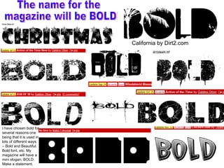
- 1. California by Dirt2.com The name for the magazine will be BOLD! I have chosen bold for several reasons one being that it is used in lots of different ways – Bold and Beautiful. Bold font, etc. My magazine will have a mini slogan; BOLD: Make a statement.
- 2. The Slogan will be: Make a Statement My chosen title is BOLD in this font. This mans that the Slogan has to Match the title in some way. I like this style make and A it looks like a comic book. This looks like the kind of font that u would see on a album cover of a pop artist. Therefore I think that this would attract the audience. The STATEMENT font in this has no fill there for its an odd one out. In this one the Statement is very black compared to the other fonts. I think that as the other fonts are a grey/light grey This one I like as it uses the same comic font for the statement and it matches. This font is simple. As the title is BOLD and Big I think that the Slogan should be the opposite this gives a Contrasting effect on the text which makes them stand out. I chose make a statement.
- 3. Features, Regulars In my college magazine the main problem that I had was the house style not matching so I will use the fonts that I have used for the title to make the Contents. This is the slogan that I will use for the magazine. This is the subheading font. It’s the same style as the Slogan but less thick. This is also like the type of font that you would have on an album as the artist name. This is relates also very well to the Album Cover Look Style that I am trying to create. I think for the contents I will use the Chicken butt as it is like an pop album style. When I see the font I think of album covers. Therefore this is why I will still use this font.
- 4. There will be a graphic design other side of the features & regulars… .. with pictures over the top.
- 5. Layer 2 shows the pictures and graphics that I will use for the cover. Layer 2 shows the pictures and graphics that I will use for the cover. Layer 1 shows the text Cover Layer 1 Cover Layer 2
- 6. Contents
- 7. DPS
- 9. Interviews Inspirations “ To George”, he reads out in a slow, deliberate manner. “Be my Valentine?” He looks at us with a cheeky grin. “Now I feel bad because I haven’t bought you anything”. Never mind that, what about answering the question in our card? But we’ve still got plenty of time together… Apart from ours, have you had any more flowers today? [Pulls mock sad expression] I didn’t get any other flowers. I’m a little hurt. Not even any cards? No cards. Have you sent any flowers or cards? [Thinks for a moment] Maybe that’s the reason I didn’t get any. Maybe you need to start sending them out if you want to get any back. See, I didn’t think of that. Now I’ve learned something about what I’ve been doing wrong. But I have been living on the road. It’s not all my fault. What would be your ideal Valentine’s date? I don’t know. Where’s a good romantic place to go? How about a nice restaurant? Yeah. Somewhere dark with candles and a good band. It seems a nice thing to do, doesn’t it? I do like the style that Richard and Judy use. This is more of a comedic style. They push the boundaries. The wrong boundaries this results in laughter, and information that the public may not wish to know.
- 11. Design and Layout Inspirations Name is a Mask Name not in usual place First side no text No text over image Very dark Name links to subtitle (exposed –mask) Very large drop text Several Smaller images of same singer