1. Advert Analysis (Queens Of The Stone Age
- Like Clockwork)
To gain a more in depth understanding of what makes an advert
successful I am going to analyse another album advertisement taken
from the front page of a website. I am going to analyse the design
focusing on the typeface, font, colour, and composition and discuss
how each of these is important to the success of the advert and how
they relate to the genre of music.
The advert I have chosen to analyse is for the band Queens of the
Stone age that are a alternative/psychedelic rock band and the album
Like Clockwork.
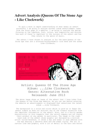
Artist: Queens Of The Stone Age
Album: ...Like Clockwork
Genre: Alternative Rock
Released: June 2013
The above image shows an image of the advert that I have taken from
the Queens of the Stone Age website. As you can see before entering
the website an advertisement is displayed that advertises the latest
album ...Like Clockwork.
The background is a solid red colour which is good as it keeps the
advert simple as does not distract any of the viewers attention from
the important information in the advert. Also, red is a fairly gender
neutralcolour so this suggests that the record company are not aiming
their product at any gender in particular. The image in the right
hand side of the advert shows graphic art designed by a british
artist called Boneface. It shows a man and woman in anan embrace with
the man wearing a skeleton mask and the woman crying. The art is
cartoon like and graphic, with a lot of detail in the hair and facial
2. features. The full image is in black and white with high contrast
making it stand out against the bold red background. However, the
womans tears are a bright blue colour which stands out against her
white face. This results in the audience noticing them as a primary
focus of the art. The image is based on a publicity still for the
1931 film Dracula, which makes sense in the advert as it is
portraying the idea of Dracula through the graphic art.
The typeface on the advert shows the band name (Queens of the Stone
Age) in a black, narrow, widely spaced font. It is slightly bolder
than the album title (...Like Clockwork) which is situated directly
underneath it. The album title is also in the same font as the band
name. Having both the bands name and album name on the
advert immediately tells the audience what the advert is, which
increases the chances on them taking an interest in it. The words OUT
NOW are the biggest font on the advert which grabs the viewers
attention instantly informing them that they can purchase it straight
away. Below this is hyperlinks to websites that the album can
be purchased from. These are in white font which stand out against
the red background and separate themselves from the black text.
Despite these being in a smaller font they are still eye catching as
the white colour breaks up the advert and fits in nicely with the
black and white graphic art of the advert. Underneath this in a small
font is a paragraph telling more about the history of the album. This
is a strong part of the advert as the band name and album name will
have caught the audiences attention and if they are interested they
look more closely and can read about the album - another selling
technique that record companies use.
When buying the album the websites offer the chance to buy the album
on CD, vinyl, or deluxe vinyl. This increasing selling chances and
profit as the album can be purchased at the normal standard price,
but it is likely that the audience will go for the deluxe version.
Also, a limited edition of the album was released in which the
background of the album was blue instead of red. Again this technique
is used by record companies to increase the chance of sales as the
audience are more likely to buy a limited edition version because of
the idea of owning something that now many people own. (See image
below).