
Recomendados
Mais conteúdo relacionado
Mais procurados
Mais procurados (20)
Destaque
Semelhante a Website Mock Up
Semelhante a Website Mock Up (20)
Mais de Tiffany TC
Mais de Tiffany TC (20)
Website Mock Up
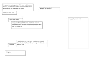
- 1. Name of film “ETCHED”I may also change the position of the other website icons because, I think there is a better composition if it is placed at the top and not underneath the teaser.<br />Icons from other sitesImage of person in mask<br />Link to other pages<br />I have put other page titles here, as websites will have other pages which give more information of the film which they are created on. <br />I have decided that I may want to add a enter site and place my teaser either on the same page or put it onto a different page<br />Enter site<br />Billing box <br />Link to other pagesBilling box I have put embedded the teaser onto the front page of the website. This has been done on other websites I have looked at such as “Nightmare on Elm street”. Space for teaserIcons from other sitesHaving icons of other websites such as “facebook” or “youtube” illustrates media convergence. This is something which I have seen on other websites which I have analysed for example” Grace”. Name of film “ETCHED”I have used the image of the person on the stairs as it appears they are running towards someone. This is the main reason why I like this image. I will use the Magic Lasso tool to cut the person out of the background so that I can paste it into the background I am going to use for my poster. This image will be used if I decide to use the poster to this layout.Image of person in maskFor the billing box, I am going to use a font called “STEEL TONGS”, this font is conventional for all billing boxes on movie posters. I have seen it on the posters which I have analysed and film posters which I have seen advertising films. As I am using this font I will be sticking to this particular convention.<br />