Sakai Visual Style Pres01
•
3 gostaram•533 visualizações

See http://confluence.sakaiproject.org/confluence/display/3AK/Visual+Design for context.

Recomendados
Mais conteúdo relacionado
Mais procurados
Mais procurados (20)
Destaque
Semelhante a Sakai Visual Style Pres01
Semelhante a Sakai Visual Style Pres01 (20)
Mais de Michael Korcuska
Mais de Michael Korcuska (14)
Último
Último (20)
Sakai Visual Style Pres01
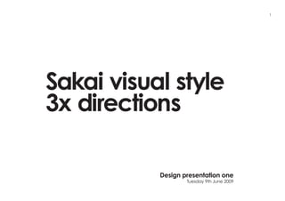
- 1. 1 Sakai visual style 3x directions Design presentation one Tuesday 9th June 2009
- 2. 2 Agenda Refresh our memories with the workshop findings Gather feedback from all three variations of visual style Decide to refine the two screens presented down to one final route based on the strengths and weaknesses of all three routes
- 4. 4 Objectives Make the out-of-the-box theme so good, people are less inclined to change it Convince people to ‘buy’ after a trial Allow flexibility for institutions (via rules and guidelines)
- 5. 5 Audiences Instructional Designers Positive Expectations Powerful Solid and reliable Flexible (but obscure) “What does it do?” Negative Clumsy, clunky Consequences Too many options of actions Hard to identify key things Reassurance Clear feedback “What will this look like to students?” (my audience)
- 6. 6 Audiences Educators and researchers Positive Expectations Easy to do simple things Organizes my life Functionality to the fore Simplicity Negative Interface feels antique Not very friendly Confusing terminology Control Cumbersome Insight 80% of users only use 20% of the functionality “Why would I take training on Not necessarily something I don’t want to use” cutting edge “Doesn’t create more work for me”
- 7. 7 Audiences Students Positive Expectations Single space for everything Mobile, RSS “Why don’t all my teachers use this system?” AJAX-ey interactions Contemporary Negative Staid Predictability Consistency (between sites) Dashboard to manage across subjects
- 8. Attributes to be of service 8 Professional Control Quality Multi- Enterprise purpose ready Safe Personal Straightforward Real world activity Collaborative
- 9. Attributes of emotional value 9 Clarity Simple Timeless Quality Flexible Organized
- 10. Attributes of emotional value 10 Friendly Innovative Smart Respected Contemporary
- 11. Attributes of emotional value 11 Easy Collaborative Autonomous Open Obvious Transparent
- 12. Attributes of emotional value 12 Consistent Inspirational Authoritative Trustworthy Activity Respected
- 13. Timeless 13
- 14. Smart 14
- 15. Open 15
- 16. Authoritative 16
- 17. Authoritative encompasses all routes 17 Authoritative Inspirational Consistent Activity Respected Trustworthy Timeless Smart Open Simple Innovative Collaborative Clarity Friendly Easy Flexible Contemporary Autonomy Organized Respected Obvious Transparent
- 18. Weighting of various visual styles 18 Authoritative Authoritative Authoritative Inspirational Inspirational Inspirational Consistent Consistent Consistent Activity Activity Activity Respected Respected Respected Trustworthy Trustworthy Trustworthy Timeless Smart Open Simple Innovative Collaborative Clarity Friendly Easy Flexible Contemporary Autonomy Organized Respected Obvious Transparent Smart Open Timeless Open Smart Timeless Innovative Collaborative Simple Collaborative Innovative Simple Friendly Easy Clarity Easy Friendly Clarity Contemporary Autonomy Flexible Autonomy Contemporary Flexible Respected Obvious Organized Obvious Respected Organized Transparent Transparent Route 01 Route 02 Route 03
- 19. 19 Route 01
- 20. Route 01 (Focus on timeless) ~ 1 of 8 (No institutional branding) 20
- 21. Route 01 (Focus on timeless) ~ 2 of 8 (No institutional branding) 21
- 22. Route 01 (Focus on timeless) ~ 3 of 8 (With institutional branding) 22
- 23. Route 01 (Focus on timeless) ~ 4 of 8 (With institutional branding) 23
- 24. Route 01 (Focus on timeless) ~ 5 of 8 (Any background colour) 24
- 25. Route 01 (Focus on timeless) ~ 6 of 8 (Any background colour) 25
- 26. Route 01 (Focus on timeless) ~ 7 of 8 (Any background) 26
- 27. Route 01 (Focus on timeless) ~ 8 of 8 (Any background) 27
- 28. 28 Route 02
- 29. Route 02 (Focus on smart) ~ 2 of 4 (With institutional branding) 29
- 30. Route 02 (Focus on smart) ~ 3 of 4 (With institutional branding ~ Top) 30
- 31. Route 02 (Focus on smart) ~ 4 of 4 (Scrolled) 31
- 32. Route 02 (Focus on smart) ~ 1 of 4 (No institutional branding) 32
- 33. 33 Route 03
- 34. Route 03 (Focus on open) ~ 1 of 5 (No institutional branding) 34
- 35. Route 03 (Focus on open) ~ 2 of 5 (No institutional branding ~ Top) 35
- 36. Route 03 (Focus on open) ~ 3 of 5 (Scrolled) 36
- 37. Route 03 (Focus on open) ~ 4 of 5 (With institutional branding) 37
- 38. Route 03 (Focus on open) ~ 5 of 5 (With institutional branding) 38
- 39. 39 Next actions 1 to 1.5 days of refinement to final route Presentation PDF file for final sign off and agreement on the 5 screens 5 screens for Tuesday 16th June COB delivery
- 40. 40 Thank you