Type
•
1 gostou•1,934 visualizações

ENGL 396 - White Space is Not Your Enemy, Charpter 7: Type

Recomendados
Mais conteúdo relacionado
Destaque
Semelhante a Type
Último
Último (20)
Type
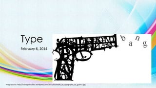
- 1. Type February 6, 2014 Image source: http://cravagolina.files.wordpress.com/2011/03/death_by_typography_by_gcore1.jpg
- 2. Type Sets the Tone • Font • Typeface or Font Family • Glyph Image source: http://fineartamerica.com/images-medium/neon-sign-series-featuring-the-alphabet-in-red-michael-ledray.jpg
- 3. Parts of a Font Image source: http://365.idtech.com/tutorials/typography_illustrator/ http://www.fontshop.com/glossary/
- 5. Font Categories • Sans Serif • Serif • Script • Decorative • Modern Image source: http://www.idtech.com/blog/looking-at-typography/
- 6. Font Categories Image source: http://enfuzed.com/the-psychology-of-fonts-infographic/
- 8. Glyphs Most fonts have a set of 265 glyphs Image source: http://www.fontspring.com/poster_imgs/73/14ed/2ed4a2990a857022fba66a3273/fp-720.png
- 9. Applying Additional Font Styling • Font size • Bold and Italic • All CAPS • Spacing Image source: http://www.indezine.com/products/powerpoint/learn/textandfonts/format-font-styles-ppt2010.html
- 10. The Right Font for the Job
- 11. Choosing & Using Fonts • Choose one font for your copy body • No. 1 consideration? READABILITY! • Choose a second font for your headlines • Can be wild and derative, script and elegant or sans serif and ultra hip
- 12. Font Size Image source: http://www.imaging.org/IST/pdfs/appendixa.pdf
- 13. Name a FONT FAMILY Image source: http://bottom-of-the-glass.blogspot.ca/2012/02/birds-2-lethal-tweet.html http://designtaxi.com/news/361384/A-Meticulous-Illustration-Of-The-Brooklyn-Bridge-Done-Entirely-In-Type/
- 14. Choosing Fonts for the Web • The number of Web font is limited • Choose fonts that render well onscreen Image source: http://www.zeald.com/site/zeald2/images/Articles/fonts/web_fonts.jpg
- 15. Spacing - Leading • Space between lines Image source: http://www.fonts.com/content/learning/fontology/level-2/display-typography/line-spacing
- 16. Spacing – Kerning vs Tracking • Negative space between two characters • Adjusting the space across a string of characters such as a sentence or a paragraph. Image source: http://www.fonts.com/content/learning/fontology/level-2/text-typography/kerning-text-type http://www.fonts.com/content/learning/fontology/level-2/display-typography/spacing-display-type http://graphicdesign.stackexchange.com/questions/2606/difference-between-kerning-vs-letter-spacing
- 17. Typesetting Lengthy Copy • Paragraph indicator • Heading & Subheading • Display fonts • Bulleted lists • Hanging indents Image source: http://www.attitudedesign.co.uk/2006/a-guide-to-practical-typography
- 18. Taking a Page from Newspaper Design • Story headlines • Columns • Justification Image source: http://www.ndsu.edu/pubweb/~rcollins/313editing/hobbiesnewsletterdirections.htm
- 19. What is a GLYPH?
- 20. Type: Not Just for Reading Anymore • Bold & Italic • SMALL CAPS • Reversed Type Image source: http://cravagolina.files.wordpress.com/2011/03/hendrix-typography.jpg
- 21. Typesetter’s Punctuation • • • • • • • • • • • Apostrophes Brackets of various kinds [ ], ( ), { }, ⟨ ⟩ Colons and semicolons Commas Dashes and hyphens ‒, –, —, ― Ellipsis Exclamation and question marks Quotation Marks Slashes Special characters ©®¼½¾ Image source: http://www.newrepublic.com/article/113101/smart-quotes-are-killing-apostrophe
- 22. OpenType for Print Design • Ligature • Swash alternates • Old style figures • Dingbats Image source: http://desktoppub.about.com/od/microsoft/ig/Microsoft-Publisher-2010/Publisher-2010-Ligatures.htm http://designshack.net/articles/typography/add-flair-to-projects-with-alternate-lettering/ http://blog.rockymountaintraining.com/adobe-indesign-assigning-old-style-figures-through-grep-styles/
- 23. What you Need to Know about Logo Design • Logos should be unique to the subject/product/organization • Logos must be scalable • Simplicity is a virtue • Limit the number of colors • Make sure the logo is reproductible in black only • Logo can be reversed • Logos should not be vertical or too horizontal Image source: https://self-issued.info/?cat=20 too
- 24. If you Must Design a Logo • Consider a type-only logo • Avoid using the font-du-jour • No clip art • Add a simple shape • Test it out • Turn fonts to graphics Image source: http://www.logodesignmadeeasy.com/world_best_logos http://breezycreativedesign.com/2010/01/21/5-different-types-of-logos/
- 25. Did I use a SERIF or a SANS SERIF font for this presentation?