
Recomendados
Mais conteúdo relacionado
Mais procurados
Mais procurados (20)
Destaque
Destaque (20)
Semelhante a Digipak Designs and Development
Semelhante a Digipak Designs and Development (20)
Mais de meggarrattmedia
Último
Último (20)
Digipak Designs and Development
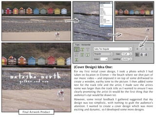
- 1. Final Artwork Product For my first initial cover design, I took a photo which I had taken on location in Cromer – the beach where we shot part of our music video – and imposed it on top of some driftwood to create a wooden, earthy tone to the picture. I then added some text for the track title and the artist; I made sure the artists name was larger than the track title as I wanted to ensure I was clearly promoting the artist (it would be the first thing that the audience’s eye would be drawn to). (Cover Design) Idea One: However, some initial feedback I gathered suggested that my design was too simplistic, with nothing to grab the audience’s attention. I wanted to create a cover design which was more exciting and dynamic, so I developed some more designs.
- 2. For this design, I took a screenshot from my music video of Liv and I holding hands, which I cut out and imposed onto a textured background (a photo of some driftwood I had taken at Cromer, where art of our video is set). I enlarged the image so it became the focus of the cover, but thought I could add more interest through adding myself and Liv’s faces imposed on the picture too. I blended the images together to create a faded, vintage look before adding the title of the track in a script font. Final Artwork Product (Cover Design) Idea Two:
- 3. Design One Design Two For these designs, the choice of font was an issue. While my feedback suggested that the font choice in design one (inspired by artists of a similar genre, such as Bon Iver) matched the natural, earthy tone of the artwork, some suggested that it was difficult to read unless you knew beforehand what the text said. This lead to me changing my font choice to the typeface in design two; however, I felt that having the title in block capitals was a bit messy, so I considered yet another option. The final font choice (as seen in design three) I think is the most effective; it is simple but easy to read and stands out against the rest of the cover. FeedbackandFontDevelopment Final Artwork Product
- 4. This was a rough design for a six panel digipak, incorporating the front cover panel I had already designed. However, there are some issues with the design. The back panel is too simplistic for a back panel; while I had designed a minimalist look on purpose (I would have added text later) feedback suggested the design was too plain and boring. The panorama inside panels I found to be dull; the grey front and back panels miserable. I needed to add some interest to create a more dynamic design. Cover PanelBack PanelMiddle Panel Inside Panels SixPanelDigipak(RoughDesign)
- 5. (BackPanel)Construction: I took a photo of Liv and I in the forest to use as my back panel image. I decided that Liv’s arm looked a bit clumsy in the shot, so using the quick selection tool I cut out her arm, and using parts of the forest, tree trunk and Liv’s coat, I edited the image so that it looked as though her arm was simply placed by her side. I overlaid a texture over the photo to create a warm, earthy tone. It was the same one I used on my front panel, so a consistent theme was kept to link the two images together.
- 6. Back Panel Feedback & Development My back panel was based on an initial idea I had of having a picture of the girls silhouettes cast by the sun. We took a variety of photos to achieve this (see the rough photos) but the ones which I liked the most were the ones taken in the forest itself, as they had depth and warmth through the deep greens and yellows. The eroded texture of the cover helped add to this depth. However, feedback from my first design suggested that the text should be moved from over the girls as it removed from the dynamic impact of the image. I also adjusted the positing on the barcode and album details, (the second design was far better received), as well as adjusting the size of the cover so it would fit the CD case dimensions. Version One Version Two Rough Photos
- 7. Other Back Panels (Rejected) Design One Design Two These were two rough ideas I had for my back cover, but I decided against both of them. (NOTE: I rejected the images before I put the track listing and album details onto them. Design one in a screenshot from my music video, cut out and imposed onto an image of the ocean. However, I felt the image was missed emotional impact – the faded image felt a bit mellow-dramatic and slightly soppy, which I did not want to achieve. Therefore, I disregarded the image. The second design was an image of our silhouettes with sun flares. However, when I showed this image for feedback, some people found that the light was too strong, so they couldn’t make out the image of Liv beneath it. Even when I softened the colour scheme, the flares were still too strong, which lessened the impact of the image. Therefore, I also rejected this design, as I also felt the design was too boring (it didn’t have the impact of some of the other photographs I used for my final designs). Rough Photos
- 8. Design TwoDesign One Final Artwork Product The main problem with my cover design was that, when I compared it to my back panel designs, it no looked dull and miserable. I decided I would have to make the design more eye-catching and warm in tone. Therefore, I used the background image of the river and its foliage, matching the green Autumn tones also seen in my pack panel (set in the forest). The overlay of the hands were no longer set as colour burn but soft light, making the image less harsh and instead more earthy. People commented that the front and back panels now felt like a continuation of one another, which was positive. But the choice of font was now a problem. Some found it difficult to read the title in design one, so I changed the font choices in design two. The two fonts complemented each other, but again the script font was difficult to read. So, I changed the font completely to Timeless, added a border to the title (design three), but I shortened the lines for the final design. Design Three Further Development (+ Font)
- 9. As I had now changed the front panel, I would have to change the font on the back panel so to keep the design consistent. Therefore, I changed the Baby Fox font to the Timeless font. Some other feedback I received was that the listing of the tracks were difficult to read with the bullet symbol separating each song. Therefore, I listed the songs along the right-hand of the back panel, the numbers in bold to make it easier to distinguish between each track. In order to make the track titles easy to read, I had to make the background lighter to the font would stand out Further Development (+ Font) Font Choices against the trees and forests behind it; to do this, I used a crop shadow shape, using the colour picker to find a similar shade on the rest of my cover. Then, I blended it over the text so it was more subtle and didn’t overshadow the rest of the design. The feedback was now a lot better: the text was easier to read and was more consistent with the cover panel. Initial Design Improved Final Design
- 10. Next, I had to create the panels 2 and 3 for my digipak. I decided early on that I wanted to have the two faces of the characters from my music video on the panels. I took screenshots from my music video and used the magnetic lasso tool to cut out the images; I then turned down the saturation on the images so they would look grey and faded. For the image of Liv, I had to flip the image so it looked like she was looking at my character. I also layered a wooden texture over the images to make them look more earthy and worn. Inside Panels Development and Feedback Panel 2 Final Product Panel 3 Final Product Rough Photos Feedback for the panels were positive. Some noted that the grey tones of the beach link to the music video where the scenes were in low saturation, reflecting the melancholy tone. This also contrasts the highly saturated, brightly coloured front and back panel in the forest, which reflects the music video that had more upbeat and happy scenes. Also, people liked having the two girl’s faces as it added more interest than simply having the beach huts. Photoshop LayersHappy/Sad Music Video Screenshots
- 11. I decided I wanted to develop a cover to go onto the CD disc so it would be more interesting for the consumer. Firstly, I took a picture of the beach huts (so it would correspond with the images in the inner panels ) and faded the photo so it looked like the colour had been drained, connoting something old and sad. However, I didn’t want the design from the inner panels to be ruined, so I took the image of panel 3 (the panel where the CD would be kept – see image below) and inserted it onto the CD cover. However, in my research, disc covers promote the artist and album name, so I put the title of the album and the name of the artist on the CD for my final design in order to promote Natasha North. CD Cover Design Development Final Artwork Product CD Layout
- 12. Final Digipak Packaging The panels (clockwise, top left to bottom right): front panel, back panel, panel 3 and panel 4. The design is for a jewel case CD (see image below). The disc will correspond with the image beneath it. So, when the disc is removed, the image still remains intact under it.
- 13. Poster Construction Final Artwork Product I began by taking a screenshot of Liv and I on Cromer pier. Then, using the marque tool, I took a portion of the sky and copied it onto the poster, using the smudge tool to blend the images seamlessly together to create the entire sky. Next, I used the smart brush to identify my coat; increasing the brightness and saturation I made my coat a vivid red against the black and white backdrop. Finally, I added the text, using the colour picker tool to create red highlights in the text.