
Recomendados
Mais conteúdo relacionado
Mais procurados
Mais procurados (19)
Semelhante a Final piece2
Semelhante a Final piece2 (20)
Mais de mc04451431
Mais de mc04451431 (14)
Último
Último (20)
Final piece2
- 2. I am designing a poster and CD cover for new upcoming artist called The Unknown also known as ?, I have been asked to design a poster that could be advertised in store to represent the CD so that it could be pre-ordered before it comes out and also design a cover that could be suitable for grime music and will link with the artists name. My concepts are Boom Box, Graffiti Walls, Urban Area, Chains and also British products. I have chosen to use these concepts to see and explore which of these concepts would suit my Grime theme, so I have explored all these concepts and came to conclusion that the two concepts I am carrying on with are Urban Area and Graffiti Walls, I have chosen to continue with these two concepts because I think they are most suitable out of all 5 concepts I have analysed so therefore I am going to continue with them throughout my project. The four artists/ graphics designers that I am looking for inspiration are Roberto Blake, Nick Purser, Tess Hulme and Rowan Pervis, also I am looking at three typography designers which are Craig Ward, Jason Howard and Stefano Buffoni , I chose to look at these typography artist because they could inspire me when it comes to designing a typography based work for my cover and poster. Design Proposal " Dear Designer I am writing to ask you to design a CD cover my new upcoming grime album. I want you to design me a unique design of the cover so that it stands out but also links with the grime scene theme but also I want you to design me a poster so that it could be promoted and sold in music stores and not just online and on iTunes as most of the existing grime albums but also I want you to design me these posters with dates of the release of the album so that the audience could pre-order the CD and therefore increase the sales of my albums also, I would like to you promote me under my artist name which is " The Unknown". Thank You, Yours sincerely Mamkeli Matomela " 2 Roberto Blake Roberto is a professional graphic designer, he uses mixed media in some of his deigns but the ones I have looked at are light painting like designs where he uses an object which is usually person then does like light effects surrounding them which makes his work really interesting and professional and that's the reason why I have investigated his work also because I tried to do some of my work based on his light painting designs. Tess Hulme Tess is a freelance graphic designer who is inspired to create his work to give out point to people and make them smile. Tess uses mix media in his some of his work he creates work, the work I have looked was pretty much photography mixed with typography which made it look really simple but really effective at the same time because each piece had different photograph and different font to it with different slogan so that they linked with the picture and the mise en scene in the picture so that is the reason why I have looked at his work and done some is work as my development work. 3
- 3. Rowan is a freelance graphic designer, Rowan works with a wide range of visual styles and processes ranging from film photography to collage and handproduced techniques. Rowan often experiments with combining several of these elements together to try and create something new and unique each time but also he is very interested in the crossover between hand-made and digital design. The pieces I have been looking at were MTV posters which really inspired me to try to do something similar to his work because of the way his work looked with different colour filters layering over the original image which was black and white and overall it looked really interesting with the MTV logo in the middle of the picture so I have tried to develop similar piece of work to him. Nick Purser 4 Nick is a freelance graphic designer who has passion for doodling, painting and drawing. Nick has worked for music record company called Good looking Records as their in-house designer and illustrator who was designing album covers for the artists who were signed under the record company, his works really interesting because he uses plain primary pictures but also does hand edits and work with illustrator which makes the covers look really simple and effective and that's the reason why I have researched Nick because his work could aspire me as he designed loads of album cover which is what my task is to do. Concepts Rowan Pervis 1 I have chosen urban area as one of my concepts because, I might use urban area as one of the backgrounds for my poster and CD cover because urban area links with the grime music theme and rap theme because it looks rough and ghetto style so it would be useful for me to this as a background for the poster and CD cover. 2 3 I have chosen graffiti walls as one of my concepts because, I might use graffiti walls as one of the backgrounds for my poster and CD cover because graffiti walls link with the grime music theme so it would be useful for me to have graffiti wall in the background of my poster and CD cover. I have chosen British as one of my concepts because Grime is an English music and it began in England and probably is only known in England too, so having a British theme as background on one of my posters could be really suitable because it would like with Grime since its English. 5
- 4. Artist Work 6 Development Development After looking at all of the artist influence, I started the development of my imagery and I started off with Rowan Pervis , his work looks appealing and also looks like it links in with the music scene so therefore I have tried to develop something that looks similar to his work, to develop it I have used the rectangle tool to create loads rectangles and then I have filled them with different colours, afterwards I have used layers when I created each rectangle so that I could get them to overlap and get different outcomes after I have merged them together and as for the last thing I have used hue/saturation pallet to change colour of each of the rectangles but also used it after I have merged all the rectangles together so that the overlapping rectangles will have different overlapped colour which would give it the Rowan Pervis look I wanted to achieve. Overall I have used different sets of colours until I got set of colours that look like they match and go together but, I was hoping for better outcome of this development, if I have used different type of picture or different shapes of the colour blocks maybe I would get a better outcome than I did. Artist Work After Rowan I have done Roberto Blake development page, I have tried to develop a similar image to what Roberto's piece looks like because I really like the lightning design he has done so to do that I have used pen tool to go around the object and then I have copied it, then I have used brush to give it the light trace effect by using pen tool to some whirls and then using brush strokes on it to give it that light effect I was after and as the last step I have repeated it both of the steps to have more than one lighting whirl around the artist , overall my development looks a bit plane compared to his but if I practise I think I could develop even better piece of work by getting some more angles and different poses of the person. 7
- 5. Artist Work 8 Development Development For the next development page I have done Tess Hulme based development page, I have tried to do exact copy of his work so that it looks like it has been developed by Tess because I think that Tess poster looks really interesting thanks to its colour use but also because of the imagery in the background so therefore it looks really appealing and professional. I have used Text tool to add text to the image also to change the style of the font I was using and after that I have used layer tool so that I could layer down the text and head image together, At last I have used a smudge tool so that I could smudge the text and make it look like Tess work. Over all I am really impressed by the outcome of this development because I really like it and it kind of looks like it has been developed by Tess. Final Piece - Album Cover Artist Work I have been inspired by 'The Game' album cover which really appealing to me but also linked with the rap music so I decided to do some similar looking album cover. To start of with I have drawn background picture with the artist and then scanned it in into photoshop , after wards I have applied cut out effect so that it looks rough but yet still interesting, afterwards I have downloaded few brushes for Photoshop to apply the blobs of paint and also the cartoon looking arrows, after I have applied them I have added the title which I have developed in Illustrator and then I have just added few finishing touches to so that it looks more like CD cover rather than some rough piece of work and then just added the name of the album which was Bars overlapping the bars on the picture. Overall I am really pleased with the outcome of this development because I really think it links in with the music scene. 9
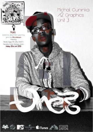
- 6. Artist Work 0 1 Development Development To developed this image I have used Photoshop, I found inspiration for this image on the internet, I found it by looking for professional looking typography tutorials and then I have found website with the typography I liked, I have used tutorial that on the website to develop this image, I have used multiple techniques like; fill tool, text tool, magic wand tool and transform tool. After developing the image I have tried different colour to see which colour combination looks the best and then I have came to conclusion that it was turquoise with pink which made the image look really interesting so I have chose that as my main development from this experiment. In this step I have added the album cover into the poster so that it is advertising the CD as well and then I have changed colour of the logos and added few more so that the poster looks more legit and therefore looks professional. In this final step I have made the album cover a little big bigger so that it is more visible to the audience and then I have added little hand that is pointing at the CD cover so that it attracts audience attention and then I have added a little bit of annotation that describes who is the album by and who is the featuring artist on the CD and lastly the day when it is released. Final Piece This is my final piece for my UNIT 3, I have chosen this because it links in with the grime music scene because it looks urban but also because I like the pix alated look about it and then the title gives it the street look about it so it kind of looks futuristic joined with urban scene so therefore I find it interesting and have chosen it as my final piece. 11
- 8. Over all, In this whole Unit the artist that has inspired me most through out this project was Rowan Pervis and music artist called 'The Game' with his album called 'Jesus Piece'. These two artist inspired me because Rowan's work looked more futuristic which links in with todays society and youth and 'The Game's album cover inspired me to design album cover that looks a bit futuristic yet it still has the rough/street look about it so that it links in with the grime theme, but also it has inspired me when I have designed my final Poster because I have used 'rough' looking title for it so it looks urban and poster is based on Rowan's work which looks more futurist but also could signify download which is in fashion now a days since young population does not buy actual albums but downloads them of the iTunes and other type of online music shops. Summary Experiments Webliography www.google.com www.bing.com www.dafont.com www.wikipedia.co.uk 14 1 5
- 9. 1 6