1. Luke Wilkes Media Studies – A2
Research and Planning – Film Poster Analysis 1
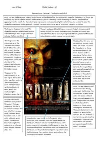
As we can see, the background image is located on the left hand side of the film poster which allows for the audience to clearly see
the image as it stands out from the text and the dark background. This image clearly shows a figure with red eyes and blood
appearing from his mouth. The character’s facial expression is emphasised by a ‘light’ in which shows the whole of its face. This
allows for the audience to clearly identify a possible character of the film as well as recognising the genre of this film.
The layout of the poster is Portrait. This The dark background (black) helps to emphasis the dark atmosphere and
allows for more text to be included within it tension that this film poster is trying to create. The dark background also
without having to make images smaller or allows for the audience to clearly recognise that this may be horror film as the
reducing the font size of text. colour black symbolises tragedy, horror and death.
This image shows the The title of the film as we can
main character of the see is located near the centre
‘Saw’ films. For fans of of the film poster. This allows
the first film, they will be for the audience to clearly
able to easily identify recognise and identify the
the character located in movie that this poster is
the top left hand corner advertising. The font of the
of this poster. This iconic title seems to be of ‘scratch
image allows gaining the marks’ which symbolises the
attention of the theme of horror as well as
audience and informing describing the film and its
them of a second ‘Saw’ contents. The image of two
film to be released. dirty looking fingers which are
covered in blood and dirt
The power of this
emphasise to the audience
character seems to be
the genre of the film and
very high as it is located
shows what may feature
at the top of the poster.
within the film.
The red eyes looking
down of this character
symbolises blood and As we can see, the sub-text of
death, whilst also the film is located directly
emphasising the underneath the film title. This
characters power that it means that it is clearly visible
may have over others in as the title is very bold and
the film. there is not bright, contrasting against the
Although
dark background of the poster
certificate rating on their
in which allows for the
film poster, the target
audience to clearly notice,
audience of this film in
drawing their attention to it.
my opinion would be
The sub-text also informs the
over 18’s. This is because
audience of what this film
of the colours in which
contains. It is also written in a
have been used, as well
non-formal way, allowing for a
as the subject in which Located at the lower centre of the film poster is the
more realistic response from
implies ‘There will be production name, company name and logo as well as the
the audience with possible
blood’ allowing for the distributors. This isn’t very important of advertising a film
persuasion to watch the film
audience to be informed poster; however it is located on this film poster to allow the
when it is released.
of the possible contents audience to make their own opinion of the film based on the
of the film. distributors and the production company’s reputation within
the film industry. There is also a date in which informs the
audience of release date of this film.
2. Luke Wilkes Media Studies – A2
Research and Planning – Film Poster Analysis 2
The first code and convention that we notice of this film poster is the characters costumes. The images of five characters within this
film are located in the top half to the middle of the portrait orientation of the poster. The image clearly contrasts against the black
background in which has been used to emphasise and allow for the image to clearly stand and be visible to the audience. As we can
see, three of the characters are wearing masks. This implies that they may be the antagonists of the film whilst two characters are
seated in front of them, potentially the protagonists of the film as we can see their body language is scared and frightened. The status
of the supposed antagonists is clearly visible as they are much taller and appear to be looking down at the supposed protagonists. This
also allows for the audience to gain a small understanding of what the plot of the film is.
The background of this film The strapline of this poster is
poster is a brick wall, clearly located in block capital
visibly behind the supposed letters, in an easily readable
antagonists of the film. The brick font allowing for the
wall symbolises a ‘no way’ out audience to clearly read it.
feeling as though the two ‘Because you were home’
supposed protagonists seated allows for the audience to
are trapped and have no way of use the meaning of this as
escaping. This allows for the well as the image located
audience to gain more directly underneath in order
understanding of the film and to gain an understanding of
what the plot of this film may be. the plot. The yellow font
allows for the sub-text to
contrast against the
As we can see, the actors’ names background making it easily
are located just above the film visible.
title. These both are placed
directly under the bright image Here we can see two of the
of the characters within the film antagonists, in which
as it allows for the audience to appear to be young
easily notice it. The font that has women. This firstly shows
been used is easy to read with the vulnerability of them as
this being emphasised with the well as gaining the
white font colour and block audience’s attention as
capital letters in which have they will want to know the
been used. The reason in which unknown, hidden behind
the actors’ names have been the masks. The dark at the
included on this film poster is to bottom of the poster
attract the attention of the signifies the unknown, with
audience as well as making this audience also wanting to
film poster appeal to fans of know what this may
both of these actors. represent in the films itself.
The title of the film is located again, directly underneath the image of the characters. Just like the actors’ names, this allows for the audience to
clearly identify and recognise the title of the film. The font in which has been used is easily readable and the white colour font allows for the title
to contrast against the dark background in which has been used. Around the title appears to be an orange glow which could symbolise fire, linking
to a tragedy in which may occur in the plot of this film.
The black background also allows for the audience to clearly identify the genre of the film as it contributes to the scary look and atmosphere in
which has been created with the use of antagonists with masks clearly visible on their faces.
3. Luke Wilkes Media Studies – A2
Research and Planning – Film Poster Analysis 3
As we can see, the sub-text of this film poster is located at the top of the poster, clearly visible in a medium sized, bright coloured
font in which clearly contrasts against the dark background of the poster. ‘New Decade. New Rules’ in which the sub-text reads, may
allow for the audience to gain an understanding of the film and potentially what the plot of the film is about. This sub-text could
signify a possible struggle for others, as maybe the image, which we presume is the villain, could possibly ‘play games’ with the
characters, ending up in death due to the knife visible in the image.
The background of this film
One of the first features the poster is black, this symbolising
audience identifies is the bright death and mystery. The black
image, located in the centre of background also allows for the
the page. The image contrasts image and text located on the
clearly against the dark film poster to clearly contrast,
background due to its bright allowing for the audience to
white colour used as well as a clearly identify each feature. The
bright shadow effect in which black background may also
emphasises the picture, allowing signify the unknown in this film.
for it to stand out. We can also This can be used as a technique
see that the image shows a face in order to attract or persuade
or mask, in which may be used an audience into watching the
by an antagonist during the film. film, this because of the
We can also see that the image audience and their willingness to
gradually, from top to bottom, be informed of the unknown and
slowly merges from the shape of what it is.
a face to a knife. This represents
a weapon, informing the
Located at the very bottom of
audience of the possible genre
the film poster is the name of
of the film, in this case, and
the film production company
horror. The knife may also allow
of this film. This allows for
for the audience to identify the
the audience to gain an
sub-genre of the film, this being
understanding of what the
due to the image of the knife,
film may be about, or
allowing for them to gain a good
whether this is a film in which
understanding.
is worthy to watch, as other
films from this production
company may have created a
good or bad reputation for
them. This also allows for the
production company to get
their name out and
identifiable, without taking
away the tension and
Here is the logo and film title in which may possibly be used within the film and on DVD or Video releases of
creepiness created within this
the film. Firstly, we notice to white colour used as well as the bold and spacious text, allowing for the
poster due to its very small
audience to clearly see the name and title of this film. The name of this film is ‘SCREAM’ in which tells the
size and location within the
audience a possible character name or a convention of the film as it is designed to possibly make the
film poster.
audience ‘scream’ with horror. We can also see that the image located on this film poster has a wide, opened
mouth signifying a scream, this relating to the title of the film itself. We can see that the creators have used a
number ‘4’ instead of the ‘A’ in order to create the word scream. This allows for the audience to understand
the name of the film being advertised on this poster and to also understand that this possibly could be the
fourth film in the sequel. The ‘4’ is in a bold, red colour, this attracting the audience attention, possibly giving
them a much clearly idea of the film and its contents. The ‘M’ located at the end is clearly visible with a long
pointed character, this representing a knife, tying in with the image used of the knife and slasher horror sub-
genre in which the audience have learnt from this film poster.