1. Comment on how the design of the magazine cover attracts the target audience:
Lucas Yates - Andersen The design of the magazine cover attracts its target audience by the use of colours, text, main image and
structure. The font used for the magazine cover is formal but slightly curved and also the colours used for the
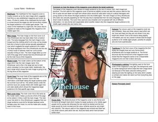
Masthead: The masthead for this magazine cover is font is quite dull and bleak not bright and vibrant which would be used when trying to a attract teenagers and
mostly covered up by the main image which suggests young adults so this shows the target audience is for the middle aged. The main image is of Amy Winehouse
that this is a very established magazine and known by who looks very sexually appealing for men the way she is represented from her body language, clothing and
many. Of what is visible of the masthead the font style direct mode of address. The cover lines used are very simplistic and not packed with lots of different
is curved around the edges but still formal which implies information, it is very formal and respectable which another reason why this magazines target audience is for
the target audience is for middle aged people. The middle aged people who are mainly men.
colour of the masthead is a light blue; the colour blue is
targeted at males so this suggests this magazine is for Colours:The colours used on the magazine cover are
middle aged men. very simplistic, there are three colours used which are
red, blue and black but they are not shown to be very
Main image: The main image on the front cover is of bright and vibrant. Due to the colours being slightly
Amy Winehouse who has been taken from a medium minimalistic and not very vibrant it shows that the target
shot. The body language from the main image is very audience is for middle aged people, possibly for people
forward and the clothing which is of a low cut top shows who are more sophisticated.
that she is trying to come across sexually appealing to
men which suggests the target audience is for males.
The facial expression from Amy Winehouse and the use Typefaces:On the front cover of the magazine the font
of direct mode of address make her come across styles are straight lined and very formal which
sexually inviting to men. The main image takes up over emphasizes who its target audience is. The formal
half of the page which shows that Amy Winehouse will structure and the formal font of the magazine cover
be the main focus of the magazine. shows that the magazine wants to be a respectable
magazine and one that is taken seriously.
Model Credit: The model credit is at the bottom of the
page which has the main images name ‘Amy
Winehouse’ and is the in the large text and is bold Photography Lighting:The lighting used on the front
which indicates it is the model credit. Additionally, the cover of this magazine is very light, the background used
text is large which shows the main image is going to be is a white background which make the main image stand
the big focus of this magazine. out because of the black coloured clothing she is
wearing and also the lighting on her body which creates
a contrast and makes her stand out from everything else
Cover lines:The cover lines of the magazine are on the on the page.
left side of the page ‘Summer Tours’ this has
information underneath telling the target audience what
the summer tours will be. The artists named under the
Design Principals Used?
summer tours are usually linked with middle aged men
and older adults which shows the magazines target
audience is for that specific age range.
Main cover lines: The main cover line is the same as
the model credit, it takes up around a third of the page
at the bottom, it links in with the main image. The main
cover line which is ‘Amy Winehouse’ suggests that one House style: The whole structure of the magazine cover is very formal and
target audience could be for females because some the text is all straight lined which implies its target audience is for middle aged
females enjoy her music it is not the males who usually people not for young kids otherwise the text would be slanted and the font
listen to this music. styles would be more rounded and the colour scheme would be very bright
and colourful. The colours used on this magazine are minimal and there are
only three colours used which are red, blue and black which have all been
dulled down.