On National Teacher Day, meet the 2024-25 Kenan Fellows
Preliminary research
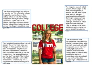
1. The magazine appeals to both
genders. There is a girl on the
The girl is happy, smiling and wearing front, which all girls would
a sporting top. This reflects the college relate to and one of the topics
in a positive way and shows their show is about teenage
college values as well. For instance pregnancy (potential gossip).
everyone is very loyal to their college But the girl is also wearing a
and that it’s a great place to be. sporting T-shirt and she is a
Making the audience, in turn, want to pretty girl, which would entice
join the college if they haven’t already guys to buy the magazine.
or read it as they are proud they are a Then as both would be of the
part of it. right age group the magazine
seems to catch its audience
well.
The fact that they have
capitalised the main headings
They have used outside college interests of what’s inside and then wrote
(student life) as their main focus and normally underneath with a bit
then girl on the magazine is the main more detail, shows that they
focus of the picture. They have used are trying to capture the
only three colours which is a typical attention of the consumer
connotation for a magazine as they like straight away. It is also a really
to use colours that work well together easy font to read and
and that don’t ‘over do it’. Also the fact understand which is good as if
that the title matches the colour of the it was swirly writing then
shirt creates a sense of unity and it people might not be so keen to
suggests to the reader that she goes to read it.
the college.
2. The main content of this magazine bases Again the magazine has stuck to just
on student life as well. With headlines like three colours, not over complicating
‘Thank God It’s Friday’ and ‘The Ultimate things but enough colour to make it look
Spring Break Escape’. Which shows that well presented. They have included
the audiences will be those who are at literally a ‘splat’ of pink, which grabs the
college but are keen and determined to consumers eye. As it is the only pink on
keep up to date with all the latest gossip. there, and it contrasts with the black
Making it clear that the key audience is background, it notifies the reader that it is
people who attend college – probably the some sort of special edition. The yellow,
college of the magazine – who want to black and white look good together as it
know everything and anything that will keeps in tone with the young, fresh vibe
keep them in ‘the loop.’ and each other compliments the other.
The picture it the key element on the front
page as it’s even over-lapping the master Once again the person is smiling and
head. The guy in the picture is shown in looking confident. Evidently this is a very
quite an ambiguous way; he is wearing important area to capture for a college
fashionable clothes, he’s got a necklace magazine as that is how the audience
on – he doesn’t look incredibly studious want to see people. It also connotes that
by his outfit, more like he’s ready to party. the college pride themselves on making
But then in his hand are a selection of text each and everyone of their students
books. Connoting that whilst you can happy and confident, it also gives the
party at college, your education is still impression that if you can be that then
extremely important and definitely not they ‘sky is your limit’ so why not go to
forgotten. Which would please most college?
parents that send their children to that
college.
3. They have used three images
here, however the main image
(group of girls) is important as it
shows friendships, college unity
and extra curriculum events that
you can be a part of. It’s a very
simple contents page with the white
background but it works well as
simplicity seems to be key.
They have used three columns to
present the contents of the
magazine which is a good
connotation of a magazine rather
than having it in just a long straight
down list. They have also
numbered the headlines so that it is
clear to the reader what page they
The font used is very easy to
can find it on.
read, they have too capitalised the
headlines and then normal writing
underneath with more details. It
seems that this is a very
conventional method of a
magazine.
4. They have included the
conventional ‘Welcome’
message from the editor
and instead of obviously
titling it ‘contents page’ They have listed the contents
they have put ‘what’s of the magazine and then next
inside?’ This gives the to the writing added a number
magazine more of a fun bar so that the reader can see
feel to it and creates a what page everything is on.
USP (unique selling point.) They writing is an easy to
read font and the headlines
stick out more as they are a
bigger size, font and colour to
the added details. They too
have included three pictures
which hints that three pictures
is a good amount to use for a
contents page.
They have a yellow circle
advertising something, as
it sticks out it suggests that
it’s something special
making the reader want to
find out what it is.